Rather than show you another shot of the beautiful and now (nearly) fully restored Duomo, I have chosen what is one of my favourite sculptures in Milan (and there are lots of them), Arnaldo Pomodoro's 'Disco'. With wonderful spring sunshine for virtually the entire week the set up for Salone Del Mobile couldn't have been better. But did it deliver the goods? Well, Yes and No. I won't bore you with the bad but hopefully tantalise you with the good - of which there was plenty. For this post I am concentrating on what the Italians refer to as fuorisalone - the shows that go on in and around the city rather than at the fairgrounds themselves. This is where you get to see contemporary design in the setting of medieval museums, ancient palazzos, busy city streets and crumbling warehouses. What could be better?
All photos are by David Harrison except where credited otherwise.
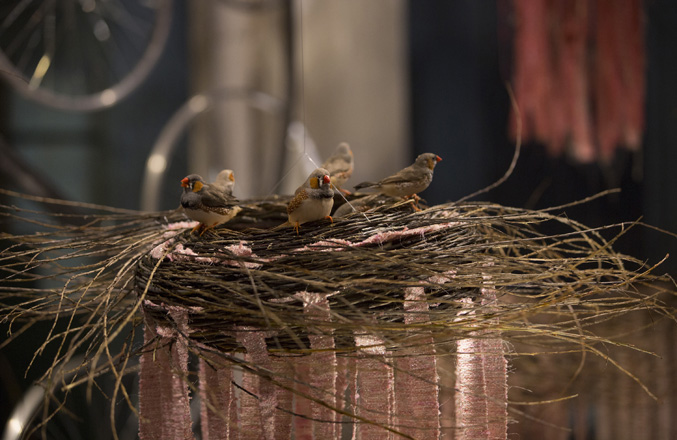
Antoni Marras' fashion store in Tortona is always a treat. Set beyond a secluded courtyard, it feels like you are in the middle of the country side the minute you step off the street. Florists work in the courtyard preparing flowers and the interior of the shop is always changing. This year Antonio Marras once again collaborated with Segno Italiano (a furniture and accessories brand that offers extraordinary objects made by traditional Italian makers) - this time creating an inspirational installation involving tiny birds.
The slowly rotating wheel of birds nests at Antonio Marras was one of our first encounters. The finches much preferred it when the nests were stationary but seemed to enjoy themselves most of the time, darting about and twittering madly.
A large area was enclosed in fine mesh and the sound of the twittering birds was interspersed with an ambient noise soundtrack - quite a surreal effect particularly in the context of an old concrete basement adjoining the Antonio Marras' courtyard.
The concept behind the installation was Segno Italiano's newly released basket range (shown left) that are made by traditional Italian basket weavers. These are available either in natural fibres or in combination with ribbons of Marras' fabrics woven into them.
If you are unfamiliar with Segno Italiano's products and philosophy of revisiting traditional making methods and supporting local Italian artisans, please take a look at the Design daily post on them here.
While we are on the topic of the slightly bizarre, it is probably good to talk about Moooi that is just around the corner from Antonio Marras in via Savona (Tortona). Half children's fairytale, half nightmare, with giant rocking horses (actually unicorns according to Marcel Wanders) and giant billboard sized photographs of scary old people and beautiful nude models by the photographer, Rahi Rezvani, Moooi once again went BIG and BOLD. This year the furniture and lighting products took a back seat to a new range of rugs - more than 40 of them - that while initially spectacular did become a little monotonaneous by the time you had viewed them all.
Of the rugs on display my personal favourites were the three rugs by Bertjan Pot and the contemplative designs of Edward van Vliet. I guess the point of the collection however is that there are rugs for everyone with designs from fashion house Maison Christian Lacroix to the hyper reality of Broersen & Lukacs. Australian photographer Sonya Pletes made her rug design debut with a moody romantic piece called 'Seduction'.
A little further down the road on via Tortona we came across the temporary house of Dutch wallpaper brand NLXL, who were launching a new range of their digitally printed wallpapers by Paola Navone and Daniel Rozensztruch (artistic director of French store and brand Merci) in collections called Addiction and Obsession respectively. Paola pushed her love of indigo relentlessly but no-one was complaining. In contrast Daniels's papers were all about collections of old and found objects. The repetition of the small objects created a dynamic contrast with a sparse arrangement of furniture pieces.
These ranges should have much broader appeal than last year's Studio Job papers which while striking were not for the faint hearted. It takes talent and bravery to successfully carry off the complex colour and pattern combinations that have become the trademark of Studio Job.
Liminal: Irish design at the threshold was a beautiful and carefully curated show in Tortona that used brightly coloured fine metal structures to designate areas and products. I was blissfully unaware of the high standard of contemporary Irish design so will be taken a greater interest in it in the future.
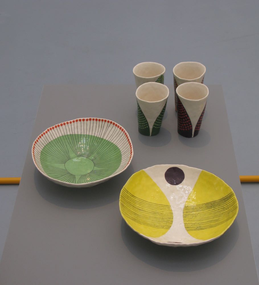
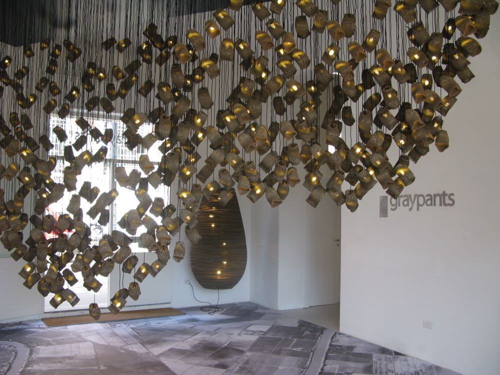
The misshapen ceramics of Andy Ludic contrasted beautifully with the rest of the highly highly refined products on display. It was great to see such a beautifully executed exhibition - just the right amount of product so that everything was visible and had space to breathe. This was helped by a giant tent of translucent material that encased the entire show in soft white light. It was a refreshing change of pace after experiencing the visual assault of the Moooi show. Also in this part of Tortona was a large installation by Canadian lighting brand Graypants, who specialise in the use of corrugated cardboard. Their installation used the material to good effect with hundreds of small, makeshift lights cascading from the ceiling of the renovated workshop.
On the other side of town to Tortona one of the biggest shows of fuorisalone was held in the imposing Museo della Permanente: Nendo 2014-2015. The fact that one single designer (even if he does have a studio of over a hundred) could produce this amount of beautiful product in just 12 months is quite staggering. Showing his pieces on a vast scale with his usual skilful use of repetition, Nendo seemed to be packing in the visitors. The shot below took some patience to get because of the hordes of people walking through.
One of the most spectacular installations of the year was the GamFratesi curated Mindcraft15. After five or six years showing in the younger design areas of Tortona and Lambrate, GamFratesi encouraged Minecraft to show in a different and more inspiring space. Chiostri di San Simpliciano is a former monastery from the middle ages that is not only beautiful architecturally but has some amazing frescoed ceilings along it's cloisters. The concept for Minecraft15 was to cover the courtyard with a reflective floor so that viewers of the show could appreciate the ceilings at the same time. Domes of fine metal rod encapsulated each of the pieces like birds in a cage and the whole experience had a strange medieval pageantry to it. Without question it was one of the most beautiful events of design week irrespective of what time of the day or night you visited (although the floor was a lot cleaner and more reflective in the morning before hundreds left their foot prints across it!)
The brief for the designers was very open so the objects delivered by them varied from small ceramics and a conceptual spinning umbrella to the sewn artworks of Louise Campbell (who is known as a furniture designer primarily). Rather than focus entirely on these objects in a gallery-style space as in the past, GamFratesi chose to create an event that became a total experience and something that was uniquely Milanese.
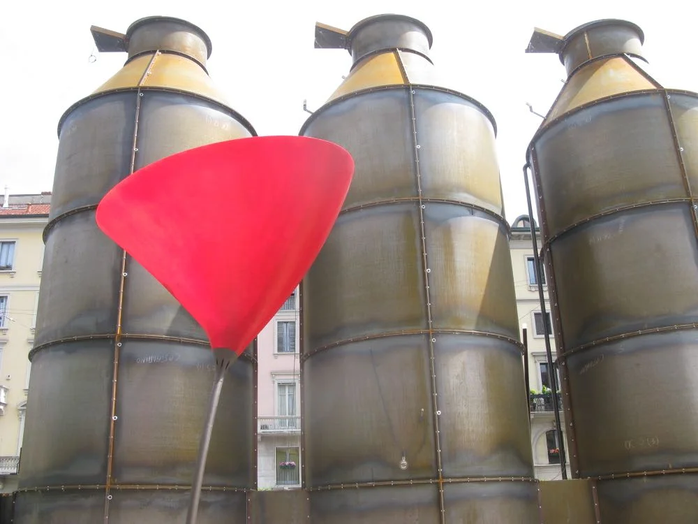
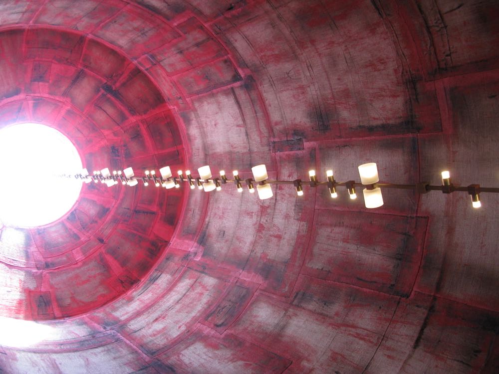
Completely different but engaging none-the-less way was the Solis Silos: feed on light installation at the rear of Italian lighting brand Viabizzuno's showroom off via Solferino in Brera. Created specifically for Salone and Expo by regular Viabizzuno designer Mario Nanni, seven steel silos were built and installed to encapsulate seven themes including fire, water and earth. Each silo delivered a different experience through Viabizzuno's lighting pieces. Being inside the four storey high silos was like something out of the Jules Verne novel, Twenty Thousand Leagues Under the Sea.
British rug company Luke Irwin showed their intricate floorcoverings as part of the design junction juggernaut in San Babila. Keeping it British Tom Dixon took over the disused cinema next door to show his ever-growing range of metal objects, lighting and furniture.
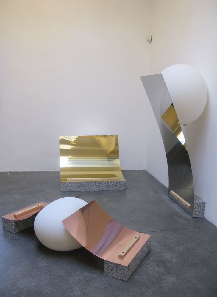
Formafantasma was also part of the Daikin / Fabrica installation FUHA. Their guest appearance took the form of a wall of 22 glass bottles in which the breath of all the participating designers was captured. Finished off with a plug of molten glass, the bottles were weighed and labelled. All the pieces were designed and crafted by the students-cum-interns of Fabrica (Benetton's design and art direction think tank) under the guidance of Fabrica's design director, Sam Baron.
The group showed conceptual works on the theme of air (Daikin is a Japanese air-conditioning company), that ranged from an all timber contraption that moved an umbrella, paddles and a windmill to generate airflow, to works where air-filled balloons allowed objects to balance or push thin sheets of metal into distorted sculptural forms. It was all highly esoteric but exceptionally beautiful.
The quality of unique contemporary and vintage pieces on display is always quite staggering. Above is just one of around 40 projects of specially committed work at the Wallpaper Handmade show in the San Gregorio district. Virtually next door at LeClettico, new online design and craft retailer, Artemest had set up their debut in an upstairs area and showed a large number of Bruno Gambone ceramic pieces.
Dimore Studio (Emiliano Salci and Britt Moran) has been one of the highlights of my trips to Milan in recent years and while this year was perhaps not as strong as some in the past, there is no denying that when it comes to a mash up of colour and pattern there are few who do it better. The more 'restrained' golden room at the end of the building followed a visual onslaught of room after room of patterned furniture, floors and walls. The wall to wall carpeting was the anchor point for a variety of extraordinary furniture pieces designed by Dimore Studio using the same colour palette.
Showrooms across the city are reworked for design week. These two (Hermes and Moroso) were particular favourites. Dutch designers, Studio WM were commissioned by Hermes to create the window display for the via Montenapoleone store and the interior of the petite showroom in via Gastone Pisoni. The designers used projections inspired by the Hitchcock film Rear Window in both premises but gave each one it's own identity - the narrow deep store in via Gastone Pisoni featuring dark lush wallpapers while the long shopfront on via Montenapoleone played on two dimensional silhouettes.
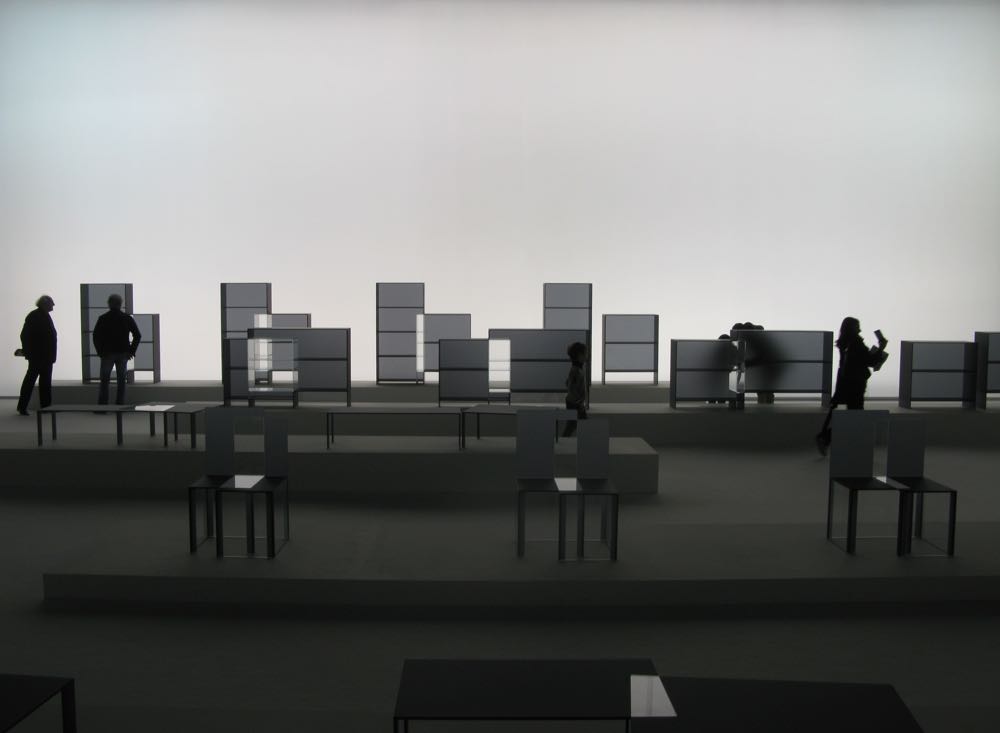
Moroso commissioned the 'Vis a Vis' installation for their showroom in via Pontaccio, in Brera. Designed by Jörg Schellmann who has designed furniture for the brand in the past, the show combined classic contemporary art works by names such as Donald Judd and Sol Lewitt with his own minimal rectilinear furniture inspired by these artists.
In a not disimilar vein the vintage and limited gallery LeClettico in the San Gregorio area (Porta Venezia is the closest metro stop) mixes all eras from ancient artefacts to the present day but wit ha particular emphasis on twentieth century design items. As seen above it's not unusual to come across four original Carlo Colombo 4801 plywood chairs from 1965 or an amazing SHAZAM! style coffee table from Pierre Cardin.
As an added bonus this year LeClettico had sublet their upstairs space to Artemest a new online source for purchasing vintage and contemporary design and crafts - particularly Italian. As I am a big fan of the work of ceramicist Bruno Gambone, I was excited to find this new source and have already earmarked a few items for future purchase.
The Lee Broom experience was certainly one of the more memorable parts of Milan design week this year. Beautifully curated from start to finish the British designer not only presented over twenty new products but exhibited them in a delightfully restrained quintessentially English way. Converting a row of disused shops into a mini department store filled with old style shop dummies and display cabinets all in a soft grey Broom removed all the distractions and allowed his products to really shine. Each section or 'department' was divided from the next by floor to ceiling drapes in the same shade of grey and topped by a discrete sign proclaiming 'haberdashery' or 'carpets & rugs'. The overall effect was quirky but calm. Located in the new and rather small design district of San Gregorio- DOCET, the Lee Broom show benefited from the fewer numbers of visitors. The hushed atmosphere suited the department store theme perfectly and allowed the whole experience to be properly absorbed.
Tasmanian born designer Brodie Neill took his newish brand Made in Ratio to Milan again this year, and showed his brand new 'Alpha' chair in very genuine workshop surroundings. The double height space was very narrow but full of character -something Neill is very keen on. The design itself is exceedingly comfortable for an all timber chair and has an extreme visual lightness.
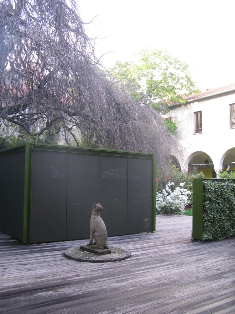
The Paola Lenti installation is always displayed in an incredible garden within the grounds of Chiostri dell 'Umanitaria in the vicinity of the Crocetta metro stop. Several courtyards are filled with Paola Lenti's outdoor rugs and furniture while a vast number of rooms are given over to showing just how well the brand's colourful interior products can integrate with historical architecture. The space with a green frame shown below is an outdoor room produced by Paola Lenti with options for screened walls. Artfully styled and beautifully presented, the Paola Lenti event is always an uplifting experience.
Okay, so I promised no shots of the Duomo but have decide to give you just one - shot by Craig Wall who shadowed me for the week lugging a case of fixed lens and a tripod. HIs beautiful shots of Milan and the Salone will appear in the June issue of Belle magazine as part of the Salone report I am compiling for them. Thanks Craig, you were a trooper. Twelve hour days for seven days is hard to sustain (we did a whole day just of street shots and historic monuments before the fair began) but you did it without complaint..
The next instalment of Design daily's coverage of Salone will be all product, product, product - for those that are getting weary of yet another shot of a palazzo and just want to see the 'novelties' as the Italians traditionally call the new items added to a collection. The third (and final) instalment in two weeks time will cover Salone Satellite and Venture Lambrate. Ciao for now.


