In what was a dream invitation, I was asked whether I would like to travel to Canberra for a preview of the James Turrell Retrospective at the National Gallery of Australia AND attend a special dinner to celebrate the opening of the new Monster dining room and salon at Hotel Hotel. Driving three hours from Sydney seemed very little to ask to experience such a wonderful double header.
The NGA's love affair with the Californian artist James Turrell has been going on for sometime. In 2010 the gallery opened the Skyspace they commissioned from Turrell called 'Within Without' - a massive work of rustic stone, placid water and terracotta coloured plasterwork. Best experienced at either dawn or dusk the installation is a refined version of works Turrell started creating in the late 60's. The Skyspace set in a enormous pond is entered via a long sloping walkway much like an ancient burial chamber.What appears like a mound of earth on the outside turns out to be a highly geometric structure internally. The central dome is built from Victorian basalt stone finishing in a perfect circle xx metres across at the apex. Inside, seating hugs the walls to enable viewers to observe the heavens and experience the varying quality of light the dome captures. The dome is surround by water water which itself is then surrounded by a square concrete walkway. Pinky orange plastered walls in the form of a square based pyramid enclose the space. In plan it is a circle inside a square, inside another square, inside a square based pyramid - all very geometric given the organic visual experience the installation is all about.
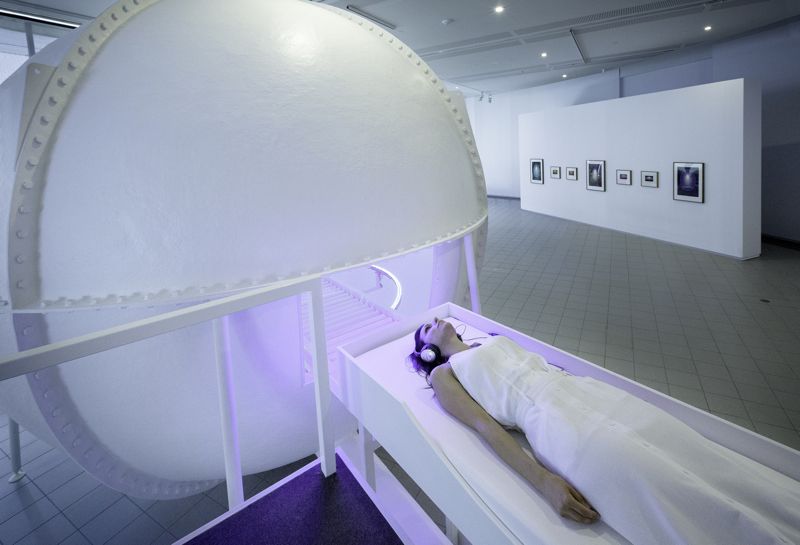
Since 'Within Without' was opened the gallery have been in discussion with Turrell about a retrospective and finally it has come to pass. Running until June 2015 the new exhibition includes a large number of works that vary from individual projections to whole room experiences. For some the real highlight will be the Perpetual Cell - a nuclear reactor style sphere where visitors experience a sequence of strobing lighting effects to a subtle soundscape.
Lasting almost 12 minutes the sequence has been created specifically for the NGA show. Pulsating LED lights flick between colours whose intensity and speed of strobing is constantly varying. One visitor at a time is able to experience the work, entering by lying on a trolley bed that is pushed into the sphere - much like a patient into a MRI scanner. Whether it's the total darkness initially experienced, the lengthy waiver your are required to sign before entering the sphere, or the group of women in white lab coats holding clipboards that mill around as you enter, there is a certain unavoidable feeling of apprehension as you disappear inside. I forgot to say that you are also given a panic button - just in case you find the whole experience too difficult to cope with.......and this probably tips the scales from curious excitement to just a little bit of real fear.........The rest you will have to experience for yourself as any attempt to describe the experience is doomed to failure. All I can say is that it appears to last just a few short minutes and leaves most people elated but slightly disoriented. There is no sense of time or space inside the sphere. Many people compare the experience to a lengthy meditation session while others find it quite intense - almost painful. According to Turrell, who has been experimenting with this concept for the best part of 50 years, everyone is effected by the light in the same way, it's just that that each individual's brain processes the information in a different way. If you add the fact that each person will describe what they 'saw' in their own unique way, it quickly becomes evident that no two experiences are likely to ever align.
Not every work is quite so involved as Perpetual Cell. For the most part the pieces simply require patience with the gallery staff advising that each work should be contemplated for at least five minutes. This gives the retina time to adjust to the light levels and begin to impose some interesting perceptual qualities back onto the work. In Raemar pink white (shown above) for example, the central rectangle changes colour over time moving from it's original fluorescent pink to a soft beige colour. Edges blur and panels seem to pulsate.......Wandering out of this room and into another also has a visible effect, as the afterglow of the intense pink turns everything green for a few minutes.
After green is quite a different experience altogether. You are requested to follow a line of white tape stuck to the walls of a hall that takes you through a series of right angle turns into an extremely dark internal space. Here the artwork glows at one end of the dark room expressing perspective and depth using a number of different light sources - LED, fluorescent and fibre-optic. The sense of disorientation in the near total darkness is acute but the mesmeric attraction of the neon-style light through what seems like a shopfront window of gauze holds your attention and allows you to witness a number of subtle changes. New colours appear on the edges, while certain colours intensify and others receed. The feeling of being trapped inside a computer game is hard to avoid.
Virtually squared (shown above) is a new work in Turrell's Ganzfeld series. These site specific works explore the Ganzfeld concept pioneered in the 1930's that suggests sensory deprivation can lead to enhanced extrasensory perception. The effect was first described by arctic explorers as they dealt with snow conditions that didn't allow them to see a horizon line and everything appeared to be shadowless and white. In the hands of Turrell, this 'whiteout' effect is layered with coloured light that goes through a specific cycle to create a variety of weird sensations. At times the experience becomes so intense that you feel you might be engulfed by a colour while at other times it's seductively soft or clean and sharp. At 8m high, 19m wide and 14m deep, it is a totally immersive experience.
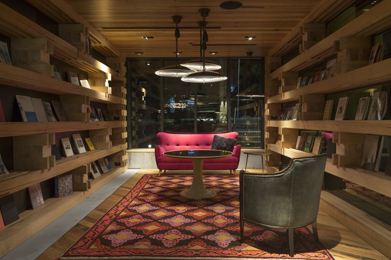
While it's hard to follow the James Turrell experience I cant ignore that part of the reason I was in Canberra was to take a look at the new Monster dining room and salon within Hotel Hotel. Alas, I can't actually show you much of this exciting new space just yet as the official photographs are yet to be shot. Due to the complexity of the folded timber ceiling and the special solid slab terrazzo floor, the room was only completed a few hours before the press arrived. The hotel's management wants to wait for some small finishing touches to be applied before it is publicised so apart from the odd instagram post by the various journalists who attended you will just have to wait to a future post. Robbed of any new images I have decided to provide a reminder of what the hotel is like in general terms and describe the concept behind the new room.
The new Monster dining room and salon adjoins the main restaurant and bar, divided by a massive pivoting wall of raw steel and glass. Designed to provide a very different experience to the existing highly communal space, the new area is cosier with a much lower timber ceiling and an extraordinary terrazzo floor. While the main restaurant area is full of specially commissioned furniture by Adam Goodrum, the new dining room and salon is totally vintage. Based around the concept of the particular style brought to Australia by the numerous migrant groups that arrived during the 50's and 60's - Italians, Greeks, Germans, Yugoslavs, Lebanese and Maltese, the room is filled with items with a largely modernist slant but of a uniquely new Australian variety. Low boomerang shaped sofas with splayed legs and generic Gio Ponti inspired chairs have been reupholstered in quality leathers or plush fabrics in unusual colours.
Joined by extraordinary salon furniture in wrought iron coated in lashings of old paint and surrounded by cork wallpaper shot with gold leaf, the room takes on a rich eclectic feel. Delicate old metal screens in white divide the large room into its two functions - dining and lounging - but they are so fine that the space will effectively remain as one gloriously mad interior. Don Cameron who was responsible for the rest of the hotel's interiors is again at work showing his deft ability to bring kitsch and cool together in an exciting way. Many of the interior items were sourced through vintage collector Ken Neale with each piece having a rich history - French wrought iron chairs brought to Australia from Egypt or hair salon chairs saved from a builder's skip to be reupholstered for the dining room. We are a multicultural nation at heart and the interior of Hotel Hotel's new Monster dining room and salon revels in this notion.
If you are intending to travel to Canberra for the James Turrell Retrospective at the NGA you would be crazy not to book into Hotel Hotel and make the whole experience one to remember.
For an in-depth look at the art of James Turrell click here
For an article on the history behind James Turrell's Ganzfeld experiments click here


