Winning might not be everything but it's a pretty good feeling most of the time. Minale Maeda are a Rotterdam based design studio founded in 2006 by Kuniko Maeda and Mario Minale. Maeda is a graduate of Science of Design from Mushashino Art University in Tokyo while Minale, despite being born in Naples, grew up in Germany and graduated in Industrial Design from the University of Wuppertal there. Both went on to complete Master Degrees at Design Academy Eindhoven, where they met. Like most young studios, winning an important design competition can make a significant impact on how their work is perceived by the press, potential manufacturers, galleries and institutions, so it would be safe to say that the studio would have been pretty pleased last week, when they were announced as the Grand Prize winners of the Biennale Interieur Award 2014 - a prestigious Belgian design competition with a 2500 euro cash prize.
The duo set up their studio in Rotterdam as a “fertile common ground” between their two native cultures. One of the studio's main interests is bridging mass-production and the skills of craftspeople. They have worked with Dutch company, Droog on a number of projects and the Italian brand Skitsch but have yet to design much in the way of regular production pieces, chosing instead to continue to explore their ideas around exterior / interior interchangeability and concepts of skin and structure. Over the years they have shown their work in a large number of galleries including Droog in Amsterdam and New York and ToolsGalerie in Paris. The studio, which is supported by Funds BKVB and the Mondriaan Foundation, have also exhibited at numerous international fairs including Design Miami/Basel, FIAC and Milan.
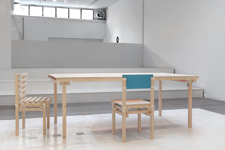
The winning project, the 'Keystones' table, was chosen from 240 entries from 32 countries by an international panel of judges made up of Rolf Hay, (the founder of Hay, Denmark), Lina Kanafani (The founder of Mint in London), Robert Klanten (co-founder of Gestalten Verlag - well known German media and publishingcompany) and Matylda Krzykowski (Polish curator, designer and scenographer based in the Netherlands). The judges outlined the design’s clever use of digital printing as an important factor in its win. According to Hay, “For the first time for me as a manufacturer, digital printing makes sense in a product context… It (Keystones) binds together everything in an intelligent and clever way”.
The ‘Keystones’ system is based on the concept of linking timber and 3D printed components together to form an easy to assemble range of basic furniture items that can be flat packed and shipped cost effectively or for that matter sourced from the end users local 3D printing company and nearest timber supplier. The project has been in the making for several years with various prototypes being shown since 2012 but it has now evolved to a point where the 3D component is a very delicate looking web structure.
The real beauty of ‘Keystones’ is that the 3D printing component has come about to solve an essential problem - not just because 3D printing has become a popular catch phrase. Most timber products require joints to connect one timber to the next but this requires expert ability and machinery and therefore adds considerably to the final cost. Traditionally timber joints are glued together which of course means that a table would have to be shipped in it’s fully assembled form - generally taking up around 2 cubic metres or more. Brands like Ikea developed their flat-pack furniture model precisely to avoid this problem but not everyone is happy with DIY assembly - nor the quality of the materials used to keep the prices to a minimum. With ‘Keystones’ the timber is solid and the 3D joint provides strength and an intriguing visual detail to the design. The collection now includes just a table and coat stand but other products will be developed over time.
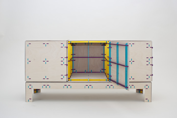
Several earlier Minale Maeda projects have also focused on this concept of small rapid prototyped parts that link standard materials to form an imaginative and functional final object. The studio’s ‘Inside Out Furniture’ – a collection of two cabinets, a table, chair and sofa, were developed in 2011 and shown by Droog during Milan Design Week. The concept promoted the internal structure to a position of importance, featuring as it did on the exterior of each piece.
They involved small 3D printed clips that joined flat sheets of plywood to solid square sections of birch. The designs could be downloaded from the internet for a small fee and the plastic clip parts sent from the printing company direct to the end user who could have the sheets of plywood cut to size locally at very little cost. The designs required only basic skills and while utilitarian have a functional beauty. Given a striking colour on the interior, the construction method became the external feature while the interior was the decoration.
In a similar vein the studio developed ‘Wrong Colour’ in 2013, a collection of storage cabinets that used flat panels fixed to a frame with brightly coloured anodized aluminium connectors. The resulting patterns in the timber from the aluminium was pleasingly decorative and the entire system a beautiful, lightweight and rigid solution.
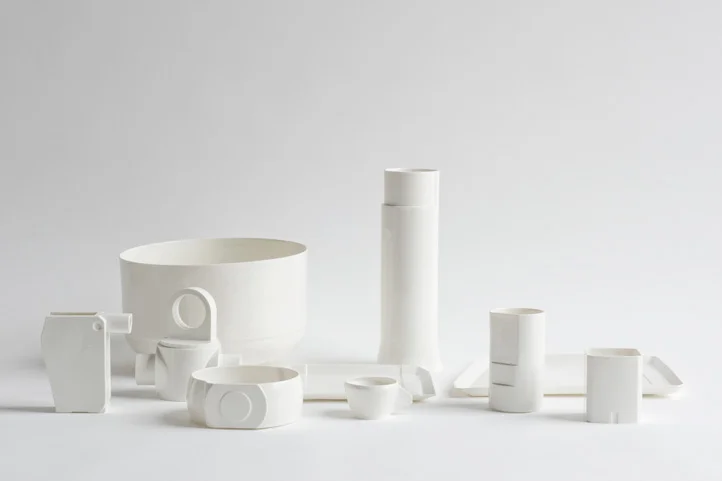
The studio’s work in porcelain is an interesting deviation from their normal material base but has a strong geometric quality. While shaped like industrial parts the vessels have a softness imbued in them by the material and the finishes. The set consists of a small plate, large plate, three sizes of cup, two bowls, a carafe and jug. A variety of finishes were explored from plain matt bisque fired porcelain and a clear transparent glaze to complex graduating colours and metallic lusters.
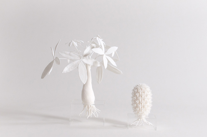
Their ‘Virtual Florist’ collection from 2011 is another foray into the rapid prototyping world. In this project the studio reversed the defining qualities of flowers - creating exact replicas of popular varieties in polyamide. Colour, season and location are irrelevant and the objects take on their own meaning.
The delicate beauty of 'Virtual Florist' has a very different aesthetic to some of the studio's early work which involved lego pieces.......and lots of them! In 2007 the studio produced two designs that were clad in lego - one a recreation of Rietveld's classic 'Red & Blue' chair - the other a complex cabinet. Working around an aluminium frame, the designs are actually structurally sound, although no doubt a little delicate. The 'Red & Blue Lego chair' was a limited edition piece of 5, + 2 artist proofs, sold through Droog in 2007.
Seeing their work over a number of years, and having just spoken to them at Palazzo Clerici during this year's Milan Design Week, it was exciting to hear that Minale Maeda had won the Grand Prize in the Biennale Interieur Awards. Their quietly challenging work is always wonderfully executed and strangely alluring despite being quite utilitarian.
The marriage of Japanese and Italian ideas within a Dutch environment seems to be working exceptionally well.
For more on this interesting Dutch based design studio, check out their website. For more on the Biennale Interieur Award 2014 and a chance to look at the work of the other winners, click here.


