To say that the Milan fair is enormous is something of an understatement. At Salone del Mobile, the trade fair element of Milan Design Week held at Rho on the outskirts of the city, they receive around 300,000 visitors each year over a 6 day period. The week as a whole is bigger than Milan Fashion Week and constitutes a major earner for the city's hotels, restaurants, clothing stores, cafes and taxi drivers. Known as fuorisalone, the events that take place outside of the fair at Rho are probably the highlight of most people's design week experience because they offer an opportunity to see many of the same items with smaller crowds and in settings that are more exotic - exceptional ancient churches and palazzos on the one hand and mechanic's garages and warehouses on the other.
Fuorisalone is also where most of the exciting installations and group exhibitions take place. In this second installment of the Milan 2016 round up, D.d offers some highlights from Salone Satellite (the young designers platform at the fair), Masterly, the expansive Dutch show within Palazzo Turati and the pick of new products from a host of other locations across the city including Ladies & Gentleman in the 5vie district and a couple of extras from Ventura Lambrate and Tortona.
This year Vitra, who regularly present one of the most impressive and beautifully styled stands at the fair, decided to reduce their presence there a little while creating CasaVitra in an area of the city made famous by the fashion precinct 10 Corso Como. Curated by Hella Jongerius the brand's creative director of colour, textiles and surfaces, the multi-storey event consisted of an installation on the colour wheel principle at ground level, a manicurist / nail bar on another (in Vitra selected colours of course) and an opulent display of beautifully styled Vitra products on the top floor.
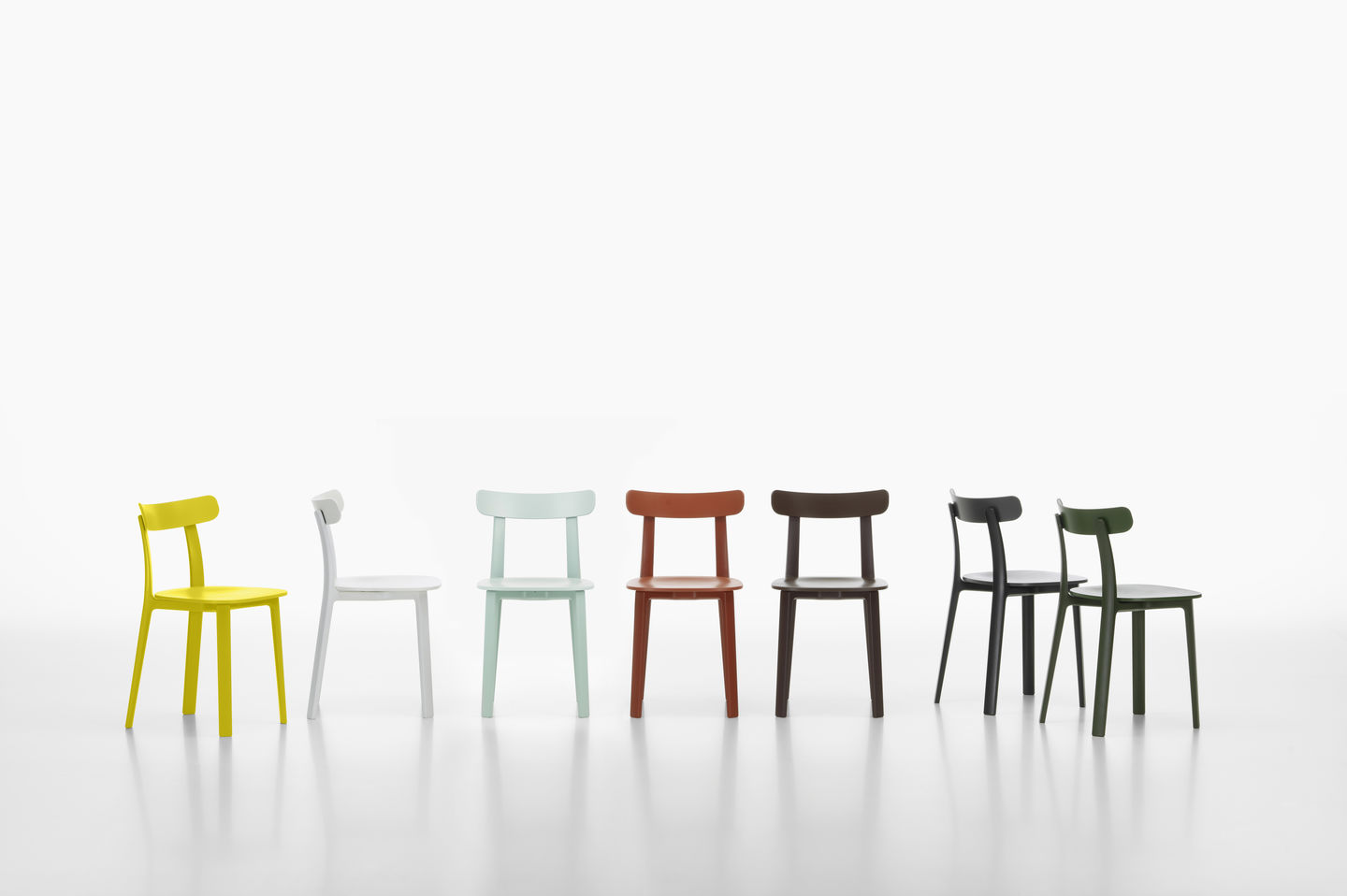
At the fairgrounds at Rho it was the new Jasper Morrison 'A.P.C'. (all plastic) chair that was creating all the excitement. As usual it was stunningly simple but meticulously conceived. Morrison also released a new timber chair for Japanese brand Maruni and a large outdoor collection for Spanish brand Kettal.
When the Dutch decide to do something it is invariably done impeccably. So it was for Masterly the mega exhibition of Dutch design and craft at Palazzo Turatti in via Meravigli. Normally used by the Milan Chamber Of Commerce, the 1500 sq metre building was home for the week to 125 Dutch artists, craftspeople, designers and brands. The exhibition, curated by Nicole Uniquole was intended to show the full depth of Dutch artistic talent from photography through glass, porcelain, textiles and product design. For full links to all the artists go to the Masterly website here.
Outside of the big palazzo exhibitions hundreds of showrooms and shop windows around the city are transformed for Milan Design Week. While this habit has sadly been on the wain over the last 5 or 6 years, there are always plenty of exciting things to witness in the showrooms of the bigger companies who put vast amounts of time and money into redoing their spaces for this international event.
Taking the theme of gold to another level, the new Golran flagship store in via Pontaccio in the Brera district was completely painted gold in an installation by Storage Studio. The luxury rug brand exhibited a new collection by Dimore Studio along side their previous collections by Bertjan Pot, Inga Sempé and Raw Edges.
In complete contrast to the golden tones of Golran, the Dutch brand Lensvelt, who work a lot in the contract furniture market, created an installation promoted as the Boring Collection. In a giant warehouse in Lambrate the company's office pieces were all displayed in the one monotonous shade of grey with a huge stack of paper sheets printed with the Boring Collection doctrine discussing boredom in the workplace. Visitors were encouraged to 'play' in the space and after just a few hours mounds of paper 'toss' balls emerged deep enough to lie in. You can watch a funny little video on the project by Dutch visual artists Lernert and Sander here.
Boring won the Milano Design Award for best installation, trumping the Tom Dixon / Caesarstone extravaganza and Nike's conceptual exploration of movement. It's another feather in the cap for a brand that in 2012 exhibited a collection called WW III where everything was painted and upholstered in Yves Klein Blue and placed around an enormous artillery cannon - in the same wonderful shade of blue.
While it has to be said that the majority of new products launched at this years Milan fair were a little on the conservative side, there was of course more than enough designs of quality and interest to keep all but the most demanding design lover happy. At the fairgrounds Zanotta's stand proved to be a highlight in terms of styling while Magis surprised everyone with their new collections by Konstantin Grcic and Jerszy Seymour which displayed a hard edged industrial aesthetic (you can see these later in this post).
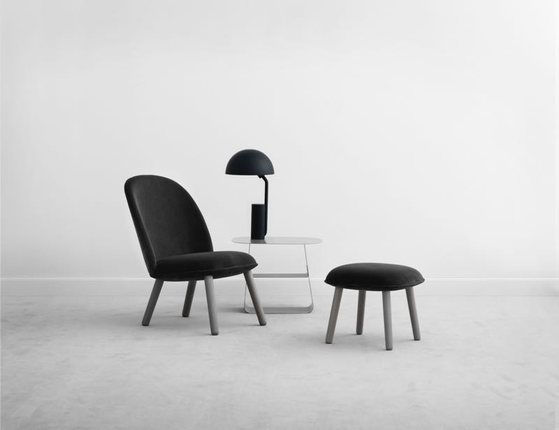
Sometimes however it is just the reduction of a brand's direction to one core product and at Normann Copenhagen after years of promoting an ever-growing collection of products they were able to promote the hell out of just one - the 'Ace' chair by Hans Horneman - a simple but intelligent concept for a flat-pack lounge chair.
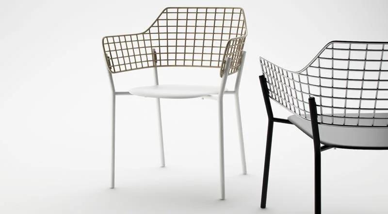
As much as I like wooden outdoor furniture there is something so wonderfully light and delicate about the metal counterpart. Italian outdoor specialist EMU released a smart new design called 'Lyze' that borrows heavily from the 50's but has it own language.
Brass continued to be the metal of choice at this year's fair but a number of labels also experimented with real gold plate. Knoll launched the 18 karat gold version of the classic Bertoia 'Diamond' chair and also offered the full Warren Platner range in this decadent finish.
Another design that I'm still coming to terms with is Patricia Urquiola's 'Gender' chair for Cassina. Obviously influenced by the work of Vico Magistretti, 'Gender's contrasting colour scheme and oversized proportions feel a little clumsy but retain the strong personality that we all associate with the designs of Patricia Urquiola.
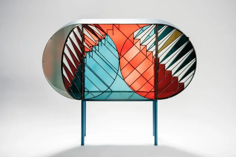
In addition to her work for Cassina as both Creative Director and celebrity designer, Urquiola produced a small and unusual collection for Spazio Pontaccio that used lead-light windows as a guiding influence. The 'Credenza' collection was designed with Milanese artist Federico Pepe and consists of several cabinets in painted metal and coloured glass, along with a room divider / screen.
The pair also designed a rug as part of the collection which was manufactured by quality rug brand, cc-tapis. Beyond this collaboration, Urquiola had designed a new rug collection for the cc-tapis brand called 'Visioni' which plays with the perception of 3-D space and comes in couple of different configurations and colour combinations.
The Arita project was launched at Rossana Orlandi at last year's Milan fair by Stefan Scholten of Scholten & Baijings. Since then the project has connected 16 selected designers from around the globe with traditional porcelain workshops from the city of Arita, Japan. Devised to reinvigorate the 400 year old porcelain making industry found in this city, the outcomes were shown in the Brera district of central Milan.
With work by designers such as Studio Weiki Somers, Stefan Diez, Pauline Deltour and BIG-GAME, the 2016Arita collection was an exciting mix of styles presented in a suitably minimal way on simple metal shelving. For anyone remotely interested in ceramics, the colours and forms were breathtakingly beautiful.
To coincide with the completion of the project Phaidon have released Arita / Table of Contents a book that documents the entire process - beautifully captured by Dutch photographer Anneke Hymmen. D.d will run a full post on the project in the coming weeks but if you cant wait that long check out the 2016Arita website here for interviews with the designers and makers along with other insights into the project.
Another meditative installation / exhibition with a strong Japanese flavour was created by Italian designers Formafantasma for Lexus in Tortona. Rather than designing an awe-inspiring light show in which to promote the brand and a new concept car (which is often the way it's done during Milan Design Week) Formafantasma applied their sensitive and culturally rich approach to design with a modern interpretation of a Japanese tea house called An Encounter with Anticipation. Inside Lexus offered tea and presented ridiculously beautiful food by renown Milan based Japanese chef, Yoji Tokuyoshi, along with some beautifully simple but also technologically challenging ideas around movement.
Formafantasma's mesmerizing kinetic sculptures in the main space with a glossy pale pink floor were powered by hydrogen with the only bi-product being a small amount of water. In another room the audience were presented with a new Lexus concept car depicted through dyed cords that moved from a bizarre tangle in the bottom of an industrial metal frame to a hazy indigo interpretation of the new vehicle - before collapsing into a heap again. D.d will be running a extended post on the installation and the finalists of the Lexus design competition next week.
As mentioned in D.d's Milan round up Part One, Konstantin Gric launched a range of tables for Cassina called 'Props' in unadorned folded sheet steel. Grcic was also in an industrial mood when he designed new work for Magis, creating a collection of tables called 'Brut' with heavy cast iron bases and an emphasis on mechanical fittings.
A strong general trend, the industrial influences extended to another Magis release the 'Happy Endings' collection of tables and stools by Jerszy Seymour. The splattered paint finish is similar to that found on camping and cooking products made in the USA in the late 19th century and more recently in Poland.
Within the bustling halls of Salone del Mobile at Rho Fiera, it's sometimes nice to take yourself out of the commercial world of furniture brands and spend some time with young designers who are just starting their careers. Showing products that are generally not yet available and quite often still in the process of ironing out potential manufacturing problems the designers. For me it's a chance to see what the next generation of designers are thinking about and how they are reinventing furniture, lighting and home accessories.
Since their 'Tafelstukken' lamps released by Cappellini a few years ago, I have been following the work of Daphna Laurens (Daphna Isaacs Burggraaf and Laurens Manders), an Eindhoven based design studio. Their work has a unique point of view and this year their collection of black pieces against a rose pink background stood out a mile.
A group of German designers showing under the name of Halle Berlin (Anna Badur, Anna Weber, Proof of Guilt and Antje Pesel) also impressed at Salone Satellite.
Dimore Studio is like a honey pot for stylists during Milan Design Week. Each year the duo's apartment showroom is mobbed by thousands of visitors trying to get an insight to Dimore Studio's new look. This year was very dark but rich and textured as can be seen by the image below. There was a big emphasis on fabrics depicting natural scenes and on giant stalactite style chandeliers. Te overall look was simpler than usual but very powerful.
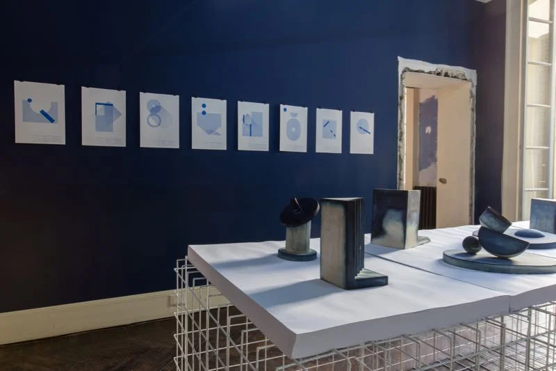
5vie is a fairly recent addition to the Milan Design Week itinerary but has quickly become a 'must-see' for any design enthusiast. This year one of the stand-out events was Ladies & Gentleman, held in a formerly grand but now dilapidated Milanese mansion. As a die-hard fan of Studiopepe I was there to see their new exhibition called 'Out of the Blue' where the Milanese duo explored the dying of plaster objects with a cyan solution that reacted with exposure to light. The result was quite magical and deeply sculptural. For more on this beautiful project go to Studiopepe's website here.
Studiopepe also released a collection of rugs for cc-tapis called Quadro Celeste.
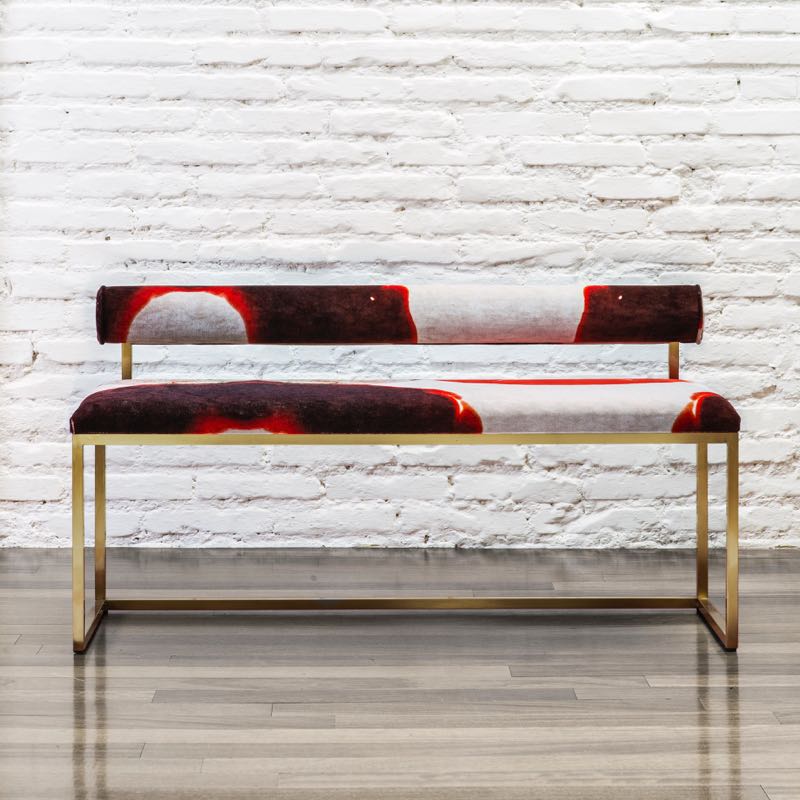
The Ladies & Gentleman event also hosted work from Rome based design gallery Secondome by designer Giorgia Zanellato and visual artist Coralla Maiuri. The result of the collaboration is a collection of brass furniture pieces with specially dyed velvet fabric that combines a rigid geometric framework with expressive upholstery,
Always a favourite, Antonio Marras did not disappoint adding a restaurant to the beautiful courtyard of his Tortona fashion showroom for the duration of Milan Design Week. In the subterranean section of the space, Marras also created an installation Terra Cotta Labirinti e Fili for Elgin ceramics using kilometres of string and giant terracotta vessels around a water feature formed from old vessels.
Somehow the Antonio Marras installation needed to be followed by this interesting daybed called 'Triclinium' by Front for Moroso. It must be something to do with the similarity between the ribs and shapes of the terracotta vessels and the daybeds odd shaped cushions......
There is a strange connection between the terracotta vessels shown below and the overside vessels from Elgin. I have a fascination with massed vessels and turned shapes and in a way the work of Vittorio Venezia and Carolina Martinelli connects not only in materiality but also in honest functionality with the Antonio Marras installation.
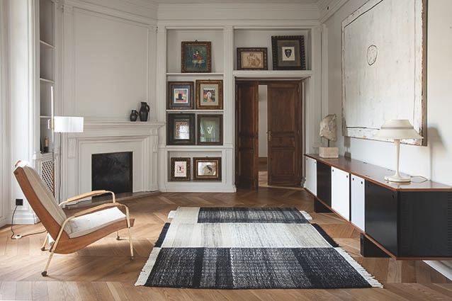
There are certain rug companies that constantly impress - cc tapis and Nodus are two Italian examples that spring to mind but Nanimarquina and GAN from Spain are two more. After several wonderful collections designed by the Bouroullecs, Nanimarquina have also collaborated wit hNeri & Hu and delivered a beautiful in-house design called 'Tres' shown below. It's definitely on my long list of current favourite rugs.
I'm not generally a big fan of Italian label Baxter's multi-layered approach. There's often just too much going on for me to feel comfortable with it. However there is no denying that in recent years they have delivered some really interesting products. This year's two standouts were those shown below: the woven cane shelving system by Pietro Russo (whose work I adore) and the deco-inspired grandeur of the 'Wireframe' cabinet by Draga & Aurel. The cabinet also comes in a low credenza style with the same complex interplay of veneers and facetted faces.
Despite the length of this post D.d has only touched on the enormous variety of interesting design that was found in the course of Milan Design Week. Creating a Milan round up Part 3 would probably have tried the patience of some of the D.d readership but keep an eye out for in-depth posts on some Milan related events and brands over the coming weeks.


