With September drawing to a close so too does the London Design Festival or LDF as it is more commonly known. With an ever-growing number of events being held in various parts of the city, the festival was starting to hot up on the 20th and ran through to the 25th. 2016 featured the inaugural London Design Biennale held at Somerset House in central London where 37 countries were represented by just one designer or studio.
Australia's entry in the Biennale was Tasmanian born Brodie Neill, who showed a spectacular table made from plastic sea debris. Representing the UK Barber Osgerby presented the giant sculpture called Forecast, shown above, in the cavernous forecourt of Somerset House. As an event it was a hugely rewarding mix of installations and highly creative products that re-enforced the inventiveness of contemporary design and the growing awareness of its importance in modern life.
With events happening right across the capital from design junction setting up across a massive site behind Kings Cross St Pancras to the north and the South East Makers Club in.... well......the south east (think New Cross, Lewisham and Camberwell) the days when 100% Design started in 1995 as a bunch of marquees on the Kings Road are well and truly gone.
As has been the case in recent years the Victoria & Albert Museum was a central hub and hive of activity with large scale installations by Benjamin Hubert's Layer studio, UK / Dutch duo Glithero and Mathieu Lehanneur keeping the crowds excited. The building is so well suited to this type of exercise with a huge central void and numerous ballroom sized rooms allowing designers to produce ideas across any scale.
Glithero, In partnership with luxury watchmaker Panerai created The Green Room, an installation named after the surfing term for being inside a tube. The work is a kinetic piece based on a form of clock with a 3.2 metre diameter circle of 160 silicon cords dropping six floors through the central atrium of the V&A. The cords move up and down in a parabolic wave motion that reflects the passing of time. Viewed from the ground floor the cords are just above head height and continue all the way to the top level of the building where the workings of the installation can be observed.
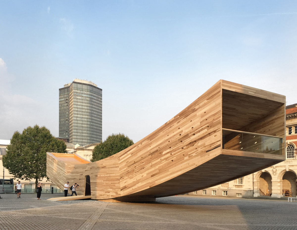
Nearby at the Chelsea College of Art, UK architect Alison Brooks collaborated with the American Hardwood Export Council to create a giant viewing platform (34 metres long!) from hundreds of beams of cross-laminated Tulipwood. The project was given the name of The Smile due to its floating curved structure.
The temporary structure was built in modules by CLT pioneers Zublin-Timber in Germany with the technical expertise of engineers from Arup. The largest pieces were 14 metres long and required special midnight to dawn transportation arrangements.
Installed over nearly two weeks in early September, the all-timber structure is a ground breaking exercise to test the possibilities of creating challenging buildings without the use of concrete or steel.
A little like being in the runner of a giant rocking horse, the walls of the pavilion are punctuated with dozens of small oval windows that allow light to penetrate and offer controlled views of the surrounding 18th and 19th century architecture.
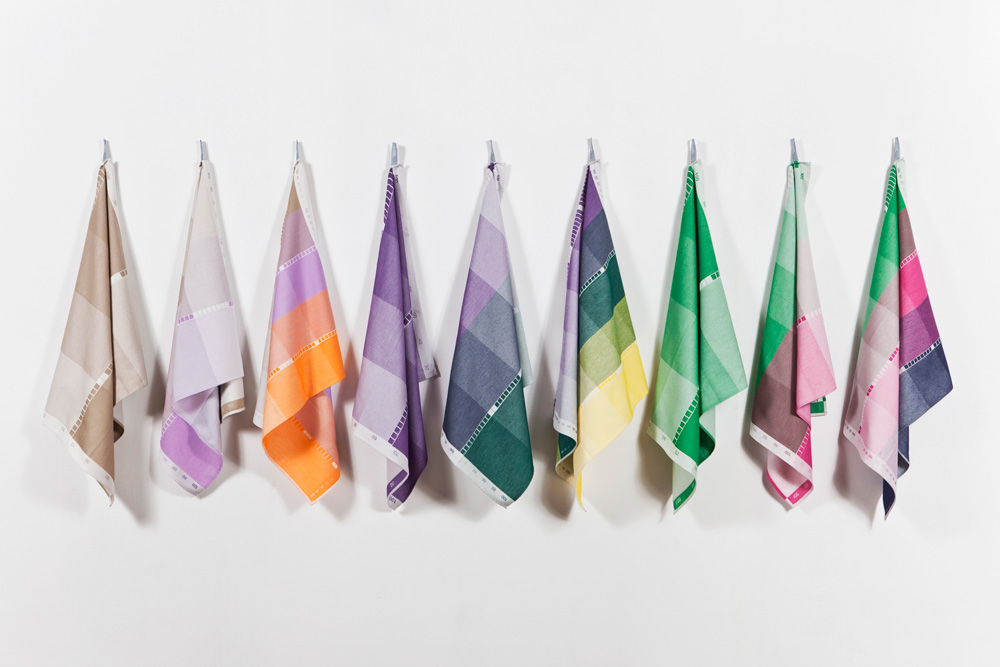
The Dutch seem to have something of an obsession with colour and as a consequence as designers they seem extremely good at controlling it and using it to define ideas. Raw Colour (Christoph Brach and Daniera ter Haar) is a design studio based in Eindhoven that works across photography, graphic and installation design. During London Design Festival Aram Gallery in Covent Garden held a solo exhibition of their work entitled Blend where the duo showed projects in perforated metal, fabric and shredded paper and lots more addressing the theme of colour. You can watch a short film on the Fans installation here.
The exhibition supported by the Creative Industries Fund NL continues until October 29. You can watch a short film on the Chromatology installation here.
Bert & May are a tile company who design and make their own encaustic (poured cement) tiles in Yorkshire based on traditional methods carried out in Spain. A regular exhibitor at the London Design Festival, this year the brand collaborated with design retailer Darkroom on a new collection of tiles called Split Shift that take the form of rectangles triangles and semi-circles that can be combined in various ways to create numerous effects. The collection also includes fabrics and a new paint colour known as Darkroom Black.
Also working to inject newness into B&W was Polish designer Olga Bieslawska whose 'Veiled' marble tables made by Carrara Design Factory in Italy, take inspiration from delicate fabrics. The two tables (one round, one oval) were on show at an exhibition curated by London design gallery Matter of Stuff at the ME London Hotel during London Design Festival that presented the work of designers including Nina Cho, Tomas Libertiny and Studio Uufie, Tim Manlier and Alessandro Zambelli.
Electro craft was an exhibition of the work of 26 designers curated by Tord Boontje. The exhibition showed some thirty pieces that involved electronics as part of their concept rather than being an electronic product. The list of designers included some big names like Boontje himself along with Paul Cocksedge and FRONT plus some rising young stars such as Bethan Laura Wood and Marjan van Aubel.
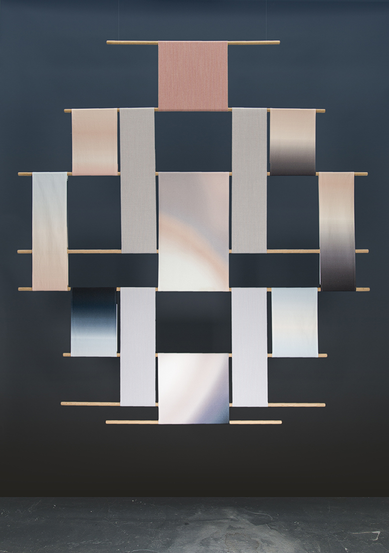
The objects were an intriguing mix of art pieces like Rive Roshan's 'Circadian tapestry and practical production items like Industrial Facility's 'Busby' USB charging station lamp (above) that is already in production with Swedish lighting company Wästberg. The lamp can also charge 3 seperate USB devices at once - including laptops. It can be fixed to the wall or integrated into the table surface in kitchens or in joinery cabinets (example on the right).
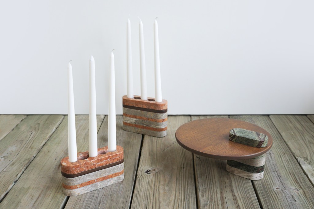
The work on show showed how electronics are crossing over into product categories that seem totally unrelated. Turkish designer Bilge Nur Saltik's 'Loud Objects' were a case in point. The stone candle holders and serving platters also act as bluetooth speakers for low level dinner music! Uk based Taiwanese designers, Poetic Lab, showed two items: unique 3-D printed memory sticks called Empty Memory and their Silo Clock - a sculptural wall clock that works with shadows and light. You can see all the designs displayed at the electro craft exhibition here.
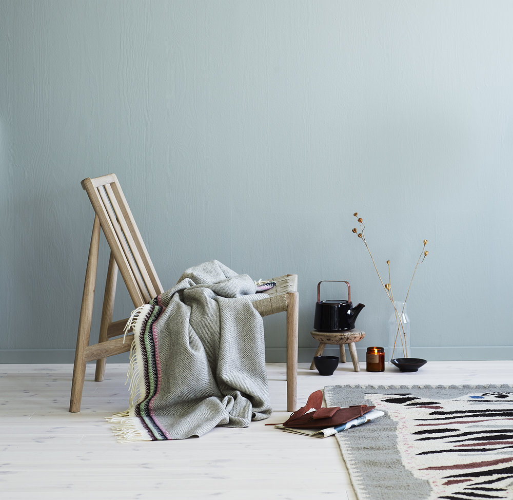
100% Norway is an exhibition that has been running each year as part of the London Design Festival since 2003. The exhibition is now also part of design fairs in Milan and Stockholm with each version of the exhibition being given a different treatment and showcasing different work. Because of it's ever evolving nature it is always a treat - even when you have already seen the show earlier in the year somewhere else. In London this year 3 products particularly took Design daily's fancy - the 'Rolla' planters by wood turner turned ceramic designer, Ann Kristin Einarsen, The 'Ida' chair by Andreas Engesvik and the timber lounge chair called Åkle by Anderssen & Voll.
More seating action was witnessed at the Trentino Collaborations exhibition with the drop-dead gorgeous 'Rondo' chair and sofa designed by Lucy Kurrein made in collaboration with Italian Alpine leather company Molinari. The design has all the overstuffed plumpness and softness one could ever want from an armchair or sofa and quite frankly looks good enough to eat. Kurrein was the designer behind the 'Teepee' sofa for British company SCP and the delightful 'Panel' lounge chair for Spanish brand Capdell.
At the complete opposite end of the spectrum is Max Lamb's 'Campione' chair also shown as part of the Trentino Collaborations show. Made from granite by the master craftsmen of Pedretti Graniti, the chair is a totemic masterpiece that demonstrates the type of skills that only come from multi-generations of artisans working in the same area. The design involves a host of stone techniques including 4-axis wire saw cutting, circular saw cutting, cnc milling, core drilling, edge profiling, feather and wedge splitting, chiselling, lettering, honing, polishing, sandblasting, flaming , cleaving and bush hammering. Phew!
Giles Miller Studio and Sebastian Cox also contributed to the Trentino Collaborations show with a freestanding screen in the Italian stone Porphyry and a wall mounted larch wood and wicker storage system respectively. You can take a look at all four exhibited designs here. The Trentino Collaborations exhibition was held at Tent London as part of its Super Brands event.
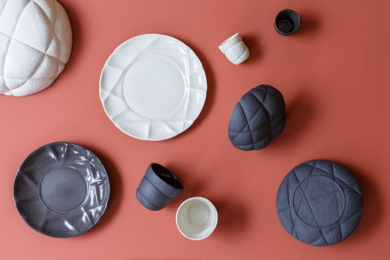
French brand Petit Friture launched their new products at Maison & Objet a few weeks ago but were showing the 'Cast' lamps designed by Studio Vit and the 'Succession' dinner service by Färg & Blanche for the first time in the UK during LDF. The lights follow Studio Vit's clear geometric language while the 'Succession' tableware is characterised by an irregular look created by casting from original pieces perhaps wrapped in something like a string. The effect adds instant character and makes each of the various vessels in the range different to the next.
Bethan Gray was approached by Iranian marquetry practitioner Mohamad Reza Shamsian to design a collection based on aspects found in Islamic architecture and culture. Her response was the Shamsian Collection which uses brass inlaid into cabinetry in a variety of shapes to create a richly patterned surface. The collection includes the 'Dhow' table whose inlaid top is based on a traditional sailing vessel of the same name and the 'Nizwa' cabinet shown below in turquoise stained timber with inlaid brass arches inspired by a fort in Oman.
Marc Péridis' 19 Greek st ran an exhibition called the Collectors club in collaboration with bo.lee gallery. Presented over the 5 floors of the narrow terrace in Soho, Collectors Club was full of the quiet sophistication of the traditional gentleman's club while actually looking nothing like any gentleman's club on the planet. Curated by Rachael Moloney, the exhibition combines the refinement of midcentury Scandinavian furniture, beautiful artworks by Wanda Bernardino with wonderful furniture by Anders Hammerstrand, Studio deFORM and others.
Pinch is that rare brand that manages to combine traditional craftsmanship with enough contemporary ideas to keep their furniture designs relevant and fresh. Their method is not about releasing new products by a variety of respected designers but is a quiet progression with newness coming in the form of an occasional new product or with a collaboration that takes the range in a slightly new direction. It was New York based design store Future Perfect that first showed Pinch how well the fabrics of Martyn Thompson Studio worked on Pinch designs. The synergy was immediately obvious and for this year's LDF Pinch showcased several of their seating designs covered in the painterly fabrics of the New York textile studio.
As usual Design daily has gone overboard with this post and while it hasn't touched on work from big shows such as design junction, Tent London and the British Craft Pavilion, it's time to give the reader a rest - at least until next week!


