Off the back of the Old Government House exhibition AT HOME that was the subject of last week's Design daily post, D.d has decided to feature the work of Fred Ganim whose 'Plane' table was such a feature of the show. Ganim is by his own admission an untrained designer but has years of experience creating objects, sculpture and scenery for the film and theme park industry. Perhaps this is a blessing in that Ganim very much follows his own path and pays little attention to what is happening in the furniture market at large. The only criteria he applies to his pieces is that they last and are beautiful. To this approach we say hurrah!
All photographs by Peter Tarasiuk unless indicated otherwise.
"I have always made things, working in the film and theme park industry as a sculptor and this gave me access to a wide range of materials and taught me a lot about form and process. Though a very informal training, this taught me the limitations and capabilities of a material, and how to problem solve to achieve the required end result. A lot of fun really".
Fred Ganim
After many years of toying with the idea of some formal training in cabinet making, six years ago Ganim enrolled in the Melbourne Guild of Fine Woodworking and studied under Alastair Boell. Since completing this he worked for several months for Melbourne furniture and lighting designers Pierre & Charlotte (who have recently moved their operation to Tasmania), and began working toward an exhibition of his commissioned and speculative work.
Ganim is based in Melbourne but is often in various parts of Australia and the Asia Pacific region working on films. In between jobs he finds the time to work on private commissions and personal ideas. It was through this slightly piecemeal approach that through the course of 2015 Ganim created enough pieces for a strong solo show. Held in August 2015 at the showroom of Criteria in Melbourne's Cremorne, the show revealed Ganim's obsession with solid timber and exposed joinery techniques. Joints are made evident and are designed to express the form more coherently. Rather than a collection per se, the exhibition was more of an expression of his arrival as a designer, with the work reflecting a range of different styles.
His most recent work is on display as part of the AT HOME exhibition at Old Government House Sydney and is called the 'Plane' table. A low display platform for books, objects or sculpture, the table expresses a plastic 60's feel in natural materials. The form is surprising and wonderful, snaking its way across an open area at the foot of the buildings simple but rather grand staircase.
"I have had the idea for a low lying continuous surface on which to display sculptures for quite a while. The 'Plane' table is really an extension of a couple of pieces I have made before like the 'U' table. When David Clark asked me to be submit something for the exhibition, I thought it was a fantastic opportunity to develop this idea, as it employs a lot of the same joinery techniques used in the amazing collection that has furnished the house for the past 150 years or so".
Fred Ganim
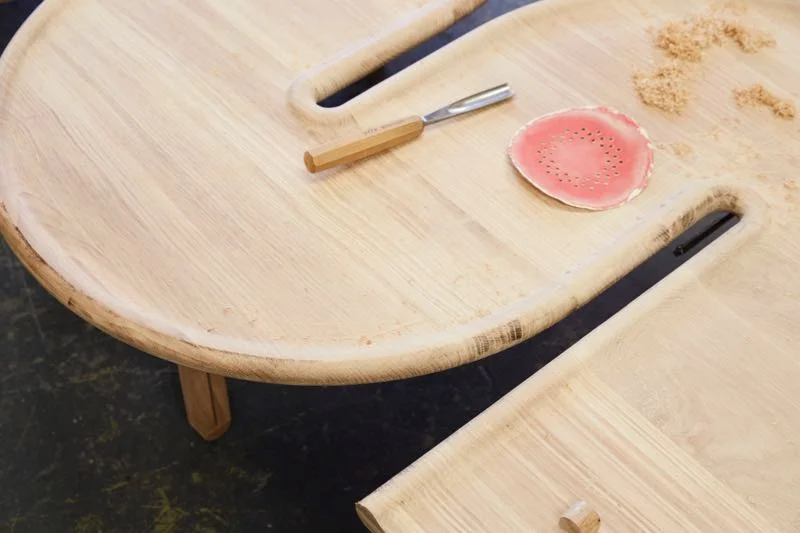
As if it wasn't evident already, Design daily can attest that Ganim has a special interest in the curve. He suggests that this is as much about its inherent tactile nature as its visual appeal. The process shots of the 'Plane' table, shown above, are testament to this. "I like the shapes of the Neo Classicists, the modernists and minimalists. Tight curves seem to work on furniture as they are very tactile, and when you see a shape or a curve that takes your eye you are naturally drawn to touch it", says Ganim. "The nice thing about furniture compared to say sculpture is that people have a different authority with furniture and feel they can engage with it. A sculpture is far more hands off",
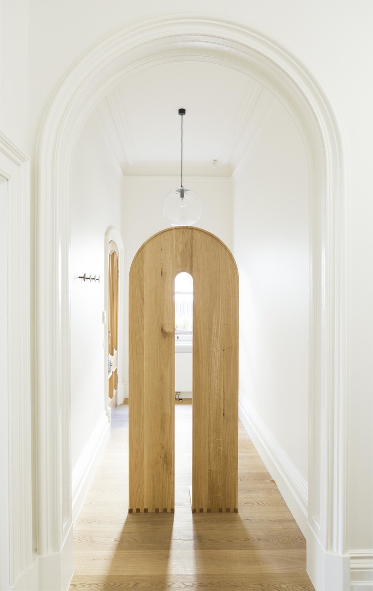
Among his private commissions Ganim has done several pieces for Melbourne jewellery designer Lucy Folk. These include a sunglasses stand and an intriguing display case both of which used turned rock maple bases. The jewellery stand (above) incorporates an expressive 'S' in white painted steel that acts as the support for the second display space but also as a playful stylistic device. Ganim's love of curves comes through once again and more specifically his interest in arches.
In the text that was written for his debut solo show at Criteria, Ganim talks in detail about his many influences. Some come out in specific objects while others are an underlying current in all of his work. “I think arches were running around my head,” says Ganim. He cites design influences as diverse as the plaster sculptures of Ricky Swallow and the 1973 repurposed cement factory project of Spanish architect, Ricardo Bofill. Describing his 'Maple Dining Table' he elaborates on the repeating arch motif, “The central slit is another double-ended arch…the rolled edge flowing to the legs.”
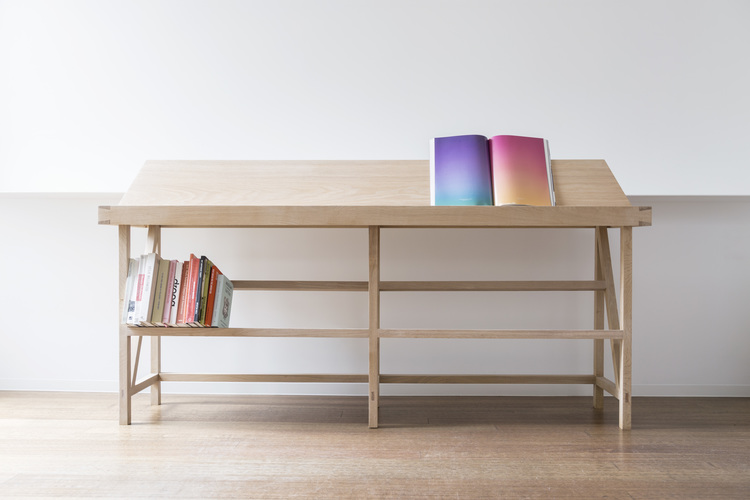
Early work such as the 'Book Stand' from 2013 and the 'Cabinet' from 2014 show a very different side of Ganim's work. With these designs straight lines take over and the strong grain of oak is visibly expressed. While these pieces lack Ganim's later curves the support structure of both items are typical of his work - open and graphic.
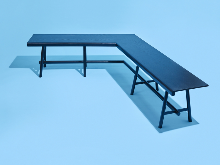
There are obvious similarities between the 'Kink' bench and Ganim's recent 'Plane' table for the AT HOME exhibition at Old Government House in Sydney. Both use black stain to reduce the visual impact of timber grain so that a uniform shape can be more readily achieved and both rely on somewhat precarious support structures that defy the conventional requirements of strength and in order to deliver objects of beauty. While the methods used to construct these support structures are completely different in the two designs, with the 'Plane' table utilising a 'S' shaped ribbon of timber to brace the legs while the 'Kink' bench uses turned timber dowels, the open unencumbered effect is the same in both.
It is interesting to note that Ganim's work moves across a variety of styles but remains uniquely his own by repeatedly referencing his favoured curves and arches. The 'Double Arch' table shown below has a strong Memphis feel with its imposing double pedestal base and reliance on bold geometric shapes but by creating the piece in rock maple Ganim has softened the look and created something more sculptural without the Memphis requirement for superficial decoration.
Ganim's 'Round' coffee table below also suggests past Italian masters - this time in a distinctly 70's mould - perhaps Vico Magistretti or Joe Columbo for their pioneering use of plastics or the stone designs of Angelo Mangiarotti. However once again it is the lack of decoration and the mono material palette that allows the form to be expressed above all else. “The restrictions are totally in the timber”, says Ganim. “But isn’t that the point? I’m not into fashioning follies but I do like the idea of transcending function with a bit of a game, then editing it all back.”
For more on the work of Fred Ganim you can go to his website here.
Certain products are available through Criteria Collection here.


