It's a rare event that Design daily posts an interior project but what inspired about this project was that it was small, created on a modest budget and has transformed a potentially dull contemporary apartment into something pretty special.
Situated in the picturesque city of Prague in the Czech Republic, the Hřebenky loft coverts a fairly standard contemporary apartment into something full of character with an eclectic mix of 50’s style and industrial materials. The project was realized by architect Dagmar Štěpánová, the founder of Formafatal, a Prague based architecture practice that works across architecture, design and scenography.
Photography by Jakub Skokan and Martin Tůma / BoysPlayNice.
Stripping out the standard finishes and rejecting the offered fittings was step one in the project. Adding in lean steel framed glass doors and sticking with an internal cladding materials in shades of grey – precast concrete panels and grey stained plywood – the completed interior bears no resemblance to the boring boxes that generally pass as modern apartments in Prague. “It’s so incomprehensible to me, says Dagmar Štěpánová, the project architect, “why most of the new blocks in the Czech republic are so tasteless”.
One of the major decisions was to remove all the plaster from the walls and ceilings of the kitchen area, replacing it with prefab concrete panels that add a heightened sense of industrial rawness. The floors were left as polished concrete while the internal joinery was all custom made to the architects specifications. Glass doors were constructed with minimal steel frames while a few that led to private areas were specified in contrasting solid timber finished in a glossy black lacquer.
While the apartment is fairly modest in size, over 40 furniture pieces were specified for the interior. In addition to CH 88 chairs by Hans Wegner, side and coffee tables from Mater and Diesel, along side the 'Counterbalance' wall light by Daniel Rybakken from Luceplan were chosen for the main lounge and dining space for their clean utilitarian qualities and fine graphic lines.
The project was totally controlled by the studio, with everything including the decorative objects, plants and cushions being specified by the architects. Drawing on past projects for fashion retailers, Štěpánová designed a entrance area clothes hanging wall from rebar (re-inforcecing steel used in concrete construction) at the center of which stands a slot together high-pressure laminate consol table in the shape of an ostrich by quirky French brand, Ibride.
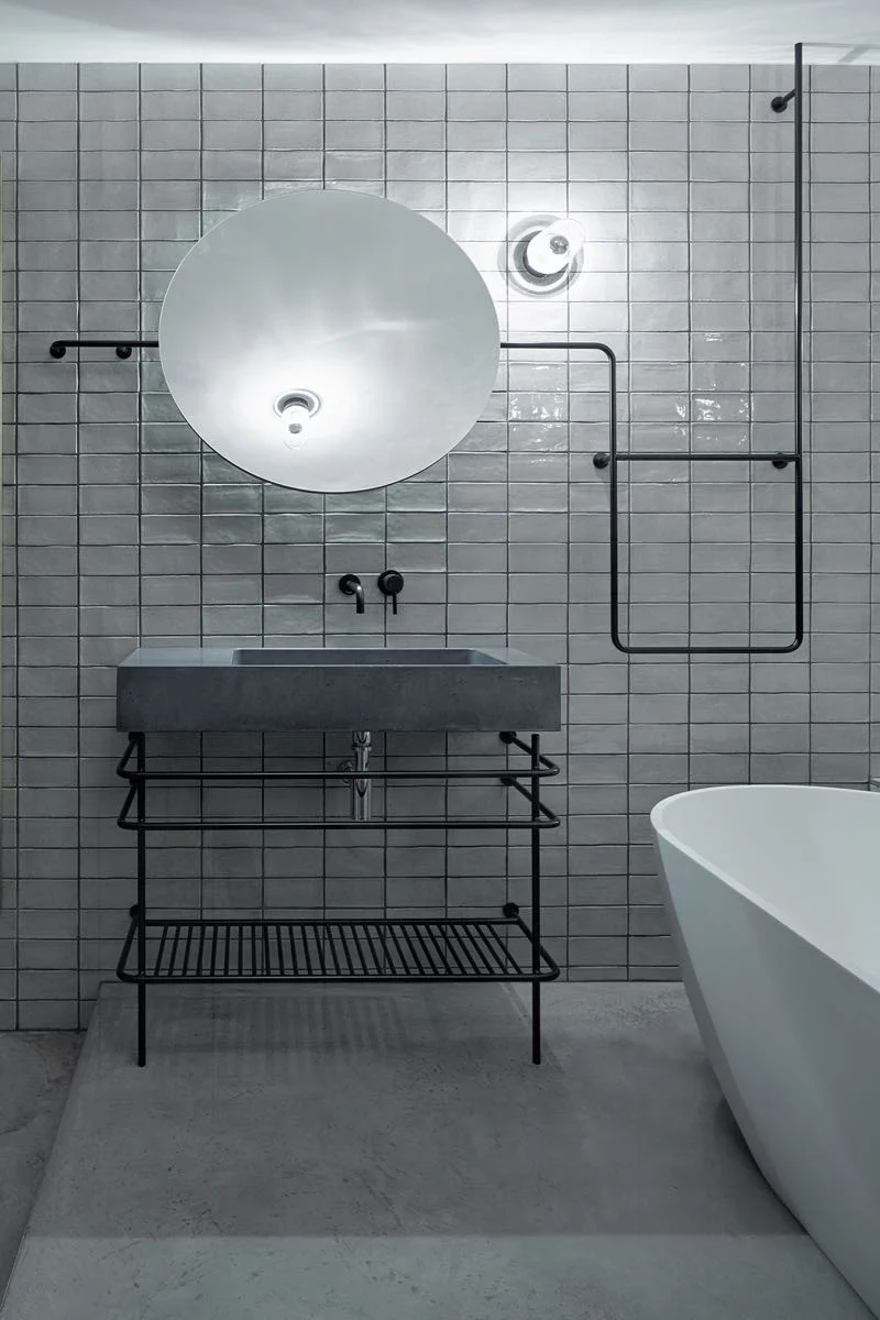
The bathroom continued the emphasis on continuous black lines with a background of handmade glossy white tiles. Simple and clean but also open and bright, the apartment's bathroom keeps well away from fitted cupboards and glass shower screens.
The rough industrial material rebar steel is used extensively through the project and it becomes the feature of the bedroom's vast integrated headboard. The asymmetrical positioning simply adds to its appeal. The visual language of bent steel rods is continued right through the space including the bathroom, where an open vanity and towel rails offer the same pared back industrial quality.
Sporting a mix of casual vintage style and local Czech design, the interior treads the tricky line line between cool and pretentious with aplomb. What perhaps makes the most obvious difference to the overall look of the apartment is the variety of wall treatments: diagonal wood panels as seen in the spare bedroom (below), a custom wall finish behind the bed (above) and the concrete panels utilised in the kitchen. Banishing the monotony of plasterboard immediately changes this apartment from cookie-cutter to an interesting creative space.
For more on the work of architecture studio Formafatal, go to their website here.


