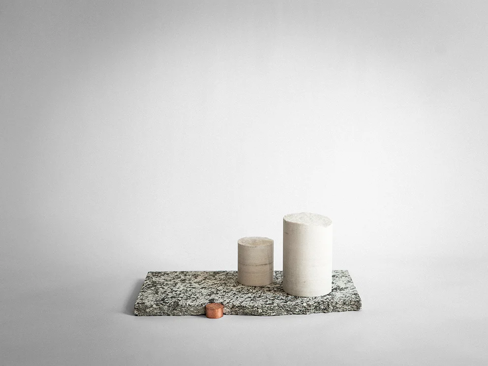
In a world of manufacturing precision and a general search for perfection, it is sometimes uplifting to come across the polar opposite. We often forget the natural beauty of a roughly hewn piece of wood or a block of stone that hasn't been worked into gravity-defying shapes but these fundamental materials left with the marks of tools speak to us in ways that I don't think many of us understand. It's a primitive instinctual attraction.
A few weeks ago while combing through the many buildings and exhibits in Ventura Lambrate, I found myself in a hall not associated with the Dutch group, Organisation in Design that curate Ventura Lambrate. Instead of young original ideas, the space was largely filled with examples of undistinguished contemporary design that reiterated ideas and shapes that I had seen many times before. About to leave, I stumbled upon the work of Cosma Frascina.
His raw objects have a strength and character that reminds us of the beauty of the hand-made and the utterly simple. Using materials that are available to him around his local area in southern Italy, he has fashioned a collection that defies an obvious connection to current contemporary design trends.
Hand forged chisels, platters made from found fragments of Roman terracotta pots and benches made from local limestone all feature. According to Frascina, it was the lack of tools when he returned to his hometown of Grottaglie (after studying design at ISIA in Florence) that resulted in a pleasant rediscovery of traditional artisanal techniques and natural materials.
Forging his own metal items and grinding their tips and blades into useful items such as knives and chisels, Frascina adds enough decoration in the form of rope handles to turn them from what might otherwise be seen as a scary tribal weapon into objects of raw beauty.
According to Frascina his local area of Apulia in the southern part of Italy between Naples and Brindisi, is full of broken fragments of Roman artefacts. Useless to archaeologists, Frascina stitches these small pieces of terracotta together to form a new extremely rough vessel using brass wire.
British designer Max Lamb’s Exercises in Seating exhibition was shown as part of 5VIE’s programme during Milan Design Week. It expresses his fascination with materials and the way man (and Max Lamb in particular) can manipulate them. While his circle of chairs were made from a huge range of materials from polystyrene to pine and cast bronze, they seemed to form a ring of ancient objects. People stopped rushing around and slowly considered each piece, occasionally getting up the courage to actually sit on them. To say it was a spiritual experience might be taking it too far but is was damn close.
The items were ordered roughly chronologically, starting with his first pieces created while studying at London's Royal College of Art (RCA), through to pieces designed specifically for the show. Lamb described his basic approach this way in a recent interview with online design magazine, Core 77:
”I am curious to understand the material landscape and see what's around me and think - 'Could I use this? How could I use this.' Whenever I have a question I have to try and find an answer”. Max Lamb
The full interview is available here.
Some of the credit for this highly acclaimed and beautiful installation must be given to Federica Sala, the curator of the exhibition. A lovely video on Lamb and his exhibition can be seen on the Nowness website here
I have been a big fan of Studiopepe for many years - ever since first experiencing one of their amazing showroom transformations back in 2010. At the time I had no idea who Studiopepe were but I fell in love with what they did. I now know they are a duo from Milan, Arianna Lelli Mami and Chiara Di Pinto and that they are graduates from the Politecnico di Milano.
The pair have become famous in the design world for their styling and interiors work more than for the products they have designed.
This is rapidly changing however, as more brands see how Studiopepe effortlessly translate their art direction ideas into successful products. They now have a second collection with Ivano Raedelli several pieces with Spotti Edizione and an item with the Danish brand, Menu.
So it was with some excitement that I went along to their ‘Ossimori’ (Oxymoron in Italian) show at the vintage and contemporary design gallery, Fragile in via San Damiano, San Babila. The work was quite different than I had expected with none of the playful use of colour that is synonymous with their styling and interiors work.
Instead the exhibition was in a small room clad in plain rolls of paper with just nine or ten objects on display: a side table, a few lights, a mirror and several groupings of objects. All are predominantly made from stone and created using simple geometric forms as the central concept.
Silvana Annicchiarico, Director of Triennale Design Museum described the items as being like totems or votives with each one exhibiting its opposite side: Hard/soft. Fragile/solid. Regular/irregular. Discarded/recycled.
What appealed to me was the quiet but strong nature of the objects. Whether these are modern or for that matter primitive, is open to debate but they do have an extreme simplicity about them that like the other items and exhibitions mentioned in this post, force the viewer to reassess the way they view contemporary design.


