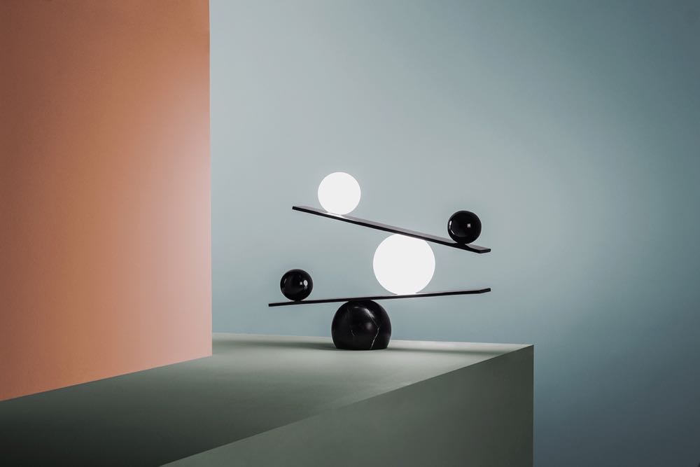
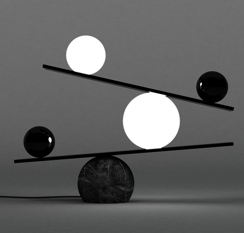
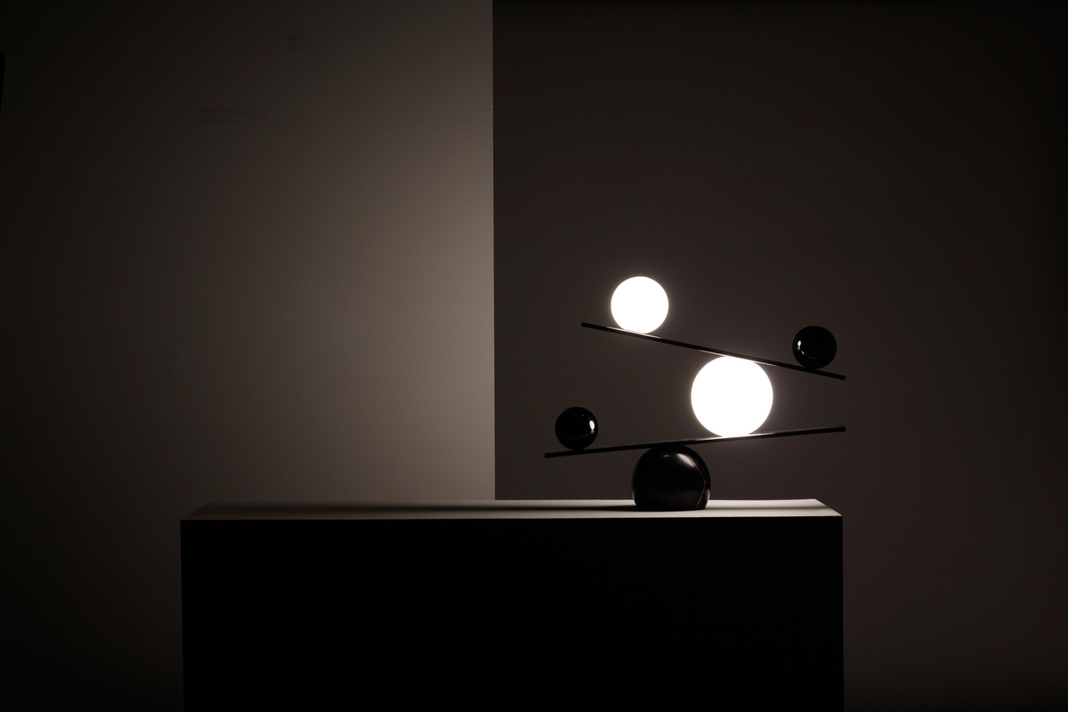
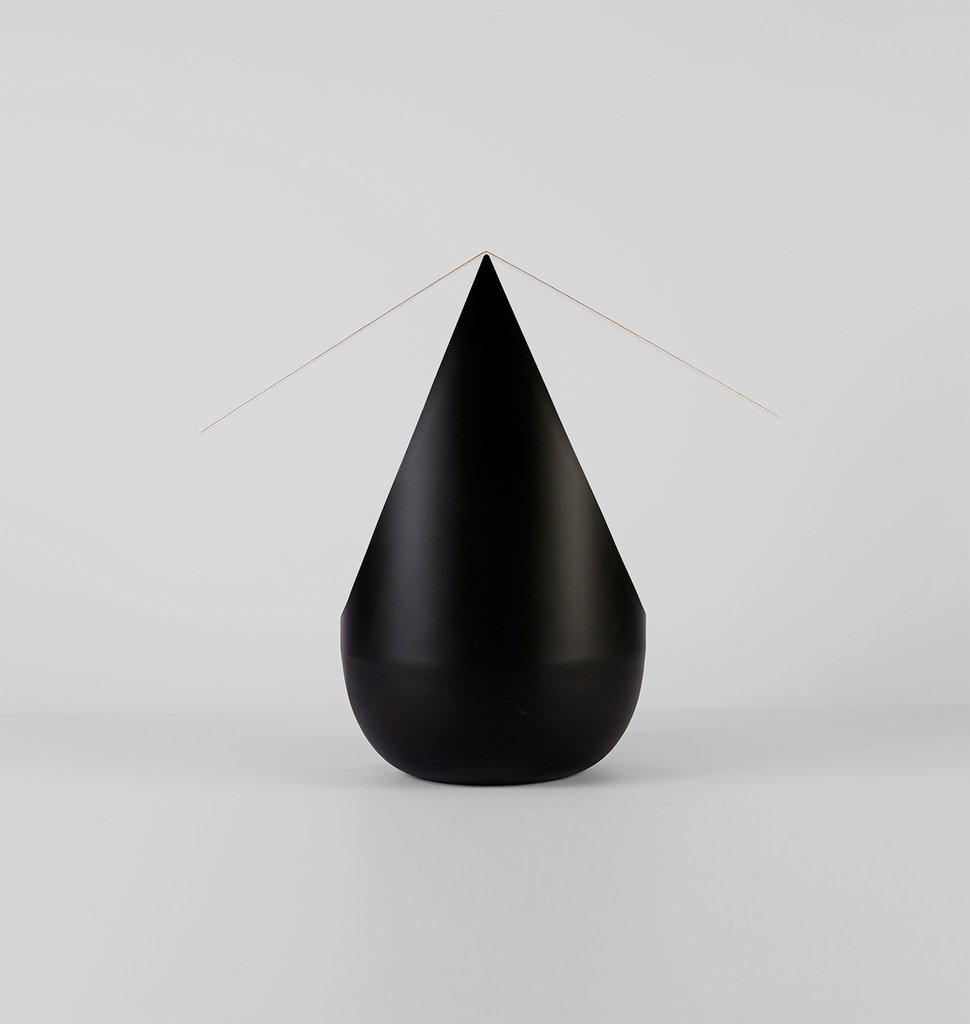
Very recently Spanish designer Victor Castanera, dreamed up the ‘Balance’ light that captures spheres in a fleeting moment before gravity has its way. New Swedish brand Oblure have developed the light in conjunction with Castanera and are launching it at Maison & Objet on January 20th.
The materials for ‘Balance’ were carefully selected to optimize the lamp’s look and delicate balancing act. The base is made from black marble, providing the intricate construction with stability. Two hand-blown glass spheres are formed and cut with immense precision so as to align with the carefully positioned steel boards. Two metal spheres act as necessary counterweights to balance the lamps intricate construction and complete the precarious vision of a light on the edge of collapse. Will it survive or will it all go tumbling to the floor?
The light source is a custom designed LED that while made to last more than 20,000 hours is replaceable if required. You can watch a video that reveals the way the light is constructed by clicking here
Oblure will exhibit on stand C162 D161 in Hall 7, Design á Vivre at Maison & Objet January 20-24, 2017.
“I want ‘Balance’ to be a reminder of how extraordinary many everyday experiences are. With ‘Balance’ I want to evoke the beholders curiosity of the world around them”.
Victor Castanera
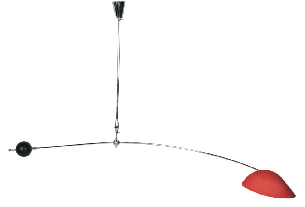
Lamps that play with our perceptions of gravity have been around for decades with Angelo Lelli the founder of Arredoluce (an example of one of his lights is shown above) being one designer from the Fifties who frequently turned his hand at playing with the physics of objects and their precarious relationship with gravity.
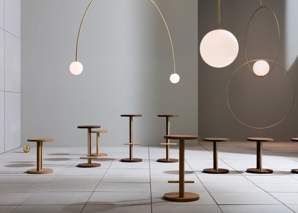
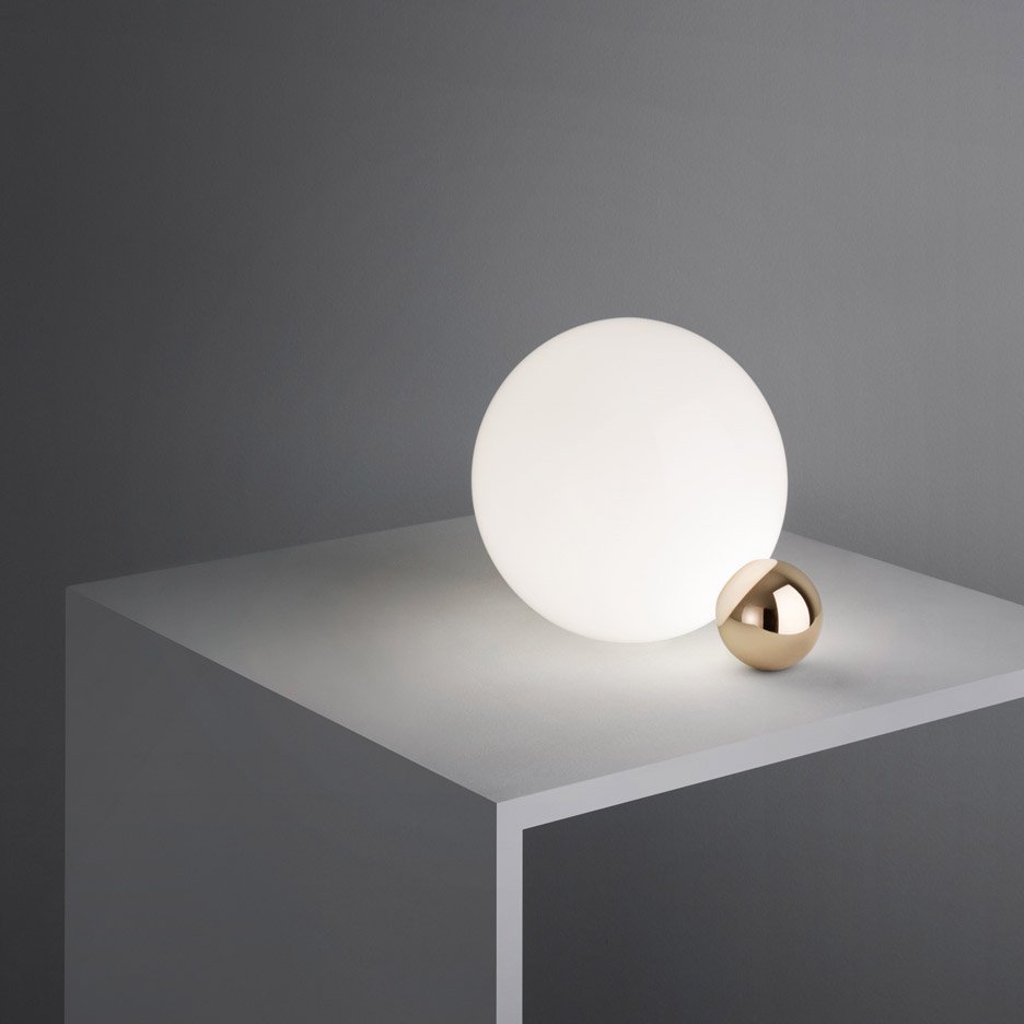
In the last few years a new wave of delicately poised lights with an acrobatic stance have been released. This probably started with London based Michael Anastassiades around ten years ago when he established Michael Anastassiades Ltd but has developed an increasing momentum through the lighting industry at large since 2010. Anastassiades' brilliance in the area of minimal lighting with magical concepts is well documented on this blog but in 2016 he designed a beautiful installation for Herman Miller called The Double Dream of Spring, where he launched his first furniture range while revealing new lighting that danced above. Simultaneously he released new designs for Italian manufacturer Flos that continued his exploration of opalescent glass spheres caught in impossible positions.
Design studios such as Atelier Areti (sisters Gwendolyn and Guillane Kerschbaumer) have a large number of lighting designs in their collection focusing around cones and spheres that explore the rich theme of balance. Design daily first saw their work in 2010 at edit by Design Junction and was instantly smitten with their way of combining simple shapes to create gentle but interesting lighting. Since this time they have also moved into designing furniture pieces but continue to delight with new designs that use cones and spheres on fine stems like geometric buds on a branch.
Two floor standing pieces of Atelier Areti's 2015 collection are shown below - the 'Bonhomme' and the 'One + Cone'
Australian lighting designer Volker Haug has also been working with the concept of balance for some time and in 2016 released a large collection that plays with the concept in many different ways and in a range of materials including brass and stone. His 'Only U' wall light is perhaps the most overt in its use of balance.
While the theme of balance using clean geometric shapes has been on the increase so to has cantilevered concepts that in their own way make us think about how objects work. These overtly physical designs offer their own pleasure - not as magical perhaps but certainly rewarding to see how simple mechanics can control gravity.
An early example of how this simple mechanical counterbalancing can result in beautiful lighting is Bernard Schottlander's 'Mantis' range from French brand DCW Editions. Designed in 1951 it's counterbalance mechanism might be described as agricultural but others would see it as simple engineering at its best.
One of the most exquisite wall fixtures ever designed is the 'Counterbalance' light by Daniel Rybakken for Luceplan. Beautifully engineered, it offers an incredibly minimal look while remaining highly functional with an extremely long reach. The arm can be moved through 180 degrees (from wall to wall ) and also from low over a table to high in the air. The shade can be rotated so it really can be used to light a room in a myriad of ways - up, down, sideways or anywhere in between.
American designer David Weeks has been working to produce dynamic lighting since the early 2000's. His 'Acaba' design in particular emphasises the quirky nature of balance as the two shades are positioned asymmetrically yet maintain a perfect equilibrium.
More extravagant examples of a more mechanical approach to balance includes the Aust & Amelung designed 'A Floor Lamp', first presented in 2014 and now in production with Italian brand Covo. The floor lamp expresses it's method of balancing completely honestly and as a consequence has immense charm. A sand bag balances the weight of the shade. The roots of this type of light can be traced to mid twentieth century designs such as Jean Prouve's 'Potence' wall light and even earlier anglepoise designs by George Carwardine and scissor lamps like those by Christian Dell from the Kaiser Idell range where the working elements are in evidence on the surface.
While completely different in style the 'Shape Up' pendant collection from American designers Ladies & Gentlemen has something of the same open explanation of weight and counterbalance as that of Aust & Amelung's bird-like floor lamp.
One material that has helped the designer create a sense of the impossible is carbon fiber. It was the basis of the hugely successful 'Twiggy' light by Marc Sadler for Foscarini and is the key factor in Arik Levy's 'North' light for Spanish brand Vibia. The combination of strength and lightness allows for arms that reach massive distances while requiring minimal amounts of counterbalancing.
Vibia have many designs within their collection that emphasise the role of weight and balance. Most of these feature impossibly fine wires with small led light sources such as Arik Levy's 'Wireflow' (below) rather than larger physical objects suspended on the tips of metal rods. In these cases the break with earthly rules of physics is more about weightlessness rather than a see-saw style approach to weight and balance.
Karl Zahn's 'Bounce' light (below) for Roll & Hill takes another tack, using aluminium covered in timber veneer to create a highly sculptural shape with an impossibly fine point of balance at the lamp's apex. Shown below in black with an ebonised white oak shade, the lamp is also available in brass with a natural white oak shade.

