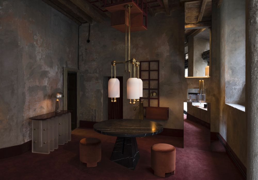
Design daily visited Salone del Mobile for the ninth time a few weeks ago. It's always a little daunting to select highlights from some such a massive event given its nigh on impossible to see everything on offer over the week - no matter how dedicated to the cause you might be. But slowly the viewing fatigue has waned and the pleasures of the good aspects of design week have surfaced and crystalised to the point where I feel confident in posting a highlights package. With big brands that woo the visitor with immaculately presented stands bigger than most domestic houses showing at the fairgrounds and installations that cost a bomb and last for just a week spread across the city, it's somewhat ironic that it's actually the smaller, more personal events that resonate the most. Don't get me wrong, I can't help being excited every time I walk into an elaborate palazzo to view some contemporary design event or other but the 'bigger is better' mantra can be overwhelming. I think this is why small scale events such as Apparatus Studio's space in Milan, strikes such a chord with so many people.
Regardless of whether you are more interested in beautifully resolved industrial design, early prototypes or limited edition art pieces, Milan Design Week does always offer up more than its fair share of memorable moments - you just need to know where to look. I feel extremely privileged to be an extended part of the design community and to be able to witness this incredible event each year. I have to admit that the week had its low points......but I will wait until you've swooned over the opener to tell you about those!
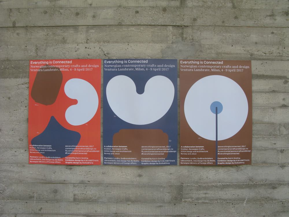
Okay, so what was the big disappointment? Well to be honest it was one of my favourite destinations, Ventura Lambrate that fell most short. Once an event that I spent the entire day and into the night discovering, I was able to walk around and see everything in less than three hours. There were less design schools and way more food outlets, less interesting young studios and one big and very over-hyped Ikea event. The two images below show the two sides of Ventura Lambrate this year - the saturation marketing of Ikeas involvement on the left and the honest beauty of Norwegian Crafts Everything is Connected exhibition on the right.
It was actually depressing to see a line of people queuing to get into the Ikea exhibition while real designers like Umut Yamac (who was located in a small space opposite) looked on. Is this what it all boils down to? Are people more interested in buying discounted Ikea items on the last day of a show than they are in discovering new design? Maybe.....obviously I applaud Ikea for wanting to be being part of a design event and for employing designers generally but I would much prefer if they were a part of a celebration of innovative design rather than dominating it.
Some said that the newly created Ventura Centrale in the tunnels at the back of the giant Centrale FS railway station was a distraction from the Lambrate event and that the commercial benefits of having the likes of Lee Broom, Maarten Baas and Luca Nichetto in the one location outweighed the hundreds of designers exhibiting at Lambrate. D.d has no idea if this is true but Ventura Lambrate has definitely slipped from the must see list for next year.
Thankfully there is always a silver lining to such things and at Lambrate this year it was again the Norwegians who provided something special. The Everything is Connected exhibition had been shown at Stockholm in February but its always nice to see it for one's self. Design daily has already covered the show in the Salone del Mobile 2017 previews post (which you can revisit here) so I wont go into it in too much detail but suffice to say the work was stimulating and the set-up was beautifully executed. You can see the entire thing in all its glory here.
Right next door to the Everything is Connected show was an exhibition of work by Danish designer Amanda Lilholt that caught the attention. The simple metal framed furniture was upholstered in unusual fabrics that resembled coloured and patterned cowhide that were referred to as 'Kopenhagen Fur'. Various seating forms were countered by a striking tall cabinet and console table with fine metal supporting structures and mysterious enameled elements.
Another stand out event in Lambrate was the Studio Thier & van Daalen display inside Design daily's favourite Lambrate location, the mechanics garage in Via Sbodio. For the last three years D.d have followed the work of this young Dutch studio (Iris van Daalen and Ruben Thier) and this year they expanded their repertoire of beautifully executed blown glass in timber frames to include several new lighting concepts involving brass and layered glass.
At Ventura Centrale however it was a case of a grungy location filled with dazzling spectacles. Lee Broom's 2007 - 2017 ten year retrospective was built up massively prior to design week but delivered regardless. It was quite mesmerising standing in a gloomy railway arch with a room full of people watching bright white versions of Broom products rotate slowly around. The average person spent at least 5-10 minutes watching quietly - which in a fair full of hustle and bustle and an impossible agenda of events to visit is no mean feat.
Literally next door was a entrancing glass installation called Decode - Recode by Luca NIchetto and perfumier Ben Gorham for Salviati, the Murano glass company. One room was filled with giant vase-like totems, the other with a collection of delicate sheets of glass.
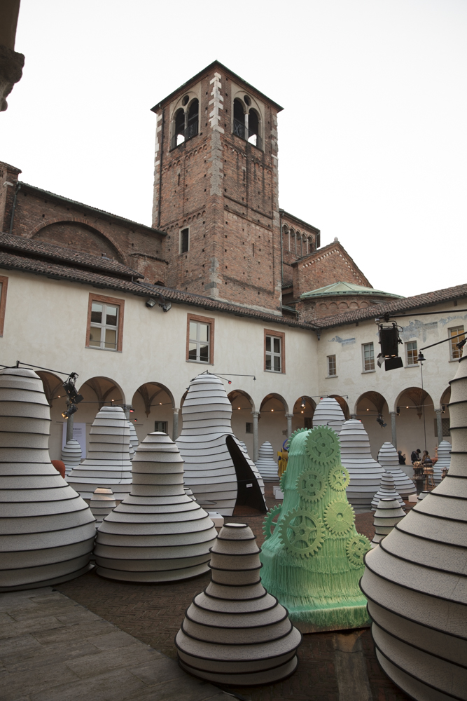
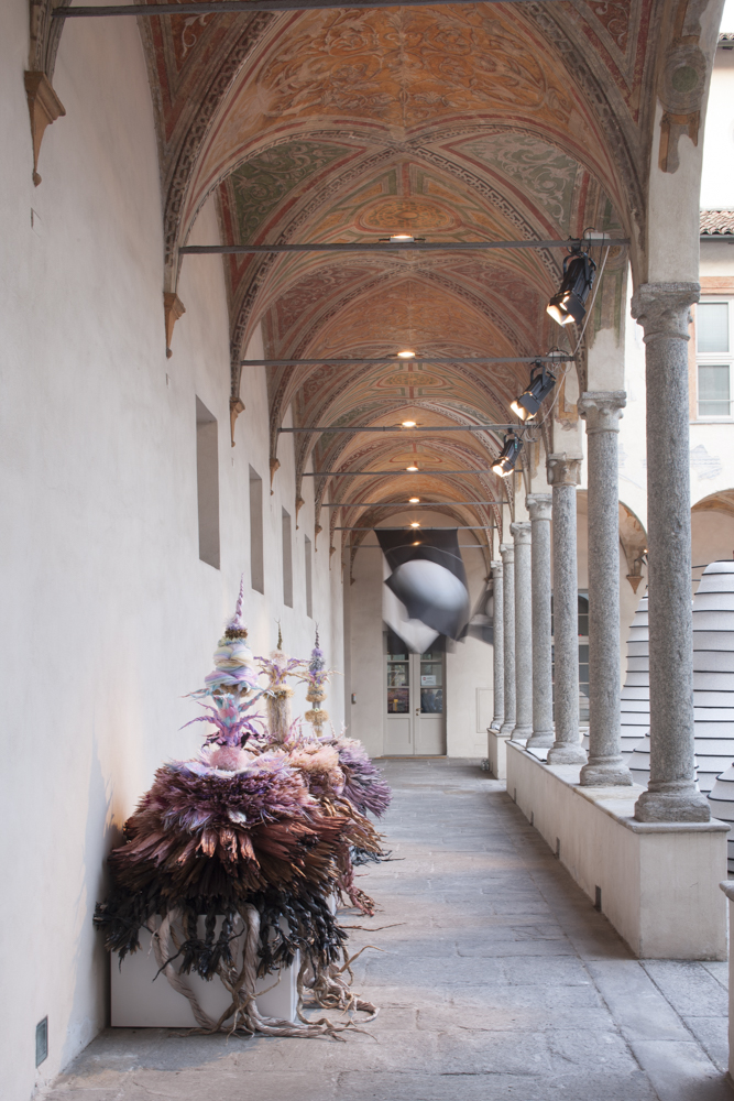
The Danish crafts organisation has been a regular exhibitor in various parts of Milan during design week since 2008. For the last two years their annual exhibition called Minecraft has been curated by GamFratesi whose 2015 show at Chiostro Minore di San Simpliciano was one of the highlights of that year's design week. This years show returned to the same magical venue but is curated by Henrik Vibskov and he chose to showcase the work of seventeen Danish creatives in a very different way, inserting pod-shaped structures into the classical courtyard to house the smaller works. Larger pieces including that of regular MIndcraft contributor Isabel Berglund (whose incredible Spinning Time Machine is the green clock style object below left) stood amongst the pods. Other contributors included Tobias Møhl, Yuki Ferdinandsen, Eske Rex and Maria Mengel, Birk Marcus Hansen, Emil Krøyer and Mads Sætter-Lassen, Anne Dorthe Vester and Maria Bruun, Kasper Kjeldgaard, Lærke Valum, Marianne Eriksen Scott-Hansen, Hanne G, Anders Ruhwald, Christina Schou Christensen, Pernille Pontoppidan Pedersen, and Carl Emil Jacobsen. You can find a lot more information on MIndcraft 17 and images of the items exhibited here.
Of course some of the old favourites continue to deliver in their usual way - Spazio Rossana Orlandi was again a haven from the commercial with a basement full of the work by interesting young designers and a leafy courtyard that remains a feature of design week despite the ever increasing crowds.
You can find out more about Mastrangelo's work (shown below left) here and Jorge Penades' work (shown below right) here.
5VIE - now in its third year - was again full of interesting events including the collaboration between Fabscarte wall paper and Martyn Thompson Studio at Ladies & Gentlemen. In the same general area Apparatus Studio and BDDW showed how American design is currently taking the world by storm and the Australian contingent of eleven designers under the banner of Local Design presented a lovely show in the absolutely beautiful 11th century chapel Oratorio Della Passione.
Also showing in the 5VIE are were Italian British duo Giopato & Coombes (Christopher Coombes & Cristina GIopato). Their new range of lighting was definitely spectacular moving from delicate tubes to brass chains with LED circles.
Every year Formafantasma create something special for Milan and this year it was a beautiful exhibition of their recent lighting experiments at Spazio Krizio. Some of the lights had previously been seen as part of their exhibition at Design Miami / Basel for Gallery Giustini Stagette and Galleria O. Roma (you can see an earlier Design daily post on this show here) but there were also lots of new designs - some of which have been industrialised into lights for Flos.
American manufacturer Matter Made put on a and the absolutely gorgeous exhibition in an area near Porta Garibaldi, north of the Brera district with pieces by Philippe Malhouin, Oeuffice, Jonah Takagi, Faye Toogood and Pedro Paulo Venzon.
Marni's extraordinary Playland show held in their warehouse near Porta Romana created a circus world with colourful woven objects and circular patterns created in sand poured directly onto the floor of the space. Colourful LED lighting and a live orchestra playing circus themes completed the atmosphere. The woven objects are limited edition pieces and were for sale on the night with proceeds going to the Colombian charity that Marni has supported for many years.
Milan is a city full of incredible old building s and during deign week a great number of them are taken over as venues by brands and events keen to exploit their potential as a backdrop for contemporary design. For the last few years the Dutch government has funded a massive exhibition of Dutch design called Masterly at Palazzo Francesco Turati. The palazzo is a sensational place for a design show with grand staircases and ancient rooms full of wallpapers and marquetry floors but this years collection of designers was too commercial for its own good and the whole event was actually overshadowed by the beauty of the location.
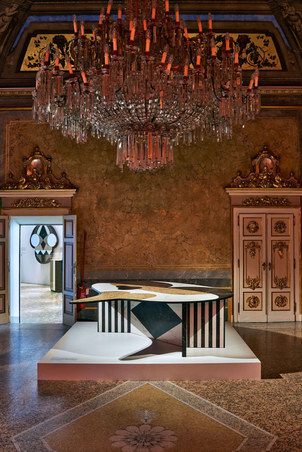
Although Hayon's installation Stone Age Folk for Caesarstone had been shown at IDS in Toronto in January, the opulence of the Milan setting made it totally new again and this was complimented by a new section to the show that debuted in Milan. The furniture and wall pieces (shown above) were made from Caesarstone using a contemporary marquetry style technique. In the next room Hayon created a very different mood with a massive stained glass and Caesarstone structure squeezed into the palace's elegant ballroom. You can read about the Stone Age Folk component of the show in an earlier Design daily post here.
Gifu prefecture in Japan has employed Swiss architects and designers Atelier Oi to promote the manufacturing ability of the region for the second year during the Milan fair. Atelier Oi are devotees of the Japanese aesthetic and culture so have been able to do and incredible job of presenting a genuine Japanese experience in an exhibition called Casa Gifu II. Although there were lots of beautiful metal pieces like samurai swords and knives on display it was the experimental perfume dispersing installation in pleated paper (below) that stole the show. You can see a delightful short film that demonstrates the way the installation works here.
Another quietly beautiful installation was the COS x Studio Swine installation called New Spring. Essentially a giant sculptural tree which delivered spheres of 'mist-filled blossoms' that disintegrate on contact with the skin, the concept was based on the cherry blossom festival of Japan. Visitors were supplied with black fabric gloves that allowed the blossoms to be caught and handled. You can watch a lovely video of the event here
Salone Satellite at the fairgrounds in Rho was celebrating it's 20th year and it did it in great style with the area designated to satellite in Halls 22-24 never looking better. While there was the usual mix of first timers and old hands (if being allowed to show a maximum of three times provides this status) it was the stands of designers like David Derksen and Kasper Nyman who have been there before that generally stood out. A few of the new exhibitors that really shone included Greek lighting designer Chris Basias, Viennese creatives, chmara.rosinke design studio and Studio Finna from FInland. Design daily will cover Satellite in full in a subsequent post so we leave you with just a taste of what is to come......

