During Sydney Indesign I visited Side Project: Music for your eyes, an exhibition of the work of a number of young Australian design practices and artists curated by Sydney design studio Page Thirty Three. Not only was I delighted to see the work of so many of the most interesting Australian design studios such as Blakebrough + King, Studio Kyss, Henry Wilson and Porcelain Bear brought together in one place but the brand new work by Page Thirty Three, was beautifully resolved with an exciting materials based take on simple geometric forms.
After seeing the Side Project exhibition I was keen to talk to Page Thirty Three not only about the exhibition itself but also about their work in general and what appeared to me to be a major change in direction for this young Sydney based brand. The Q&A with Bianca Riggio - one half of Page Thirty Three studio - is the result.
Both Bianca and the other half of the studio - Ryan Hanrahan - studied fine arts at Tafe (for non Australians this stands for Technical and Further Education) - Riggio specialising in photography and printmaking while Hanrahan favoured graphic design and illustration. The two set up Page Thirty Three in 2010 to provide playful design objects for the home. They are interested in simple rituals and comfortable spaces.
D.d: Hello Bianca, Can you give Design daily a quick rundown of how Page Thirty Three came to be?
Bianca: I guess we started out quite naive to design. Ryan and I are both from fine arts backgrounds so we came into design and our business with some fun ideas but not much real grounding in object design. We started about 5 years ago with a stacking plywood crate based on the generic milk crate and it was an instant success here in Australia. It helped get or name out there but we no longer sell it as we have evolved and matured our design sensiblity since then.
D.d: What sparked your more recent explorations into what might be termed Modern Memphis?
Bianca: When I first started I didn't really know what inspired me in object design. I’ve slowly come to understand what motivates me and our ideas have grown with it. Because of my fine arts background I have always looked at art - and sculpture in particular - like the British sculptor Anthony Gormley……but it took me a while to appreciate that my interest in art and having a business that manufactures design objects meant that I could make my objects really artful. I love Brutalist structures and Neolithic rock formations – I guess that is what inspired the 'Tactile Equations' collection we launched at Side Project, but on the other hand I also love nature and how it sometimes takes over man made structures.
D.d: I was going to ask you about the images that come up on your website from your social media feeds - they seem to all be about wild nature and Brutalist architecture but from what you are saying this is what is inspiring Page Thirty Three at the moment.
Bianca: We are constantly enamoured with the man versus nature idea.
D.d: Your mainstay up until recently has been small objects - a oil burners, canvas laundry bags and your 'Cinematic Light Box' lamp. What made you decided to move into larger objects?
Bianca: Last year was the first time we experimented with large design objects - we did a collection called Optical Delusions that launched the ‘Slab’ chair, the 'Protractor' and ‘Tipi’ lamps along with a small version of the ‘Zig Zag’ table that we developed into a coffee table for Tactile Equations. Working with bigger pieces was a massive learning curve for us. When we went back to do this current collection which had been sitting in our sketch books for a couple of years, we were a bit more prepared than previously. It takes a while to get your head around how to run a business, how to work with different materials and how to release new products.
D.d: The 'Slab' chair has something of a Dutch aesthetic - it has elements of Rietvelds 'Red & Blue' chair or perhaps some of the elements of Piet Hein Eek's work. How did you arrive at the design?
Bianca: The ‘Slab’ chair encapsulates the progression of Page Thirty Three as a design studio. We started in fine arts and both of us continue to practice graphic design. When we first started making objects our first port of call was flatbed cnc machining because it is 2-D just like what we were used to. The 'Slab' chair puts these 2-D components together to create a 3-D object. For our latest collection however, we were able to instinctively work in 3-D rather than having to construct objects through 2-D methodology.
D.d: Tell us more about the development of Tactile Equations and the exhibition Side Project.
Bianca: After doing the Optical Delusions collection in 2014 we had primed an audience for Tactile Equations. We decided that it needed a venue that differed from the average retail outlet and so were determined to create our own. Launching the collection through the Side Project exhibition at The Stables worked really well. Our skills were a little more finely tuned and the platform showed our work in the right context. Sometimes all the ideas are there but if you don’t engineer them properly or launch them at the right time and in the right place they don’t really get noticed.
D.d: And Side Project: Music for your eyes? - tell us a little about the curation process.
Bianca: Side Project came about for a few reasons. Sometimes designing can be a bit of an isolating pursuit. As a designer you spend a lot of time by yourself in your own space, so I wanted to connect with other designers in Australia whose work I really love. I don’t think there is enough of the style of work that I admire being shown at the moment, so I decided to do something about it and curate a show based around all my favourite designers – Henry Wilson, Studio Kyss, Porcelain Bear and people like that. I also wanted to put it together in a way that made that tone of voice clear. As I have said, we wanted our Tactile Equations range to be launched in the right environment and by curating our own event we could totally control that. I also wanted to bring in fine art and so we involved artists like Lynes & Co, Tin & Ed and Eloise Rapp.
D.d Tell us a little about the pieces that form Tactile Equations.
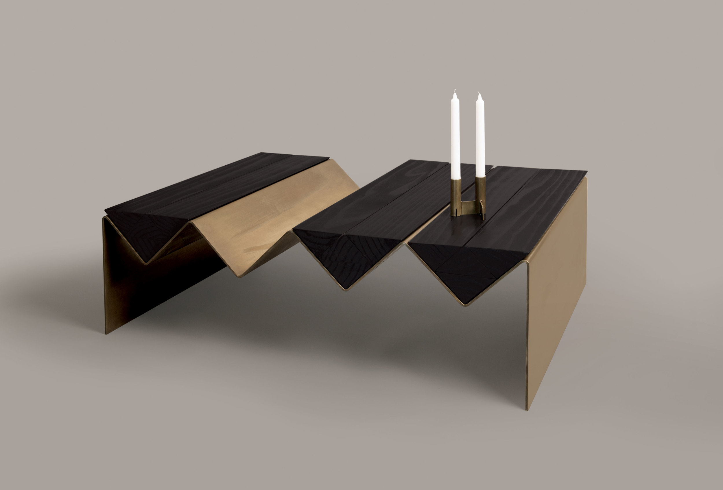
Bianca: We originally designed the ‘Zig Zag’ table as part of the Optical Delusions collection. It was a magazine rack or side table but we had wanted to make something more substantial and so reworked it into a large coffee table. We had loved the black and brass look so kept the small ‘Zig Zag’ table in its powder coated colours while we developed the coffee table in a combination of black stained timber and brass. The other objects are of a scale that is more typically associated with Page Thirty Three - oil and incense burners, a table lamp and a modular candle holder - but all share a heightened sense of materiality using bluestone, granite and brass.
D.d Collaborations seem to be de rigueur these days, explain what you like about them.
Bianca: I’m big on collaborations. The results are nearly always better. I really like working with other people first and foremost. I also like being up close with design that I like and feeding off that creativity. With Side Project: Music for your eyes I just reached out to all these different people I admire - like Jonathan Zawada, Studio Kyss and Daniel Emma. It was really nice because they were all so responsive and the show was incredibly well received.
The Side Project exhibition included the work of 15 designers and artists (and one surfboard shaper) including Kane Banner, Blakebrough + King, Brown Cardigan, Daniel Emma, Four Eyes, Haydenshapes, Lynes and Co, Ode Ceramics, Page Thirty Three, Porcelain Bear, Eloise Rapp, Studiokyss, Amanda Talbot, Tin & Ed, Henry Wilson, Jonathan Zawada.
Tactile Equations objects are limited edition pieces and while the originals were sold at the end of the Side Project exhibition, Page Thirty Three are now taking orders on a small limited edition run. Pricing of the objects has been finalised and is as follows: The 'Zig Zag' table $1700, The solid bluestone lamp 'Stratosphere' oil burner $1980, 'Superstructure' table lamp $1350 and the brass and granite 'Void' incense burner $250. For further enquiries go to the Page Thirty Three website here.


