At long last Design daily has got its act together and is delivering a new blog post. 2018 was a great year weather-wise for Salone del Mobile with a beautiful burst of spring being delivered bang on time after weeks of cold and rain. Milan Design Week offered some 1500 Fuorisalone events over the seven days of 16-22 of April making it impossible for any mere mortal to see everything but Design daily (David Harrison & photographer Craig Wall) equipped with a couple of 50cc Peugeot 'Tweet' scooters courtesy of Cooltra gave it our best shot. We failed of course but in the process we managed to see an incredible amount of amazing new design and experienced by far the greatest numbers of palazzos ever experienced in the ten years Design daily has been covering the fair. Milan pushed the boat out this year and we were the lucky recipients.
All photographs by Craig Wall except where indicated otherwise.
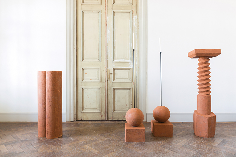
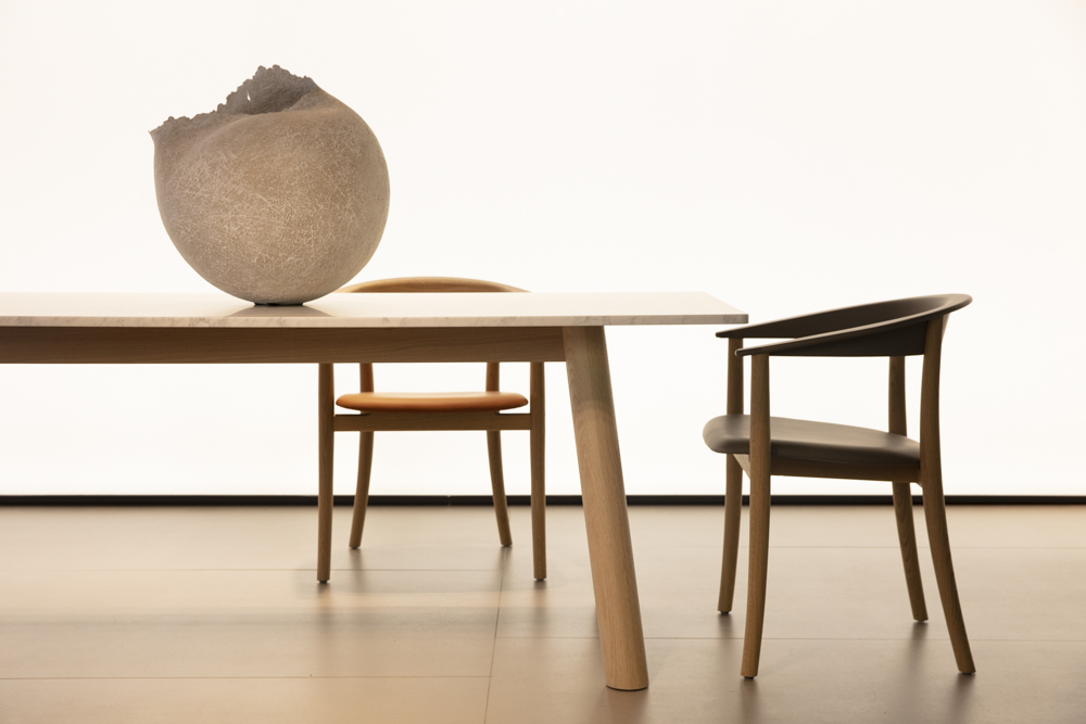
Georgian designers Rooms (Nata Janberidze and Keti Toloraia) have always done things from very much their own perspective. Originally coming to the attention of the design world with a over-scale floor lamp in wood that was briefly shown under the Moooi brand, the duo continue to work across interior design and product design creating very sculptural, almost elemental pieces in stone and wood. Their work is strongly linked to the heritage and culture of Georgia and despite critical acclaim the studio remains based in Tbilisi.
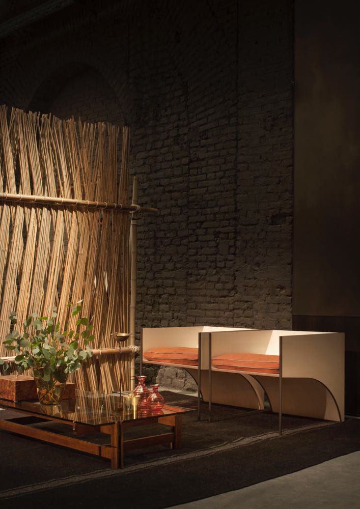
Only officially opened in September 2017, Six Gallery in Porta Ticinese was a real discovery. The name comes from the fact that six different founders from different disciplines came together to create the project which includes a gallery, restaurant / bar and the offices of architecture and design studio Quincoces-Drago & Partners, set around a beautiful courtyard. David Lopez Quincoces and Fanny Bauer Grung are the founders of Quincoces-Drago & Partners and were the curators of the installation for design week. The obvious feature was a ceiling of 38,000 dried corn stalks that took a month to install working for four hours a day. That's extreme dedication to a concept! David Lopez Quincoces is a Milan-based Spanish designer who has designed a large number of furniture pieces for Living Divani, LEMA and most recently Potocco.
The gallery displayed the duo's penchant for mixing vintage and contemporary pieces with original versions of Danish classics like Kaare Klint's 'Safari' chair being shown with Quincoces' latest pieces such as the stone bench QD 02 shown above and the QD 01 chair shown below left. The installation carried this interest in textural natural materials through to vintage Hannoun rugs and woven cane screens like the Quincoces' own QD 10 shown above.
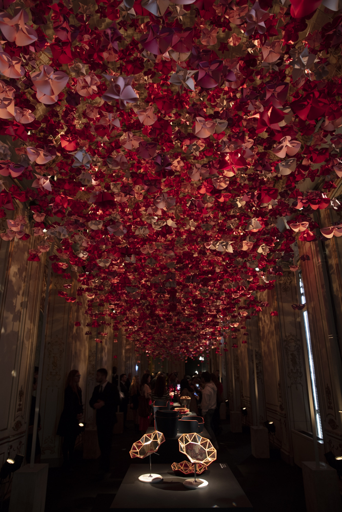
As in recent years Marras has opened his atelier space as a temporary bistrò and restaurant, Domus Rana. This year the ceiling was resplendent with fabric flowers instead of decaying real ones but the effect was no less breathtaking.
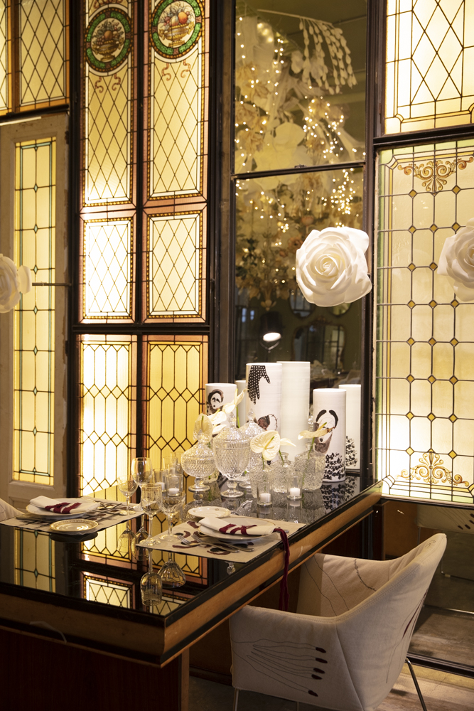
The offices of Vogue Italia were opened up to interpretations by several design practices including British designer Faye Toogood, whose gorgeous room can be seen below. Other contributions came from Belgian designers Muller van Severen along with Sabine Marcellis, Michael Bargo, Mario Bellini, Patricia Urquiola and Quincoces-Drago mentioned earlier.
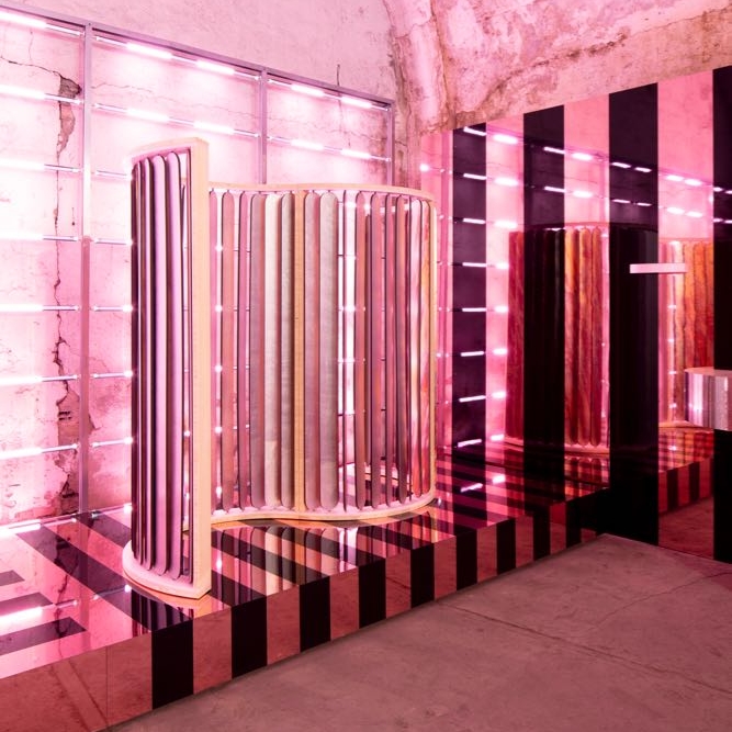
Transitions III - was an installation by Baars & Blömhoff, a Dutch company that sources industrial & architectural materials for designers. Held in one of the vaults under Milan's main railway station as part of Ventura Centrale, featuring the work of six Dutch designers Mae Engelgeer, Floris Wubben, Studio Truly Truly, Job van den Berg, Christian Heikoop and Bart Joachim van Uden. The space was a far cry from the majority of the cold concrete vaults, with the installation bathed in pale pink neon.
The Wallpaper Handmade show was again located in the Mediateca Santa Maria in via Moscova. This year's theme was Wellness + Wonder so designers worked around their own interpretation of this concept producing everything from a contemplation carpet (David Caon) to incense burners (Jonathan Cross) and a "Hugging Column" (Mae Engelgeer) - all three of which are shown amongst the designs pictured below.
Michael Anastassiades created a dazzling LED lighting installation in the beautiful exhibition space behind the Flos showroom in Corso Monforte. The linking LED components showed the versatility of the Anastassiades' 'Arrangements' system.
HenriTimi are a MiIanese company that specialise in bespoke kitchens and bathrooms with a a tendency for the monolithic but they also produce a select range of furniture and lighting pieces with a strong architectural quality. The location of the Selentium installation was the Basilica of St Marco - in the areas normally reserved for priests. The chair on on the right in the courtyard is the MN 102 Eva chair by Mario Nanni (2011).
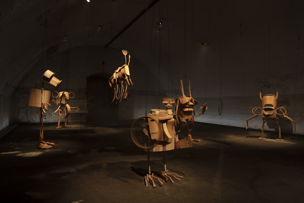
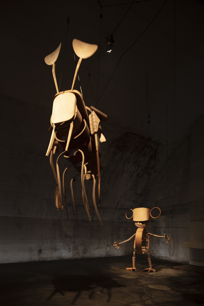
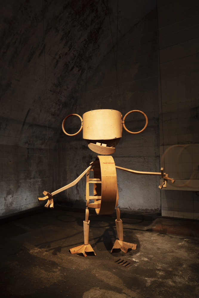
One of the most delightful installations in the selection offered at Ventura Centrale this year was Giants With Dwarfs. The archives of 130 year old Swiss chair company, Horgen Glarus, were raided and reinvented as giant wooden puppets (entirely made from chair parts) by Swiss architect and designer Stephan Hürlemann. The creatures could be operated by visitors by pulling ropes to move their limbs. It was all good childish fun.
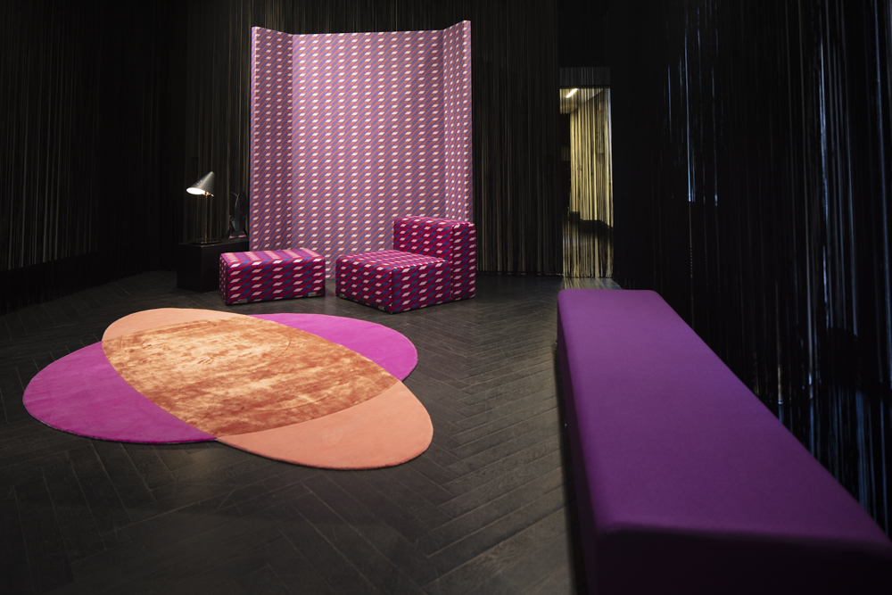
Palazzo Stamskin was an installation by French studio GGSV – Gaëlle Gabillet & Stéphane Villard for fabric house Serge Ferrari. The installation played with exaggerated architectural styles and motifs in bold colours to create an environment to house upholstery pieces showing off the range of colours and textures available in Serge Ferrari's 'Stamskin' range of outdoor fabrics.
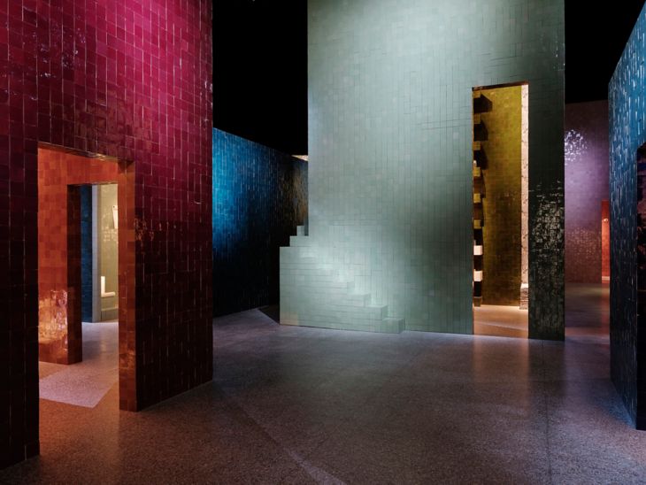
Not quite so surreal but in its own way equally as playful, the Hermés installation was one of the most incredible events of Milan Design Week. Held in Museo della Permanente - a creative arts museum in central Milan, the installation was created from 150,000 handmade Moroccan Zellige tiles in the most delicious combination of colours imaginable.
Seven mini pavilions were built in varying scales and shapes creating a tiled village. The real beauty came not only from the handmade tiles themselves but from the interplay of colour between the exteriors of each pavilion but also from the glimpses of the tiles within as each pavilion was also tiled internally in a different but complementary colour. The project was conceived by Hermés Maison artistic director Charlotte Macaux Perelman and Alexis Fabry with scenography by regular Hermés collaborator, Hervé Sausage, the installation showed an incredible understanding of how to manipulate colour and form. You can watch a lovely short video about the new Hermés Home collection here.
Every year Milanese rug company cc-tapis launches rug collections that surprise and delight. In 2018 it was a combination of Patricia Urquiola's 'Slinky' rugs - a collection of three rugs inspired by the 70's spiral toy - and Bethan Laura Wood's Super Fake collection of four rugs that stole the show. Completely different but equally as energetic and inspiring, the two collections were on show in the brand's new showroom in Piazza Santo Stefano, just a few streets south of the Duomo.
Czech lighting company Lasvit delivered what was essentially a massive party all week, taking over the bijoux theatre Teatro Geralomo situated only a stones throw from the Duomo. The theatre is a 19th century scaled-down version of Milan's famous Teatro alla Scala and has only recently completed a long restoration. Lasvit seized the opportunity to be the first company to use the building during Salone and delivered a mad-cap mix of cabaret performances, music and theatre with burlesque performances daily and actors wandering around in bizarre clothing acting out strange scenes from an unknown play - all to provide an interesting backdrop to exhibit their amazing glassware. Its an extreme idea but it certainly worked with the installation taking out the Milano Design Award for 2018 for best event at Fuorisalone.
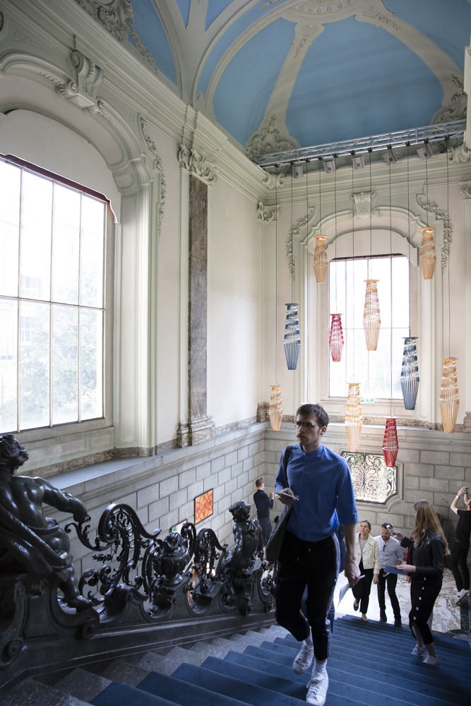
Louis Vuitton's exhibition Objets Nomades has become an annual event in the Palazzo Bocconi in Corso Venezia. Drawing huge crowds, the exhibition is almost too busy to enjoy properly but like the Hermés show that was similarly mobbed from morning 'til night, patience was rewarded. Several new products to add to Louis Vuitton's range of travel objects came from Marcel Wanders but it was the ceiling of leather flowers and a room of luminous pink balloons that seemed to be getting the most attention. Among the glitz and glamour there were some beautiful objects on display as part of the growing Objets Nomades collection - several by London-based Israeli practice Raw Edges and as the signs below suggest, by Barber Osgerby, Atelier Oi and Patricia Urquiola along with some outrageous pieces by the Campana Brothers whose pink 'Bomboca' sofa is like a giant imaginary sex organ.
While talking about luxury brands and exciting installations, it's hard to go past Bulgari's REINVENTING (DESIGN) RVLES - the brand's first Milan Design Week show outside of the Bulgari Hotel. Taking over a space in via della Erbe in the Brera district, designers Iván Navarro and Courtney Smith created an intense world of colour and pattern with design studios MVRDV and Storagemilano contributing spaces to express very different aspects of the Bulgari brand. The main space was created using tiles in black and white that changed colour with the neons.
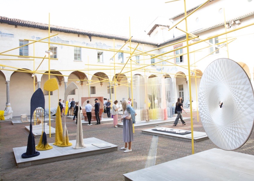
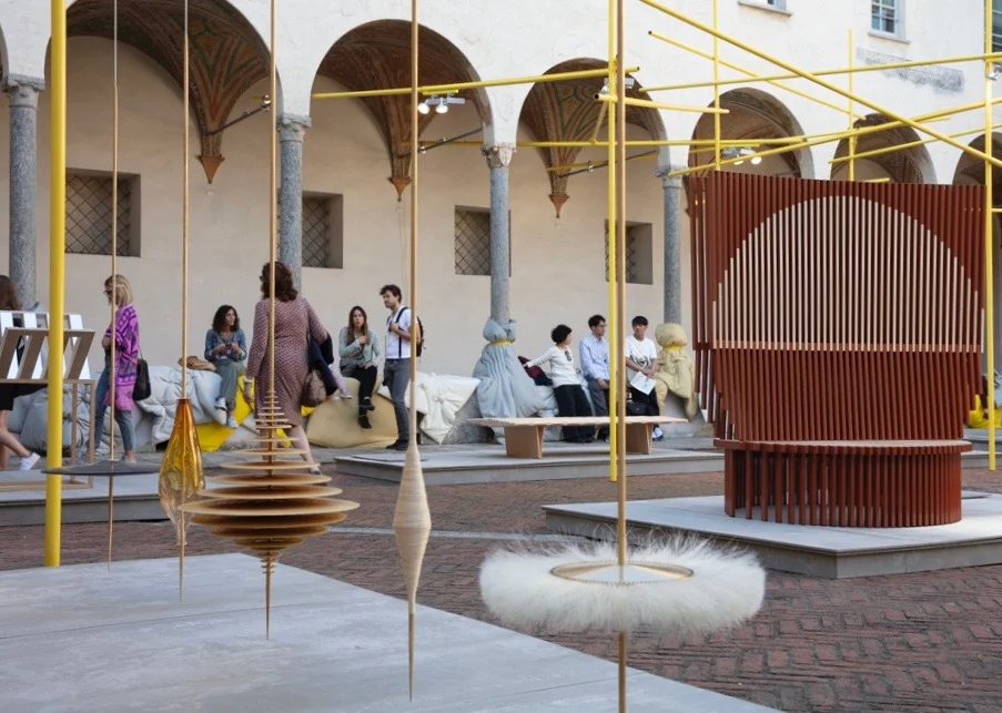
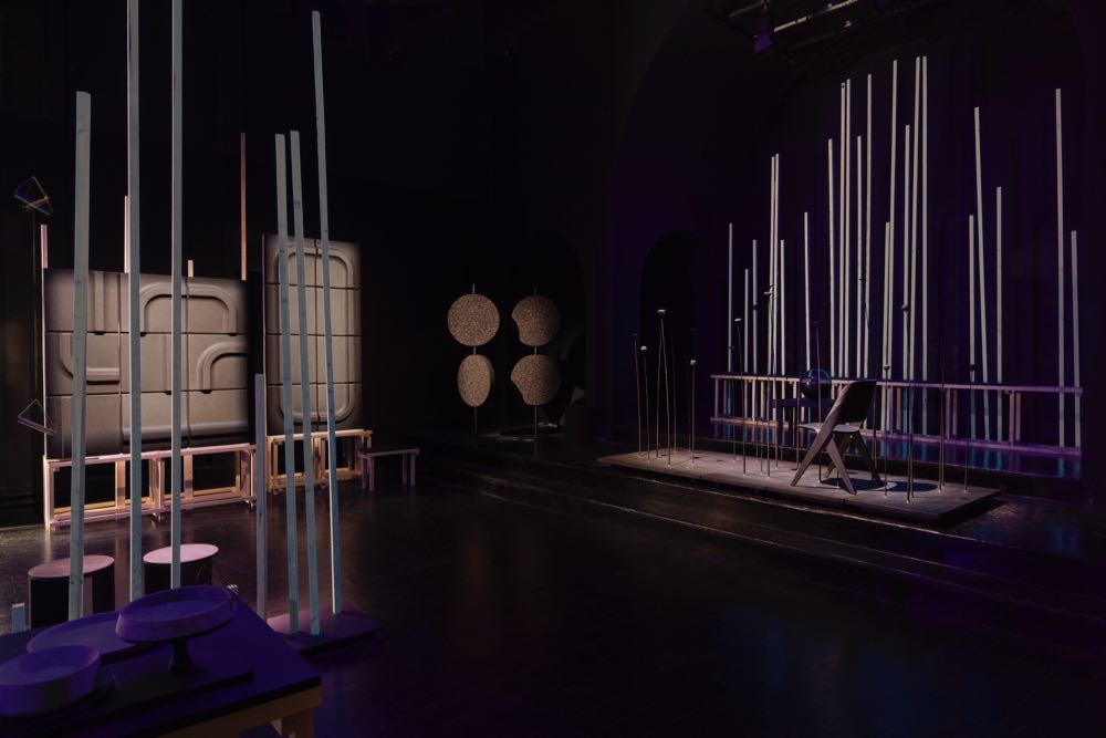
The Mindcraft exhibition is a Danish Arts Foundation initiative that has been showing in Milan since 2008. For the last couple of years this extraordinary selection of design and craft has used the courtyard of the Basilica of San Simpliciano (built in the 3rd century) in the heart of the Brera district as its mind boggling backdrop. Each year a new curator is chosen to select the artists and designers that are featured. Furniture designer Ditte Hammerstrøm was chosen as the curator for 2018. Using bright yellow scaffolding poles to create a contemporary space within the arches of the cloister's beautiful courtyard the work of seventeen Danish creatives across the fields of furniture, art, craft and textiles were on display. You can see all the wonderful work and settings of the Mindcraft shows since 2008 by clicking here and scrolling to the bottom of the Mindcraft exhibition page.
Spotti is an institution in Milan and the retailer of fine design works hard to make their space as exciting as possible each year during Milan Design Week. In the past this has often involved showroom makeovers by Studiopepe or special installations by designers like Konstantin Grcic. This year they went one step further and presented new items for the SEM collection - pieces created for the brand by designers they have commissioned. Previous collections have included 'Gold' by Paolo Rizzo and 'Family Tales' by Studiopepe. In 2018 they approached Elisa Ossino, Giacomo Moor and Turin-based architecture practice, Marcante-Testa. The disparate collection was brought together by Ossino's clever use of colour and material with curved sheets of corrugated plastic.
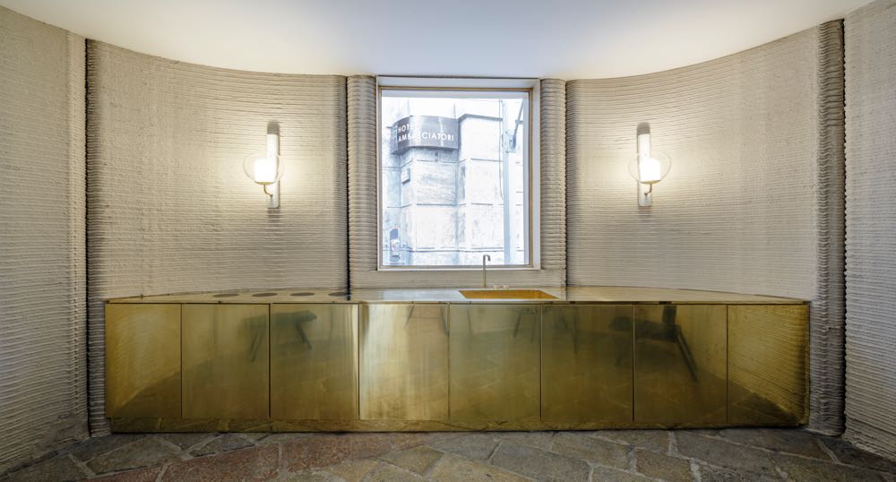
Massimiliano Locatelli's CLS architetti succeeded in 3-D printing a concrete house in less than 48 hours - right behind the Duomo in Piazza Cesare Beccaria. Dwarfed by the monumental arch of Galleria del Corso, the house seems rather small but in reality the building was the equivalent of a 100 sqm one bedroom apartment with a bathroom, kitchen, open plan living / dining room and seperate bedroom. The plan consisted of four vaguely circular pods made from thirty five seperate sections made independently then joined to the next. Each section took 60 to 90 minutes to print. The accuracy of the building enabled door and window frames to be built off site and fitted in place with no modifications. Due to its modular construction, the building can also be disassembled and moved.
London and Venice based glass company WonderGlass created an installation within Istituto dei Ciechi - Milan's Institute for the Blind. With just four elements to the show and only one of these a light, the space and the beauty of the pieces had to be of an extremely high level. In comparison to Czech glass rival Lasvit, whose Monster Cabaret was an all-singing, all-dancing affair in technicolour, WonderGLass was a subtle event with the silence of the auditorium broken only by the gentle noises of an ambient soundtrack.
Studiopepe's Club Unseen was a secret club in a disused building behind San Babila. Getting in required a tattoo to be sent out by post.......or an introduction by a friend who was already a member. Open every night for the duration of Milan Design Week from 6 - 12, the club featured an amazing bar concept where only the hands of the bartenders were visible as they poured drinks. It was totally surreal but beautifully theatrical. What appeared to be impromptu sets by bands and DJ's kept things going when design talk wained. Studiopepe created an interior that combined 70's glamour with their signature flair for colour and vintage furnishings. This was complemented by customised versions of their favourite contemporary pieces and their very own tiles and wallpapers.
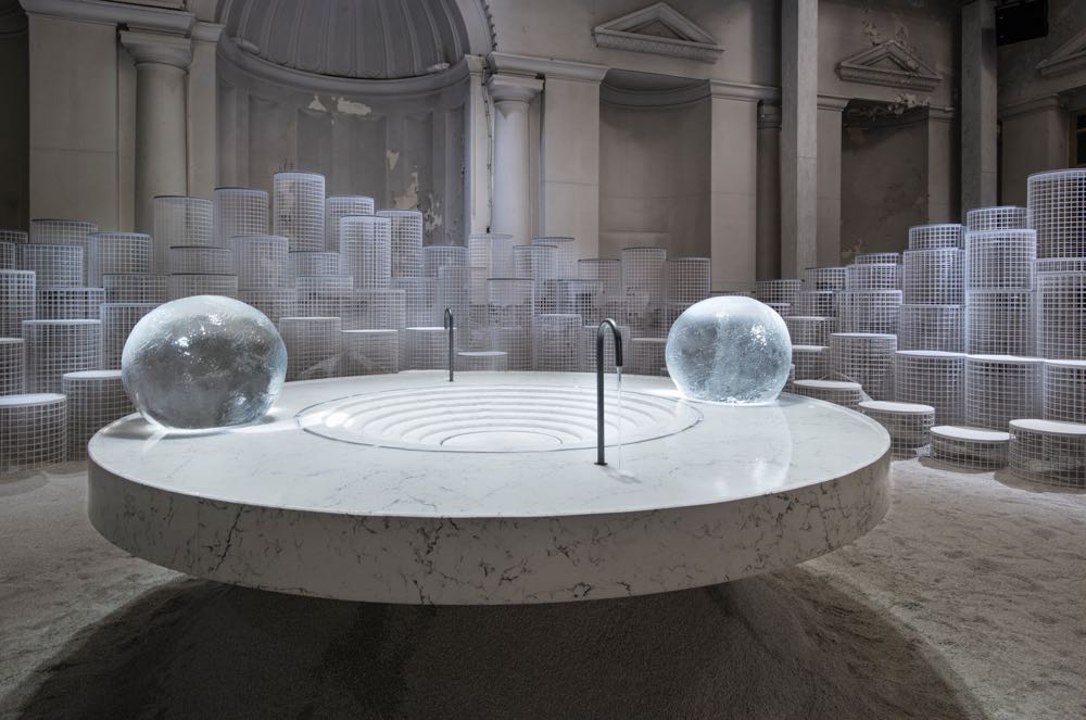
Designed as an immersive experience based around a conceptual kitchen island, the Altered States installation for Caesarstone by experimental New York architecture practice Snarkitecture, successfully motivated all the senses. The circular kitchen island in the centre of a classical architectural space was made of Caesarstone White Attica. This 'altar' provipded the platform from which the changing states of water - ice, liquid and steam were explored.
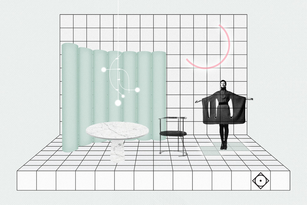
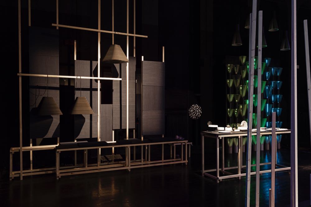
Finland is slowly freeing itself from being forever linked to Alvar Aalto and is coming to the fore in contemporary design. Nordic Happiness was an installation designed to modernise the concept of Finland as remote and unconnected with the rest of the design world. The name of the installation refers to the fact that Finland was recently determined by a UN survey to be the happiest country on earth. The installation, created by design house Made by Choice, featured eleven Finish companies that represent quality design values combined with a holistic approach to the creation of their products. In addition to Made by Choice, Finarte, Himmee, Raw Finish by Hukka Design, Innofuser, Lovi, Poiat, Saas Instruments, Secto Design and Soften and Viaminnet were included in the installation.
"Finland is known for the old heritage design brands. We want to present the selection of new Finnish design and the values that guide the country and society today"
Lasse Laine, co-founder of Made by Choice
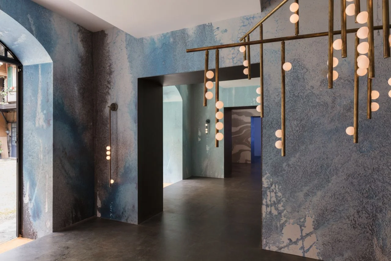
New Yorkers Lindsey Adelman and Rachel Cope of Calico Wallpaper delivered a beautiful joint show called Beyond the Deep based around their common interest in aging effects and salt corrosion on materials. For Lindsey this took the form of aged surface finishes on her new 'Drop' lighting system (shown below right), while for Rachel and partner Nick Cope, the appearance of their new 'Oceania' wallpapers comes from experiments into painting salt solutions onto paper and watching and building on the effects.
Just across the cobbled courtyard Matter, another New York brand, were showcasing the Matter Made collection of designs from the likes of Luca Nichetto and Fay Toogood. The latest news from this exciting brand is a collection of reissued planters from the 50's by Brazilian designer Sergio Rodrigues and Luca Nichetto's new modular lighting system 'Legato' that uses cones that can stack or be clustered in a myriad of ways.
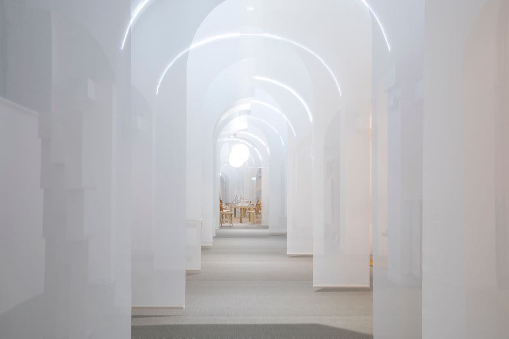
Created by Joyn Studio (founded by Lisa Grape, Helena Eliason and Ida Wanler), the Swedish Design Moves installation HEMMA - Stories from Home brought a huge number of Swedish designers and brands together in a beautiful way. With sections divided by white fabric drops the installation delivers the domestic environment the concept was striving for. For a full list of the dozens of brands and designers who contributed to this show - take a look here.
Exotic wallpaper company Fromental collaborated with London vintage specialists, Maresca Interiors and radical terrazzo suppliers Solomon & Wu in an exhibition entitled Meandros. The organically shaped table and bench items in terrazzo (shown below) were designed by Maresca Interiors using Soloman & Wu's new terrazzo material made from wood and coal waste called 'Foresso', and their cotton waste version called 'Cottoncrete'. The collection of furniture pieces is called 'Creto'.
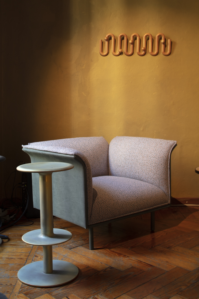
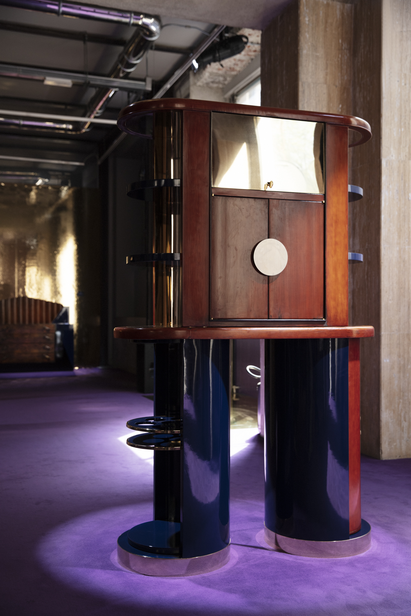
Australia's LOCAL DESIGN set up shop in the amazing but distinctly dilapidated environs of a former palazzo at Cesare Correnti 14 in the 5Vie district. The showstopper was Adam Goodrum and Arthur Seigur's straw marquetry cabinet 'Bloom' (shown left) but all the pieces on show by the 26 designers were well received. The 'Lounge chair' on the right is by Ross Gardam, the stool is the 'Rev' by Adam Cornish for Nau and the wall mounted coatrack is by Fred Ganim.
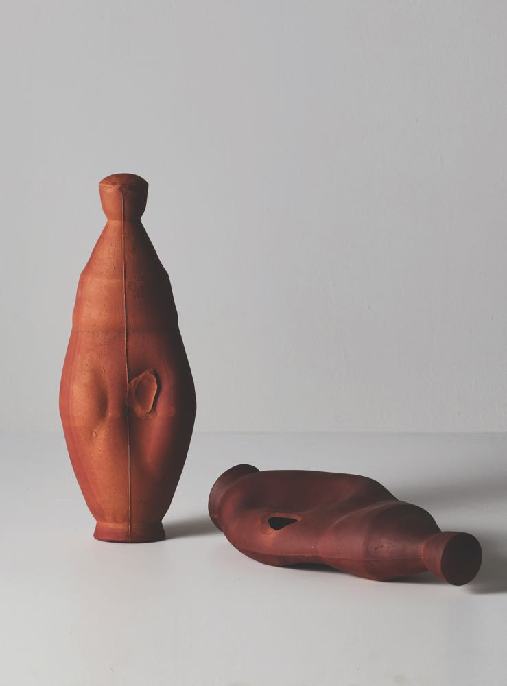
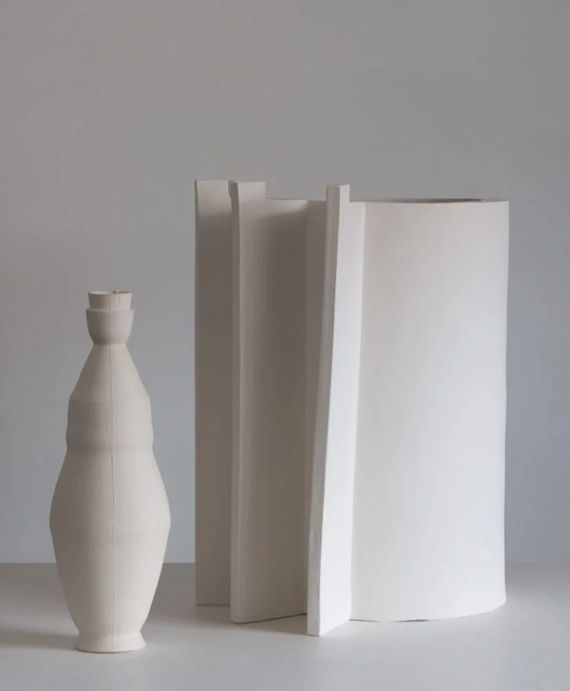
Just around the corner in Via Santa Marta were more Australians - potter Damon Moon and furniture designer Andrew Carvolth partnering to present The Milan Project along with Elliot Bastianon's exploration into cultivating crystals on objects in his show Growth Sites.
Darlings of the Milan design scene, Dimore Studio ramped their Milan Design Week presence up another notch by creating three exhibitions. The first, held in the usual Dimore Studio space involved complex displays of vintage elements inside tents complete with individual soundtracks. Visitors peeked through viewing windows or through rolled back tent flaps. It was all very voyeuristic and a little strange.
The second exhibition Perfettamente Imperfetto was held in another part of the Via Solferiono 11 complex and featured Dimore's contemporary furniture and lighting pieces. The brightly lit, make-shift environment of plastic sheeting and white painted floors that had a eerie forensic feel and at times was like being in a scene from Kubrick's 2001: A Space Odyssey. Each room contained just one item - a chair, a giant lighting piece, or a cabinet full of flowers. Visitors wound there way through a series of rooms not knowing quite what to expect next. It was delight.
The third exhibition Limited Edition was a small selection of Dimore's one-off furniture designs made using salvaged vintage furniture components - mostly from the early 20th century - in burl walnut or similar rich timbers combined with gloss lacquers. The forms were quite radical once Dimore had completed their interventions but the objects retained a strong sense of their past lives.
Envisions are a large group of young Dutch designers who have shown in Milan for the last couple of years and this year once again collaborated with Spanish wood panel manufacturer Finsa on some experimental ideas around composite wood materials. The Envisions approach is not to show the finished product and so none of the materials were actually made into anything, it was more an exploration if what is possible by rethinking the process.
These sometimes involved the dying of wood fibres or chips prior to the manufacturing of panels or by the creation of patterns with veneer offcuts. The results were bright and playful and hopefully kickstarted some future new sheet materials.
One of the highlights of the excellent Unsighted exhibition was the 'Ruins' collection by Italian designer Roberto Sironi. His pieces made in conjunction with master foundry, Fonderia Battaglia and the skilled artificial stone artisans at Marmo Artificiale di Roma were quite extraordinary. The piece on the right 'Hubert', is a bronze mirror so highly polished that the bronze is reflecting the decaying wallpaper on the other side of the room. The coffee table on the left is called 'Baalbek'.
BELOW IS A SMALL SELECTION OF SHOWROOMS AND A FEW STANDS FROM SALONE DEL MOBILE.
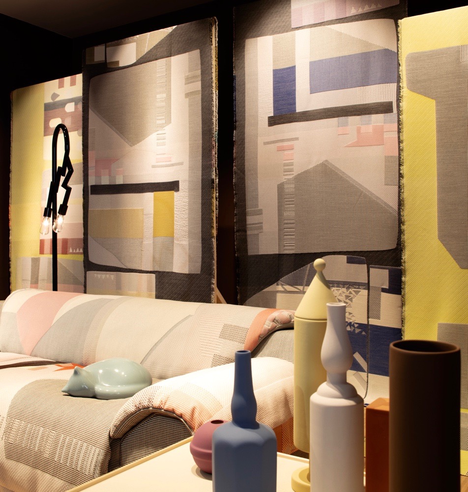
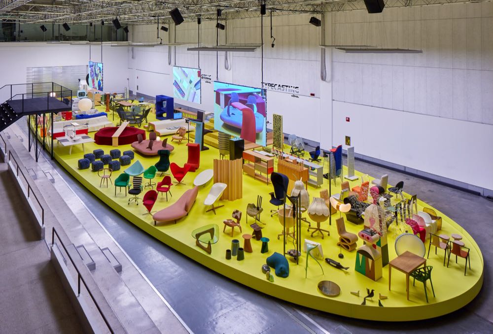
Below left is the new limited edition sofa design 'Vlinder' (Dutch for Butterfly) by Hella Jongerius. The design is more about the special woven covering than about the sofa's shape. The fabric was developed by Jongerius with a dedicated team of textile engineers and hand weavers. "Contrasting colours in the weft, seven structures, and a mix between thick woollen yarns and refined quilted textures form a unique pattern. Vlinder is a master study in weaving. It shows a new way of producing a tailored “one-off” pattern and creating an haute couture sofa" states Jongerius' website about the project. On the right is a small snippet of the Vitra installation at La Pelota in Brera. Called Typecasting, the installation displayed hundreds of Vitra pieces in a giant oval on the floor of the famous futsal court. While some were production pieces many were rarities and prototypes.
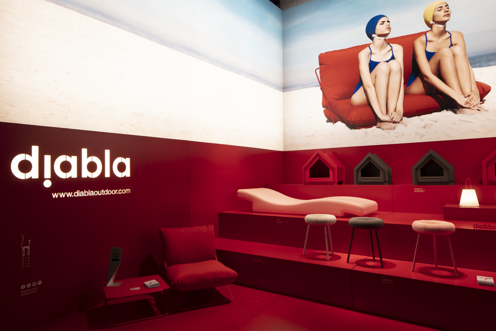
Its always interesting when a newcomer hits the boards during Salone. This year Spanish outdoor specialist Gandiablasco launched a new outdoor brand called Diabla. Aimed at a younger, more fashion conscious audience, the look is simple and cool with great supporting imagery.
The Baxter stand at Salone del Mobile was dark and moody, with a high level of luxury on view. The stand (to call it a stand is a bit of an understatement as it is at least the size of an average house) presented a lovely selection of luxury pieces including work by Design daily favourites, Pietro Russo and Vincenzo de Cotiis.
B&B Italia do not show at Salone del Mobile so their flagship store (right next door to rivals Cassina) is always flooded with press and dealers during design week. The news this year were new pieces from Piero Lissoni with the 'Eda-mame' chaise, Michael Anastassiades' 'Jack' shelving/room divider, and a sofa system called 'Atoll' from Antonio Citterio, along with a host of items from Naoto Fukasawa - a sofa, side table, dining table and dining chair. The designer Paolo Piva who passed away last year, was remembered for his contribution to the brand by raising the profile of his B&B classic the 'Alanda' coffee table that was designed in 1982.
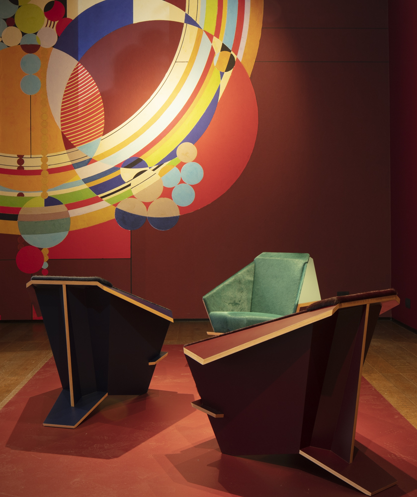
Cassini showed of their newly revamped flagship showroom this year celebrating fifty years in the Via Durini location. To mark the milestone they reissued a slew of interesting designs that range from the 'Taliesin' chair by Frank Lloyd Wright (1949) (shown below left) to Vico Maggistretti's 905 dining chair (1964) and a Gerrit Rietveld chair from 1927 called 'Beugel'. Below right is Ronan & Erwan Bouroullec's new 'Cotone' side chair and table. Other new items included a range of dining tables by Michael Anastassiades called 'Ordinal' and a new modular sofa by the brand's creative director, Patricia Urquiola, called 'Bowy'.
We could go on.......but rest assured that the next Design daily post will provide an equally tasty hit of design as we do a whirlwind round up of the 50 BEST NEW PRODUCTS from the fair. Ciao for now.

