After a brief hiatus to write up a few reports for magazines, Design daily is back with a comprehensive round up of products installations and events that were inspirational, moving or just plain clever. Design is a many faceted thing so to attempt to round up what was good from a hard-nosed industrial design perspective to beautiful art pieces and everything in between is an extremely tall order. In the end it has to be a very personal selection and while I pounded the streets for 7 days I have to admit that I never seem to manage to see everything that is on offer. Not withstanding this, I hope you enjoy part one of D.d's snapshot of Milan Design Week.
Black and white marble is always a strong theme in Milan but this year it went further than normal with a Marsotto Edizioni installation by Nendo called 'Light and Shadow' with a split room in two by white carrara marble objects on one side and the identical objects in black marquina marble on the other.
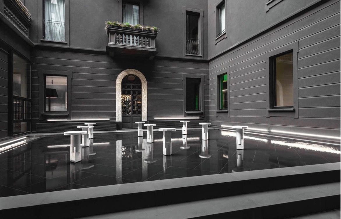
Joining Nendo on the theme was a beautifully tranquil installation of carrara tables by OEUFFICE for Lebanese design gallery Carwan, at the Senato Hotel.
Its hard not to mention Moooi's marble piece at their show at Via Savona 56 in Tortona. Designed by Paul Cocksedge 'Caution: Heavy!' takes a huge chunk of carrara marble and shapes it into a sort of squashed piece of foam - making something hard look soft......geddit? I'm not sure whether they are related but the image below shows a crack in the floor running right underneath the middle of the piece.........'Caution: Heavy!' did weigh in at 6 tonnes.
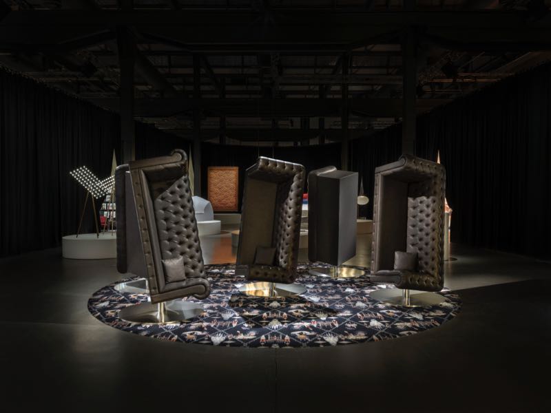
While I had some affection for Cocksedge's giant folly in marble, I had no such feelings for Marcel Wander's ridiculous chesterfield sofas upended as lounge chairs called 'Charleston'. I may have missed it but I didn't see them dance. I'm all for Moooi's irreverent approach but with this they seemed to have crossed the line from irreverent to irrelevant.
Thankfully Bertjan Pot restored some clarity to the Moooi vision with his 'NR2' floor lamp. A very poetic extension of his work in spun threads that started back in 1999 with his 'Random' pendant light, the lamp is intricate but simple at the same time. Umut Yamac's 'Perchlight' series is an unconventional lighting collection in six variations made from folded synthetic paper and brass.
At Cassina the big news was the arrival of Patricia Urquiola. Late last year, after many years of designing for B&B Italia, the Spaniard jumped ship to become Cassina's creative director. For salone this year she released her first Cassina pieces - a wonderful modular sofa system called 'Beam' that revels in it's industrial qualities - and an oddly proportioned lounge called 'Gender'. Both pieces pay homage to the work of Vico Magistretti (his 'Sinbad' seating for Cassina in particular). This is not surprising as Urquiola worked with Magistretti for several years during the 90's.
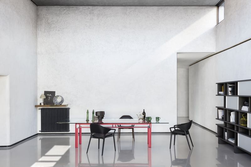
Also from Cassina were a large range of mirrors by Ron Gilad that explored his familiar territory of optical illusions and in contrast a set of highly industrial table / dividers by Konstantin Grcic in bent raw steel. Anyone familiar with Classicon's range will see a striking resemblance with Grcic's 'Diana' tables from 2002 but these are much larger in size and far more raw.
While big brands like Cassina and B&B Italia tussle over who gets to boast about Patricia Urquiola now, small but agile Danish brand HAY put on a stellar performance at one of Milan's most difficult venues, the vintage futsal (indoor soccer) court called Pelota in Brera. This wonderful but cavernous space has seen some design history in recent years with Established & Sons creating three impressive exhibitions there from 2008 - 2010. This must have been a poignant moment for Sebastian Wrong who was once the creative director of Established & Sons and is now the head of Wrong London, a lighting brand that shows and works in collaboration with HAY. Wrong.London was formerly known as Wrong for Hay but will now specialise solely in lighting to avoid confusion with HAY's interior products.
The big product of the moment was the 'Can' sofa and armchair by Ronan and Erwan Bouroullec. HAY has had great success with its 'About a chair' collection in particular but to crack the sofa market is something that has eluded them. This design should be a huge success as it combines flat pack assembly for reduced cost with a high level of comfort. The look shares something of the qualities of both the 'Basket' and 'Alcove' sofa designs by the Bouroullecs for Cappellini and Vitra respectively.
In addition to the sofa there was a fantastic new stacking chair and stool design 'Softedge' by Iskos Berlin and a lovely new compact armchair by Doshi Levien called 'Dapper'. Wrong.London released a number of new lights including a great desk lamp by Pierre Charpin called 'PC'.
Within the exquisite interior of Palazzo Clerici, Dutch gallerist Thomas Eyck celebrated 10 years in the business with an exhibition organised by the Zuiderzee museum. 'Oak Inside' a series designed in 2011 by Christien Meindertsma was the fairy tale focus while Wouter Paijmans hand riveted - then crushed - aluminium to form a dramatic backdrop.
Across the road at Circolo Filologico Milanese, GamFratesi created a warm red interior covered in custom carpeting to showcase their selection of Danish crafts for Mindcraft16. The works ranged from the incredible purity of Cecilie Manz's 'Sølvgade' chair to the extraordinary ceramic and timber pieces 'Heavy Stack' by Maria Bruun and Anne Dorthe Vester and the delicacy of cabinetry in glass and maple by Akiko Kuwahata. For more take a look at the Mindcraft16 website here.
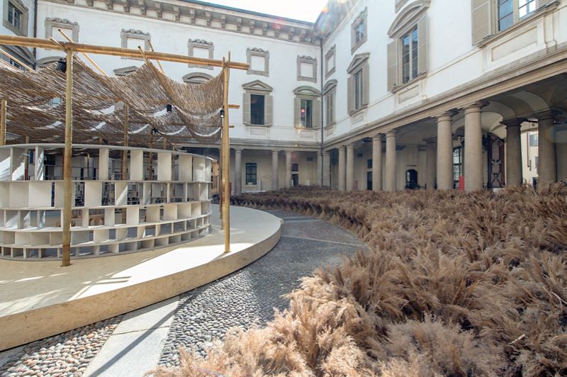
Palazzo Litta, a beautiful palace on Corso Magenta hosted A Matter of Perception: Tradition & Technology a large event organised by DAMn magazine. The event featured a courtyard concept by Diébédo Francis Kéré that evoked a rural village.
Inside the event showcased very varied works from the decorative qualities of Brazilian designer Leo di Caprio (yes, his real name) to the minimalism of Jasper Morrison's products for Punkt and the lighting concepts of Daniel Rybakken - all within the incredible architecture and interiors of an 19th century building.
A large Belgian contingent called Belgium is Design also showed along side famous names such as Maarten Baas, Andrea Branzi, Michele De Lucci and Alberto Meda. For more check out on the DAMn website here.
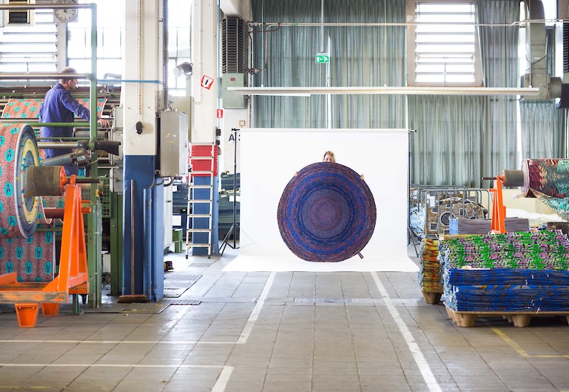
While the Dutch organisation Ventura Lambrate was weaker than previous years (partly due to a few players moving to Isola, a small new district near Porta Garibaldi), there were still some gems to be found. Newish Dutch brand, Label Breed, showcased its new collection of interesting and sustainable design items including a rug by Simone Post called 'Carpet Vlisco Recycled' made from waste Dutch wax fabrics (commonly worn in Africa) and a light weight dining chair made from scrap carbon fiber from the aerospace industry by Marleen Kaptein.
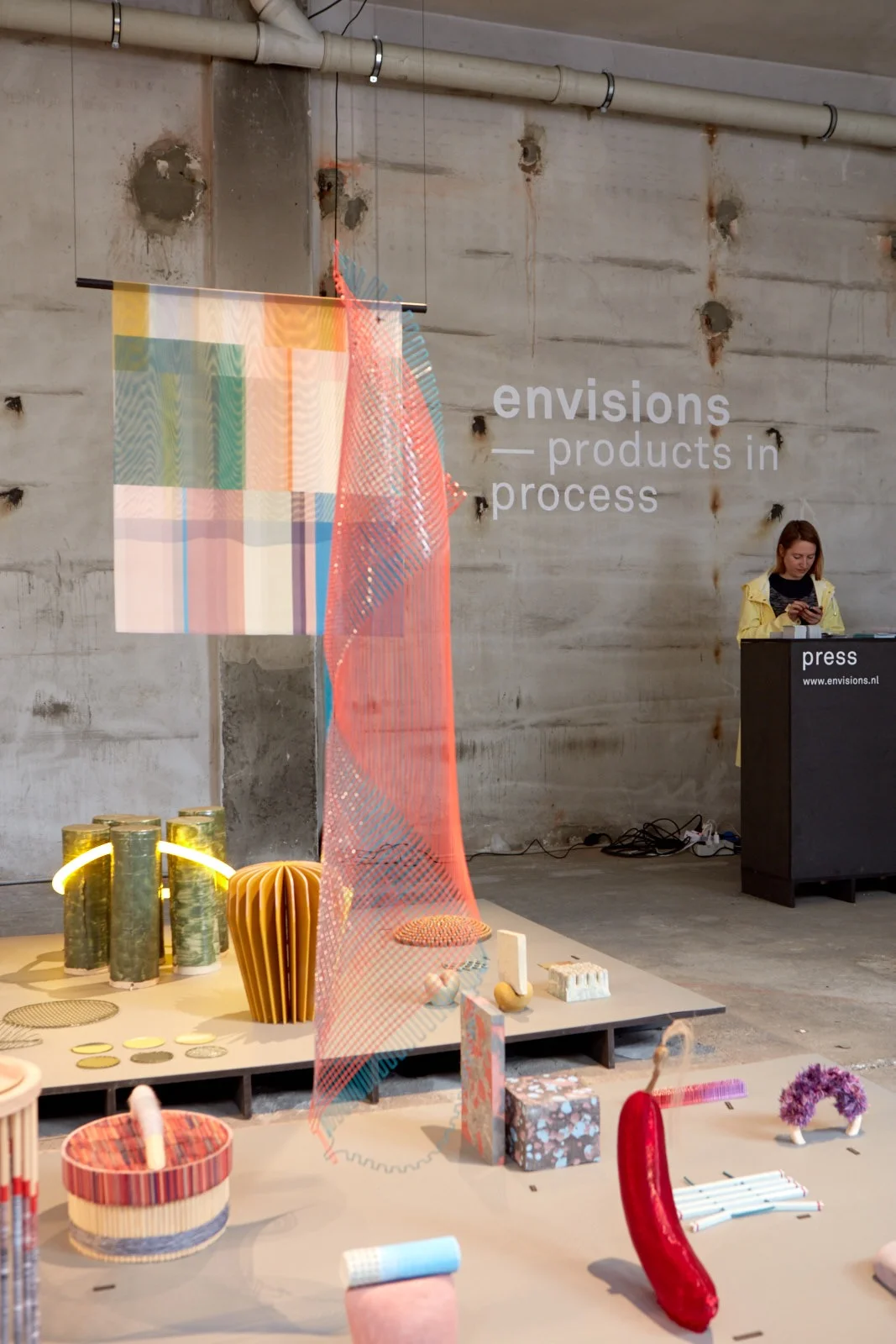
Not all design exhibitions revolve around finished product. Envisons : Products in Process was a show curated by nine designers to show just the process with no final products anywhere in sight.
Participants included — Adrianus Kundert, Bastiaan de Nennie, Iwan Pol, Jeroen van de Gruiter, Sanne Schuurman, Simone Post, Plott studio (Rudi Boiten and Mireilli Burger), Studio Truly Truly, Tys Gilde.
Other work of particular interest in Lambrate included Thomas Vailly Studio's 'Colour of the Day' clock which presented crystalline colour fragments as a time piece. Don't ask me how it works but it was mesmerizing to look at.
Baars & Bloemhoff are an materials supply company from the Netherlands. The Transitions project shown at Ventura Lambrate, asked 6 designers to reinterpreted the way certain materials could be used. Lex Pott, Studio Mieke Meijer, Visser & Meijwaard, OS ∆ OOS and others obliged.
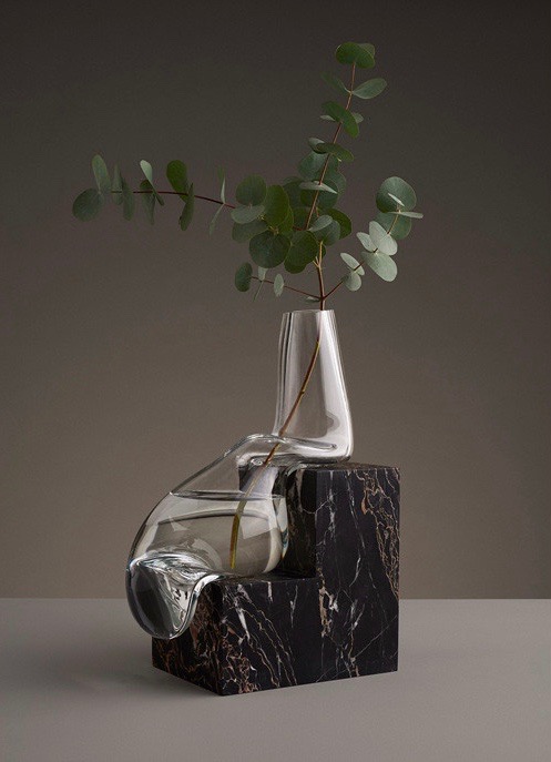
One of the most appealing things about Ventura Lambrate as an event is that it brings together prototypes, finished products and conceptual pieces and installations. This allows for a project such as Baars & Bloemhoff's 'Transitions' to exist right next door to something as poetic and artistic as the limited edition work of Iraqi-born Hozan Zangana. Highly sculptural and sensual, the work explores shape and materials in a way that is only matched by Aldo Bakker and Swiss designers Dominic Plueer and Olivier Smitt (PlueerSmitt).
Another stimulating thing about Milan Design Week in general, is the number of venues spread across the city. Beyond making the week highly interesting for journalists and other visitors, it also enables designers to show their work in new locations each year. Having seen the work of Erik Olovsson in collaboration with Kyuhyung Cho at Rossana Orlandi for several years, it was a nice surprise to come across him showing solo at Ventura Lambrate. This year he presented some amazing glass and stone pieces using stone specific to areas of Sweden in addition to simple timber stool and storage crate designs under the name Studio E.O.
As in previous years Klubben, a platform to support Norwegian designers, in conjunction with Jotun and Norwegian Crafts, created a beautifully restrained exhibition of work presented within the context of blocks of pastel pinks and earthy colours. The work included pieces by established Norwegian designers such as Andreas Engesvik, to up and coming artists and designers such as Elin Hedberg, Vera & Kyte and Sverre Uhnger. For more check out the Norwegian Structure website here.
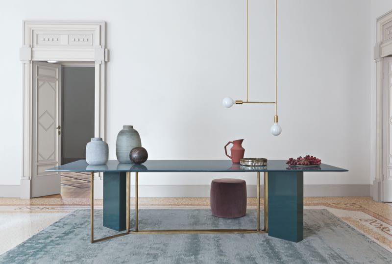
And just to prove that I'm not totally obsessed with new products I am finishing off this post with a product launched at last year's show that has been re-photographed and deserves another round of exposure. The 'Plinto' collection from Meridiani is an incredibly versatile design that works equally well in round, rectangular and square formats.
Stay tuned for next week's Milan Design Week Part 2 when more delicious new design will be revealed!


