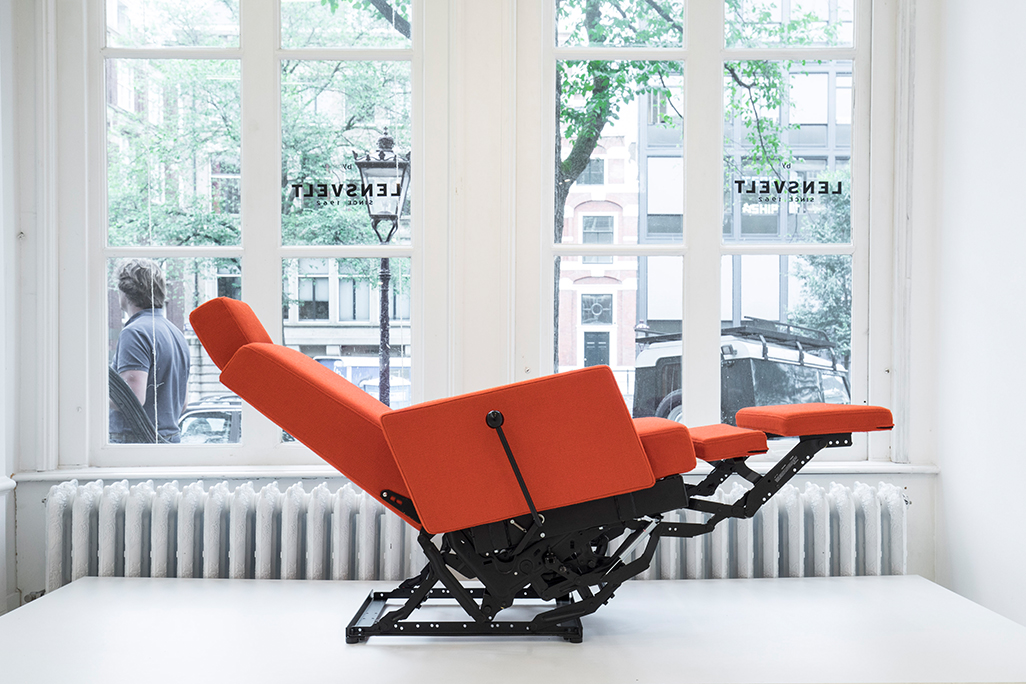
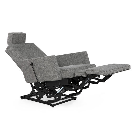
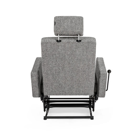
After years of disparaging comments on the human desire for comfort over art, Design daily has caved in and accepted that a little comfort can actually be very nice. Taking possibly the ugliest furniture category and turning it into a striking piece of furniture, Atelier Van Lieshout has shown that the 'lazyboy' recliner can be quite beautiful in the hands of the right designer.
The intriguing development of the 'Lazy Modernist' chair points to a completely different style of design not often touched upon by Design daily – the accidental discovery. While design might be perceived as an art form where diligence and experimentation lead to exciting creative outcomes, design can equally be a consequence of a chance encounter. It would seem that Dutch artist Joep van Lieshout was the recipient of some divine good luck and then applied his considerable design skill to reinventing the physical appearance of a long maligned furniture category.
The 'Lazy Modernist' chair started out life as a road side throw away, a discarded piece of junk. Joep van Lieshout found an old Chinese-made Lazy Boy at Rotterdam's garbage disposal and dragged it back to the studio where he removed the upholstered elements that make this particular sort of chair so objectionable. With new foam elements on the remaining frame, van Lieshout transformed an over-stuffed Michelin man style object into a lean, mean sitting machine. There it sat unfinished but well loved in the studio of Van Lieshout until Hans Lensvelt made one of his regular studio visits and saw the raw dissected chair and was immediately sold. Seeing through the hastily applied foam blocks and the clunky mechanism, Lensvelt accepted the challenge of developing the chair into something that combined flexibility, comfort and mechanical dexterity.
One of the more memorable installations Design daily has attended over the last few years when visiting Ventura Lambrate during Milan design week was the WWIII installation by Atelier Van Lieshout for Lensvelt in 2012. Everything was painted or upholstered in the same shade of blue - with an enormous blue but very real artillery gun as the centrepiece. The installation reiterated Van Lieshout's strange fascination with over-scale objects and incongruous colour.
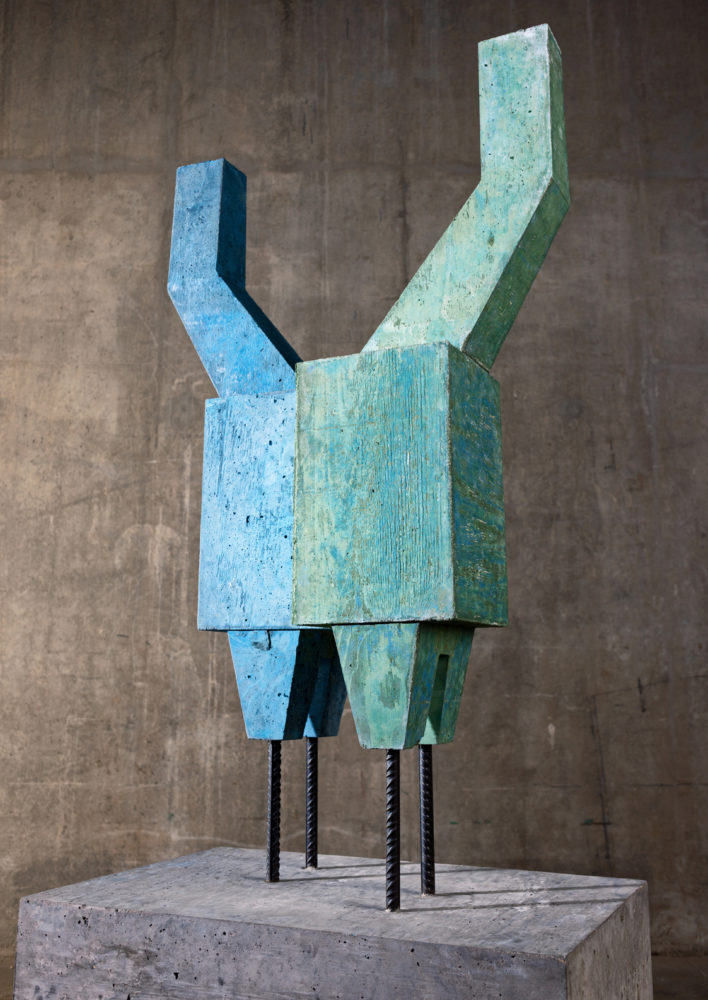
While Van Lieshout is primarily a sculptor he has collaborated with Lensvelt on a number of projects for nearly twenty years. These have range from furniture designs to installations. The Dutch artist is most well known for his oversize objects made from moulded polyester and his featureless human figures but he also creates large architectural works in steel. His work has been exhibited in MoMA, New York, the Hayward Gallery, London, and Centre Pompidou, Paris. For a proper insight into the colossal body of work created by Van Lieshout take a look at his website here.
The collaboration between Hans Lensvelt and Joep van Lieshout started at the end of the nineties. In 1998 and 1999, Atelier Van Lieshout's installation 'The Good, The Bad and The Ugly' was frequently talked about. This strange work of art involved the joining together of a small weatherboard house (known as the Black House) and a American trailer home. The juxtaposition of these two incongruous elements fascinated Hans Lensvelt as did the rawness and simplicity of the Black House interior.
"We lived in the time of Minimalism. The works of Tado Ando, Wiel Arets, Maarten Van Severen, Jasper Morrison and John Pawson dominated the media. I appreciated, and still appreciate, this minimalism. The austerity, the orderliness, the technicality, the sophistication, the rectangular shapes."
Hans Lensvelt
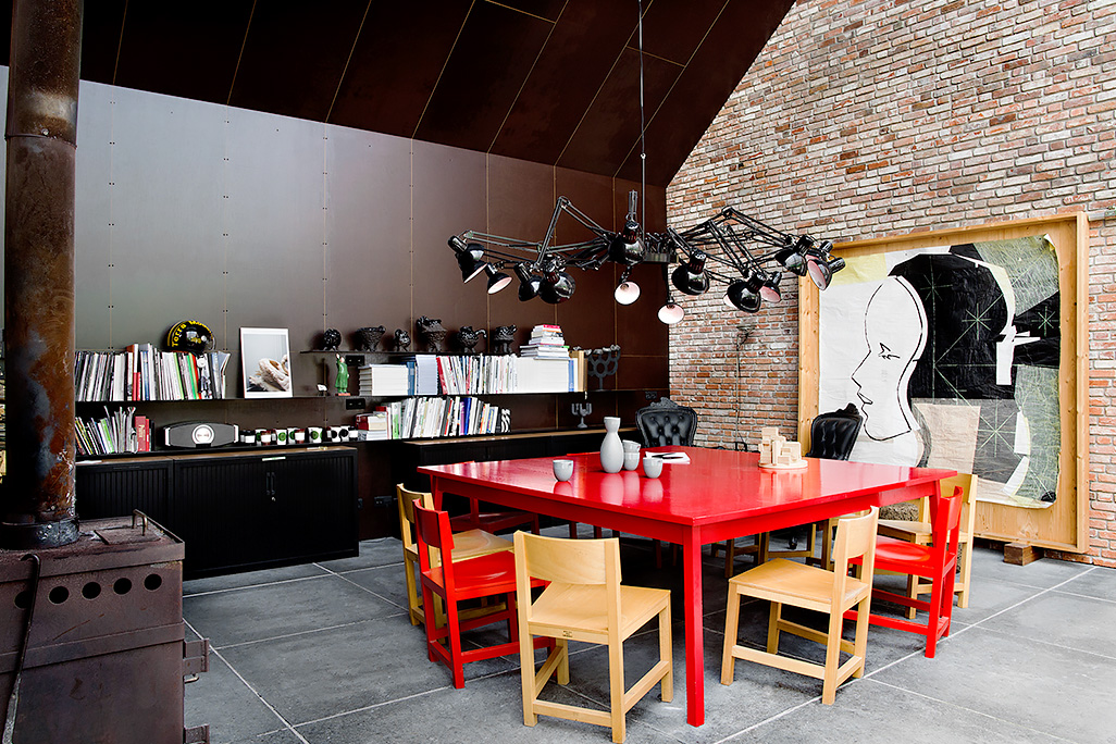
The Black House included furniture pieces with a simple, modern minimalism that explored a variation on the Shaker aesthetic. This style struck a chord with Hans Lensvelt and he pursued the studio hoping to add the designs to the Lensvelt collection.
"I wanted to develop the tables and chairs used in The Black House as a standard product for my collection", says Lensvelt. "At that time, I did not have a fully wooden chair in the collection and this seemed to me a particularly valuable addition. Twenty years later, Joep van Lieshout revealed to me that the interior of The Black House was actually a last minute addition. They had totally forgotten to create an interior, and it was built in one hour."
The 'AVL Shaker' chair and table have become important pieces of contemporary design and were licensed by Moooi for a number of years. Now back in the Lensvelt catalogue the design continues to be much specified item for domestic interiors and communal spaces alike.
A Moooi promotional image of the AVL Shaker chair with photography by Erwin Olaf.
Back to 2017 and the 'Lazy Modernist'. Like many of Lensvelt's products such as Richard Hutten's 'No Sign of Design' chair, The 'Lazy Modernist' has a stripped back design sensibility. This is a no fuss solution.
The 'Lazy Modernist' chair is available from Lensvelt in two standard fabrics: Lensvelt Uni Black and Kvadrat Hallingdal. The chair is priced from 1049 euro.

