I'll own up right from the start that I'm not normally a big fan of marble furniture. I find it pleasant enough but just far too predictable. It's a bit like glass furniture - it has to be something really special to avoid becoming incredibly dull. In other words it takes a lot for me to sit up and take notice of something made from marble. Happily a bunch of designers have been creating some wonderful objects in this ancient stone of late and forced me to reconsider my curmudgeonly view.
The marble lights of Swedish design group Studio Vit, are a perfect place to start on what can be so right about using marble. First revealed at Salone Satellite in 2012 they were an immediate hit with the press but it has a taken a few years for this to filter through the system and become an actual purchasable product. In early 2014, the Danish Company, &tradition released the light under the name the 'SV3' pendant. In the hands of Studio Vit the lamps were the opposite of the excessive luxury usually found when marble is used. Instead it was all about proportion and simplicity. With a range of five different sized cylindrical 'collars' and three sizes of glass spheres to choose from, the lights can be tailored to the user's personal sense of proportional perfection. It seems unfortunately that the exquisite floor version is not going to be released. Prototypes of this involved a hollow marble base ring through which the cable ran - the idea being that the weight of the base ring clamped off the cable to suspend the pendant at the desired height (using a hook in the ceiling or a convenient beam as seen below). Whether its non-release was due to safety concerns I'm not quite sure but we might have to start a petition if &tradition don't release it in the near future.
GamFratesi know how to bring together predictable elements in new and spectacularly beautiful ways. So it is with the Danish / Italian duo's new 'TS' table for Danish brand Gubi. Released during Milan Design week in April, the table is said to be inspired by 30's architecture. The 'TS' name is short for 'The Standard' and the table comes in four different types of marble: Verde Guatemala (green), Marrone Emperador (brown), Nero Marquina (black) and good 'ol Bianca Carrara (white). The look is very different in the different marbles but always retains a certain 30's dapper quality. This could be the perfect modern side table for deco interiors.
British designer Lee Broom is well known for his cut crystal lightbulb pendants and other lighting and furniture designs that show off lashings of old world glamour. His 'On the rock' glasses released earlier in 2014 offer a far more contemporary take, combining smooth rounded shapes in crystal and marble.
Brooms interest in these two materials has led to some new products that will be released during London Design Week: The 'Nouveau Rebel' pendant lights and the 'Globe' table light. The former are a range of pendants that use a thin marble diffuser with a blown crystal shade.
The effect is of something organic trapped in a glass case. 'Globe' uses the same material mix but in a radically different form - a 40cm diameter carved piece of marble with a light source hidden beneath a thin sheet of marble and covered by a dome of crystal. The soft glow through the marble is quite magical while the glass offers a contrasting sharp line of reflected light.
Australian design studio, Blakebrough+King have also been doing a little work in marble of late. Commissioned by Absolut Vodka to create something special for the brand's premium vodka Elyx, launched in Australia a couple of weeks ago, the studio developed a drinks trolley like none you have ever seen before. 'Elyx Martini Trolley' is just the first of a number of products the studio is designing for Absolut.
Carved from slabs of marble and carried by a copper plated trolley, the design epitomises the obsession that is Absolut. Specifically geared to the preparation of the perfect dry martini, the trolley shows how white marble can capture luxury and simplicity simultaneously. The final outcome was a collaborative effort by Sarah K and Ben Blakebrough from Blakebrough+King, along with Sarah Spackman, from the Fortynine Studio, who designed and made the copper Vermouth atomiser. The copper stirring spoon is by Studiokyss.
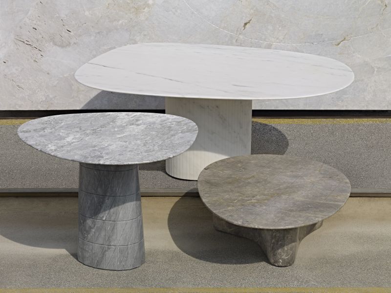
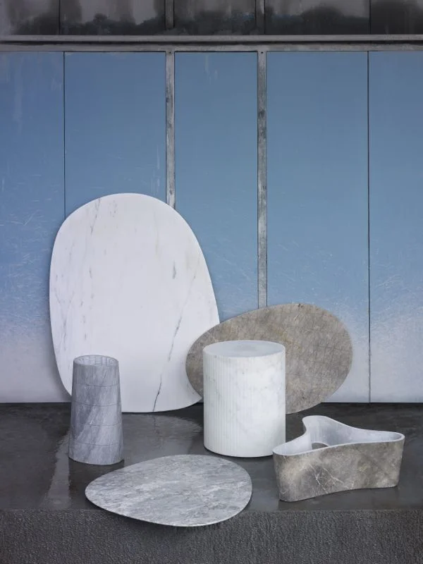
Scholten & Baijings are not normally associated with earthy products but in a recent collaboration with Italian marble company, Luce di Carrara, they proved that their sophisticated design sense doesn't only translate to brightly coloured and patterned objects. With a subdued collection of tables and table accessories that exploited shape over colour and that showed only subtle references to pattern, Stefan Scholten & Carole Baijings presented a new approach to the use of stone. Very soft natural finishes were used to avoid any sense of excessive bling.
Another new product in marble that will be released during London Design Week is a clock by Dutch based design studio Formafantasma. Designed for British brand Established & Sons, the clock is as minimal as it comes. The time is read from the veining pattern of the marble on the smaller disc relative to the light grey / dark grey veining on the rear disc. Reading the twelve and six o'clock times is perfectly simple but the rest may take some getting used to - there are no hands or numbers, just two discs of stone.
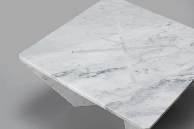
The last in this collection of newish products in marble was commissioned by New York's Cooper-Hewitt Museum as a limited edition offering for the museum's shop. 'Annexe' is a side table and coffee table of flat sheets of marble. Conceived like a flatpack design only in precious Arabesque marble, the tables are made from only three pieces so that assembly takes just a few seconds (but a little bit of muscle).
Designed by American Joe Doucet, the table's shape is water-jet cut, then the pieces are honed by hand. Due to the slot together design and the weight of the marble no fixings or glue are required.
So there you have it. Who said we had seen everything marble had to offer? This old fashioned material seems to be going through yet another period of innovation with a large number of designers creating extremely simple but evocative works in furniture lighting and accessories. Yes, there are still companies who think that innovation is carving Alessandro Mendini's 'Proust' chair in marble but this can hardly be termed design. Technology is one thing but for design to really work it needs to be more than just a by product of a new whiz-bang multi-axis cutting machine.


