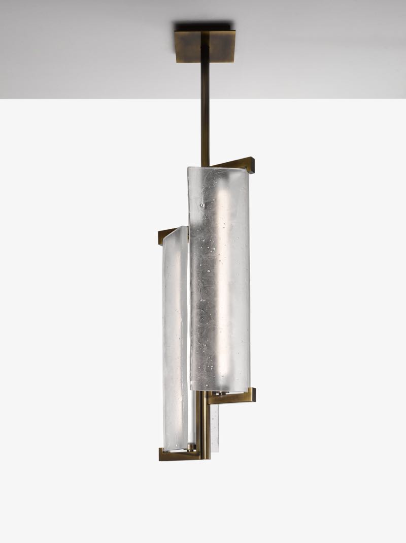
Lighting is going through a bit of a transformation and its nothing to do with technology this time around and all about composition. There is a general race to embrace minimal concepts involving fundamental shapes. Cones, spheres and long thin bits of tubular steel. Some of these new designs are really extraordinary but just as with any strong trend there are a lot of less original designs that pursue the look and fail to be totally convincing. Although this style of elemental light can be traced back to Vico Magistretti's work for Artemide and Oluce in the 70's and probably even earlier, the influences on the current wave of designs really started much more recently - in the early to mid 2000's when British designer Michael Anastassiades’ ideas around geometry and balance first began to emerge. His influence on 21st century lighting design has been rather profound.
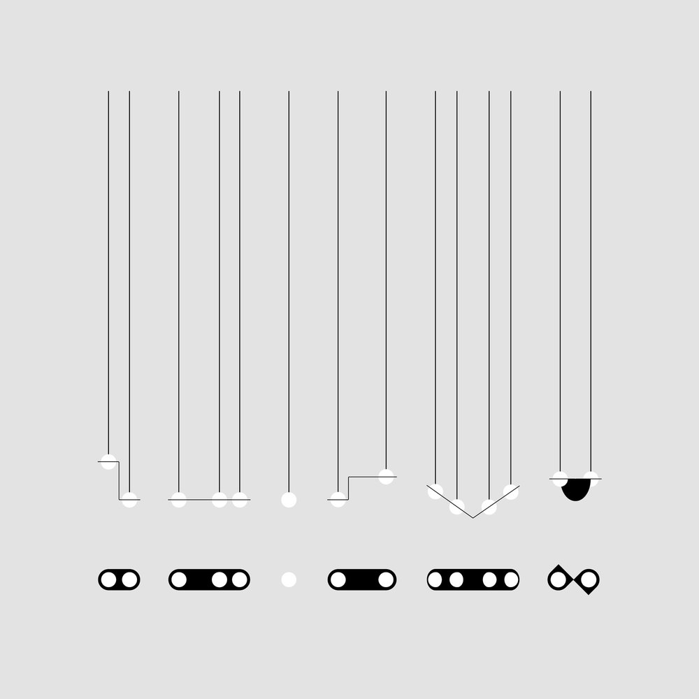
In response to the number of wonderful lights popping up on a regular basis Design daily, has decided to put together a round up of the hottest tickets in the lighting sector for 2016. There are still 4 months to go before the year is officially over so there may well be more brilliant lights in the pipeline but what the heck, lets just go for it. The list showcases a large number of the elemental geometric designs mentioned earlier but includes a couple of other lights with a more organic expression as no trend exists in splendid isolation and not everyone wants a light that looks like a 3-D version of one of El Lissitzky's Constructivist artworks. The 'Node' lights of Amsterdam based studio Odd Matter (Els Woldhek & Georgi Manassiev) below, exemplifies the constructed approach with its actual on/off mechanism becoming part of the overall composition and emphasising the essential role electrical circuits play in lighting.
The interplay of shapes can be far more gentle when translucent materials are involved, so while the fashion is for brass, stone and painted metal components, glass works beautifully to combine the graphic qualities of pure shapes with areas that blur the lines a little. A good example of this is the 'Papillon' wall lights by Bernhardt & Vella released by Italian brand Arflex. The soft hues and the overlapping components present a simple graphic look with a small amount of added complexity.
As mentioned earlier, marble has been a prominent player in new lighting design whether it has been used in a traditional way as a base or as a translucent shade. Advances in stone cutting technologies has made this process a possibility and the results are always interesting as the material offers a conflicting sense of weight and solidity versus translucency and fragility.
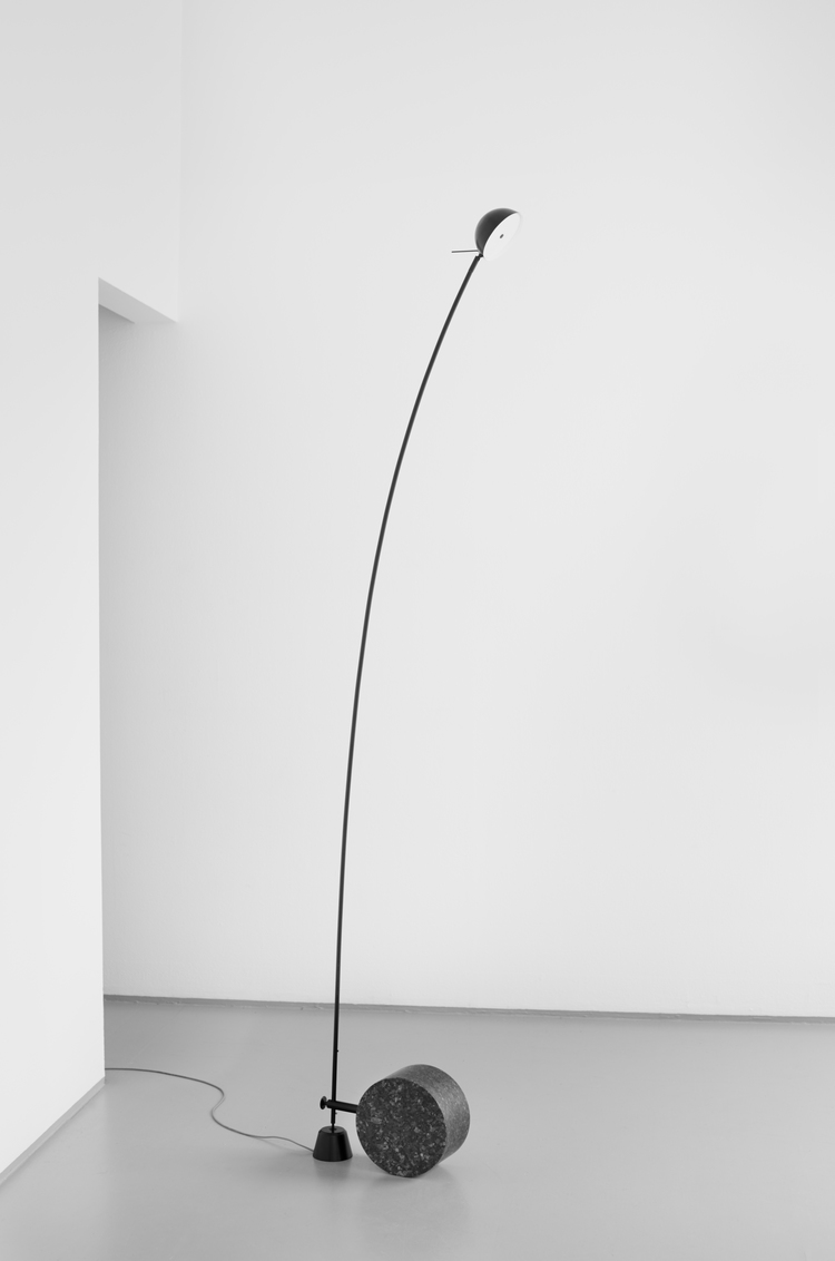
It is shape however that creates the most immediate impact on most lighting designs and recent trends have seen shapes become simplified and decorative elements stripped back to reveal the basic function of a light. These shapes are often borderline industrial as in the 'Balancer' light by Yuue Design above but the best of the genre also reveal a poetic side that initiates an immediate emotional response. The sculptural qualities of many of these designs means they are no longer just a source of light but art pieces in their own right.
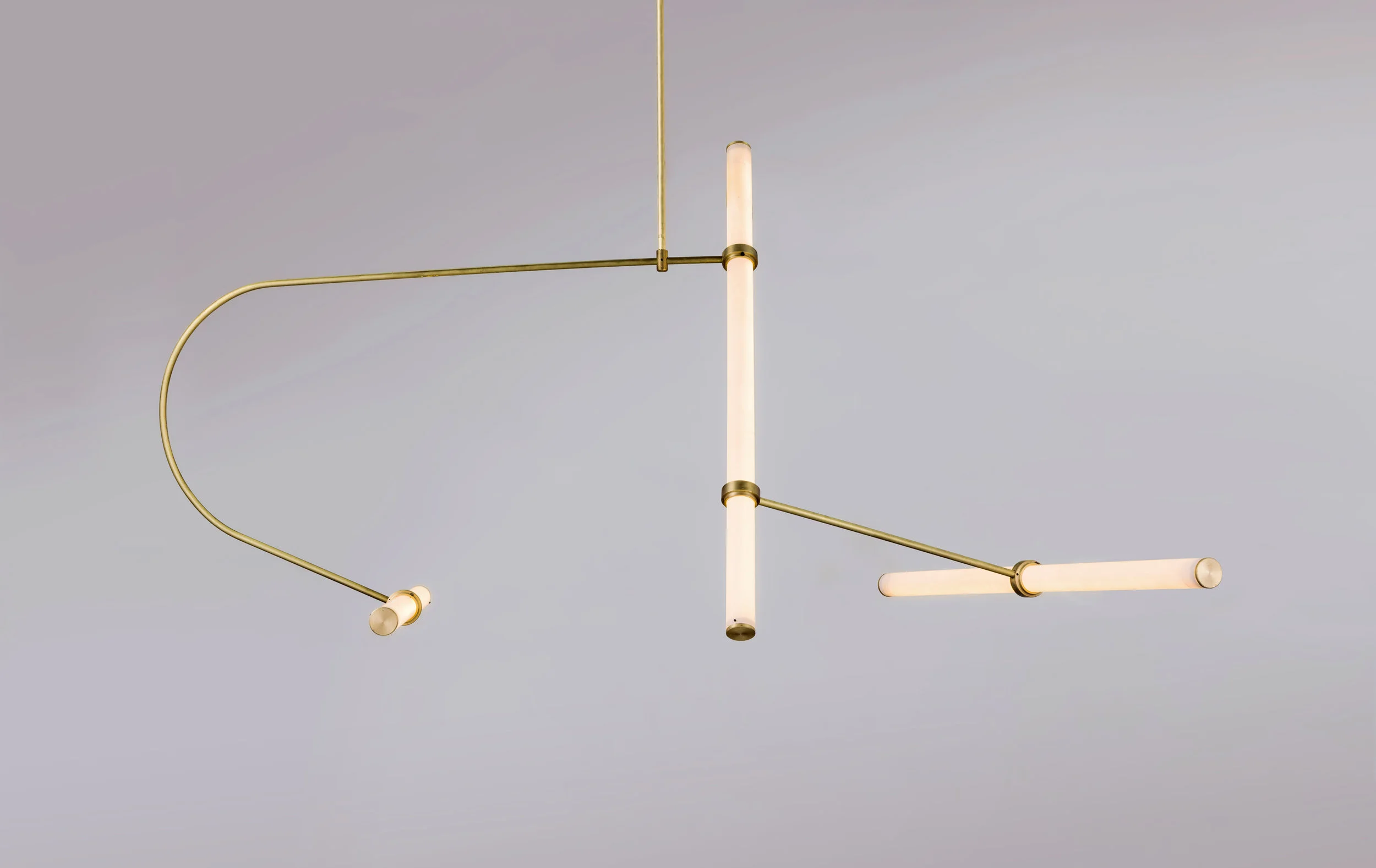
Artistic balance seems to be a key factor in many of the lights shown in this post. In the 'Ariel' light (below) by Norwegian designers Bjørn van den Berg & Falke Svatun for example, a solid cylinder of stone grounds the design visually and physically while and extraordinarily fine arm stretches to a disproportionately small shade. It is these artistic decisions which have made this light so alluring and which if treated differently would most likely have failed to achieve such a wonderfully expressive result. In a similar way the 'Mobil' pendant by Monika Mulder (above) is all about an expressive line and the contrast between the white and black elements. In both designs there is a strong sense of dynamic tension but overall it feels 'right'.
The graphic power of fine lines against the flat plane of a wall is being explored by a host of lighting designers of late, some working in a more intimate manner as in the 'Pin' lights by Ichiro Iwasaki (above), while others choose to make a grand gesture as in the 'Volta' pendant by Spanish designers Nahtrang Design (below).
In recent years the humble electrical cable has become an important feature of many lighting designs. As seen in the 'Laurent' light from Lambert & Fils (below), the cable emphasises the graphic qualities of the light itself and when the lights are hung in combination an exciting interplay of lines can be achieved. This scenario first came to light (pardon the pun) with Michael Anastassiades' 'String' light for Flos in 2013. The shade itself was either a simple cone or sphere but due to the extra long length of cable supplied with each light, was able to become something akin to giant piece of string art.
The use of black cable as bold motif or line drawing has continued apace since then with releases from DCW Editions and Ladies & Gentleman encouraging users to experiment with the zig zag route of the cable as much as the final position of the shades. Czech designer Lucie Koldova's new design for Brokis called 'Puro' (below) also relies heavily on the expressive use of electrical cable. In this case it is the contrast between the thin cable and the bulbous middle elements that are the defining elements of the design.
The 'Knot' pendants (below) by Italian design studio Chiaramonte Marin are another new design from the Czech glass lighting specialist Brokis. These lamps feature a twisted rope flex that passes right through the hand blown 'spheres' that lends the design a seafaring character, reminiscent of fishing bouys and the like. An LED light source is concealed under a brushed brass cap helping to highlight the rope within.
One of the most exciting creators of original lighting designs are New York based Apparatus Studio. In four short years they have found a place in the lighting's venn diagram where traditional craft, geometry and a modern interpretation of where mid century modern and art deco all intersect. The use of materials as diverse as bronze and horse hair make their work closer to art pieces than industrial design however the construction of their lights remain rooted in old-school small industrial processes. The 'Circuit' lamp pictured below, is assembled and finished by hand reflecting the brands devotion to a level of craftsmanship that is rarely seen today.
Formafantasma's attitude to lighting design is quite unique. In their hands the concept of light becomes an expression not only of materials and craftsmanship but also several less tangible aspects such as history and the emotive qualities of light. Their 'Delta' table light (below) was part of an extensive Design daily post on Formafantasma's Delta collection shown at Design Miami Basil and you can read about it in detail here.
While this post predominantly provides a look at lighting that exhibits a minimal geometric style, there have been some interesting examples of lighting concepts where minimal meets flamboyant. The 'Balloon' lights by Matteo Zorzenoni are a good example of this as they combine a simple ceramic lozenge shape with a fabric shade that resembles a crown, complete with a slightly eccentric little 'cherry-on-the-top' jewel-like fastener.
Australian designer Ross Gardam has achieved the simplification of shape in his 'Polar' table lamp in an ingenious way. The body of the light is made from slip cast ceramic that is left unglazed and is therefore extremely matt while the light source and reflector are housed in the tilting flat disc that would otherwise be called a 'shade'. The arm of the disc is held in place magnetically. Like his 'Ora' desk lamp this is a beautifully engineered lighting design and one that explores totally new territory.
All the lights shown in this post so far have been powered by electricity........well I guess thats how the majority of lights work. The 'Candela' light be Francisco Gomez Paz for new lighting brand Astep, is a very different affair however. Candela uses ethanol (a sustainable plant derived fuel) to create light much in the way of a traditional hurricane lantern but it also generates a low level electrical charge in the process so that phones and tablets can be charged via USB at the lamps base. Traditional aesthetics and 21st century needs both addressed in the one lamp - thats pretty good! AStep is a Danish lighting company founded by Alessandro Sarfatti, the grandson of renown Italian lighting designer Gino Sarfatti. As a consequence the brand has launched with not only Gomez Paz's brilliant Candela but also several important reissues of Gino Sarfatti and Vittoriano Viganò designs from the 1950's.
This list has been an attempt to bring together the lights that Design daily has been most excited by over the last 8 months. The list could go on but like all good things this post must come to an end so what better note to go out on than a sustainably fuelled, iPhone charging lighting design from a great new brand?


